

You want a pricing page with three plans side by side, or a feature table that updates when you add a new product. Framer's CMS Collections can do this — but a Collection List stacks items vertically by default, not in the columns your comparison table needs.
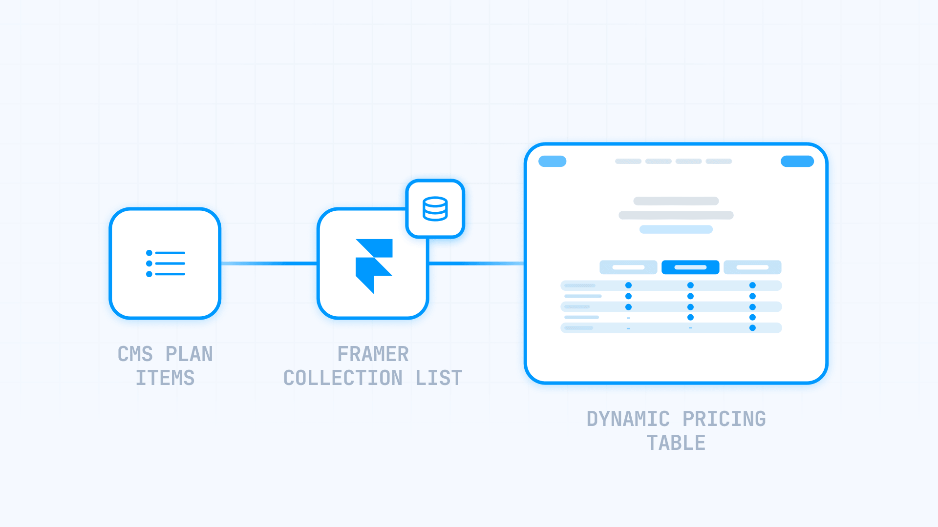
The fix is simpler than it looks. With the right fields and a horizontal layout, your table updates itself from the CMS — change a price, and every column follows. This guide walks through the full build in six steps.
Why a dynamic comparison table matters for your Framer site
A table that reads from your CMS turns a fragile, hand-built layout into one that maintains itself. Change a plan or feature in the CMS, and every column updates — no redesign, no duplicated edits. Common uses:
- Pricing pages: show plan tiers side by side; change a price in the CMS and every column follows.
- Feature grids: ✓ and — indicators driven by Toggle fields stay accurate as your catalog grows.
- Recommended plan: highlight one tier with a badge, controlled by a single field you can move between plans.
- Spec tables: compare Storage, Users, or Limits across items, one item per column.
- Easy updates: adding a plan is just adding a CMS item — no layout work.
Framer CMS Tables vs a Collection List: which to use
Framer has built-in CMS Tables, but they live inside one item's Rich Text field and are authored by hand — good for a static spec sheet for a single product. They can't pull values from several items into side-by-side columns.
For a dynamic comparison — one column per plan — use a Collection List. That's what the rest of this guide covers.
- Static table inside one item → use Framer's native CMS Tables.
- Dynamic table from multiple items → build it with a Collection List.
Step 1: Create a Plans Collection in Framer
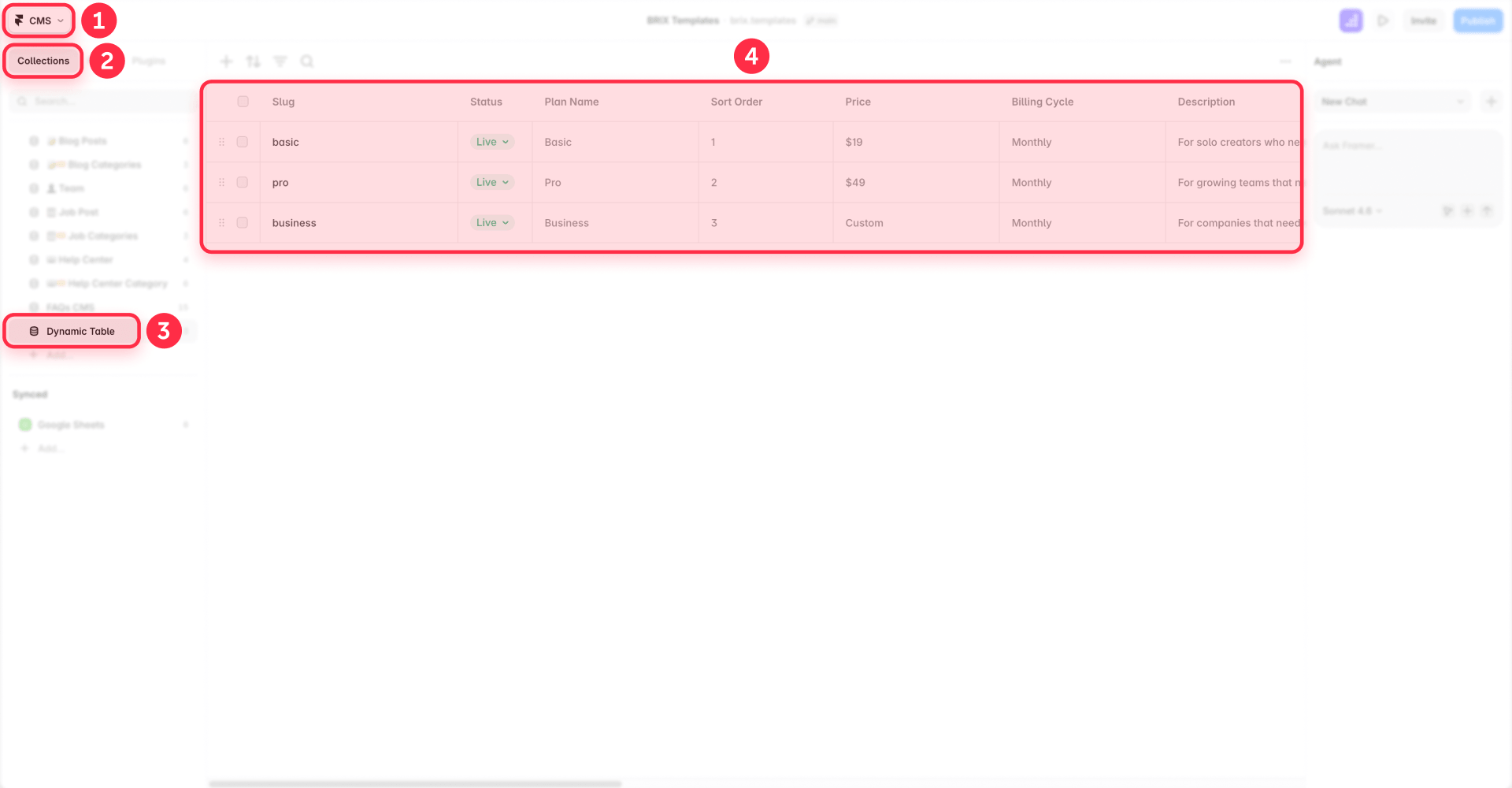
Create a CMS Collection and call it Plans. Each plan — Basic, Pro, Business — becomes one item in it.
This one decision does most of the work, because one item equals one column later. Add a new plan and a new column appears; you never rebuild the design.
Keep it simple with one item per plan. (Advanced: if many products share the same features, you can reference a separate Features Collection — but most pricing tables don't need it.)
Step 2: Add fields for every value in your Framer plan
The fields you add now decide how much manual work the table needs later. Set these up from the start:
- Text fields — plan name, price, description, and CTA.
- Toggle fields — for yes/no inclusions like "Custom domain" or "Priority support." These become your ✓ and — cells.
- Option fields — single-select dropdowns for fixed values like billing cycle, or cells with more than two states.
- A "Recommended" Toggle — to flag the plan you want to highlight.
Every value the reader sees should come from a field. If a price or checkmark is hardcoded into the design, the CMS can't update it.
Step 3: Build one reusable Component for aligned rows in Framer
This is the most important step. Build a single plan-column Component, bind its fields to the CMS, and reuse it for every column. Because every column is the same component, your rows stay aligned automatically — "Storage" in plan A always sits at the same height as "Storage" in plan B.
You can't rely on CSS subgrid inside Framer's visual layout, so the shared component is the reliable fix. Two quick tips:
- Equal-height columns — so shorter content doesn't pull rows upward.
- Fixed height for predictable rows (like price), flexible height for variable rows (like descriptions).
If your columns still come out different heights, learn how to fix uneven card heights in Framer grids.
Alignment is a structural problem, not a spacing problem. When every column is the same component, the rows can't drift.
Step 4: Drive checkmarks and dashes from Toggle fields in Framer
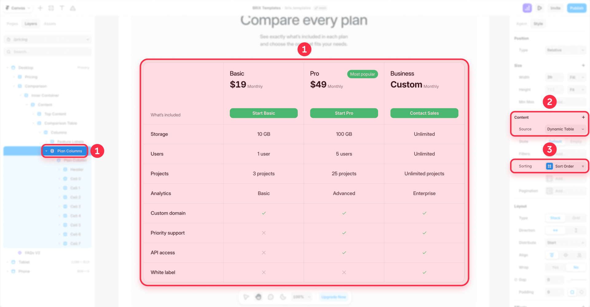
Most tables need a ✓ for "included" and a — for "not included." Drive both from one field:
- Add a Toggle field for the feature, for example Custom Domain.
- In your component, create two variants: one with a checkmark, one with a dash.
- Use a conditional to swap between them based on the Toggle — true shows ✓, false shows —.
For a cell with three states (✓, —, or a value like "Up to 50"), use an Option field instead, with one variant per state. Never hardcode these indicators — bind them to the field, so flipping the CMS item is all it takes to change a ✓ to a —.
Keep the row visible on desktop and show a dash for "not included." Hiding a row in just one column breaks alignment. See how to hide empty CMS sections on your Framer site only when a row is hidden across all plans.
Step 5: Highlight the recommended plan in Framer
Pricing pages usually emphasize one plan — a different background, a Most Popular badge, or a scaled-up column. Drive it from the Recommended Toggle you added in Step 2\.
Bind that Toggle to a conditional or variant that controls the badge and styling. When the value is true for an item, that column renders highlighted. To move the "recommended" flag to a different plan, just toggle the field in the CMS — no design edits.
Step 6: Make your Framer comparison table responsive on mobile
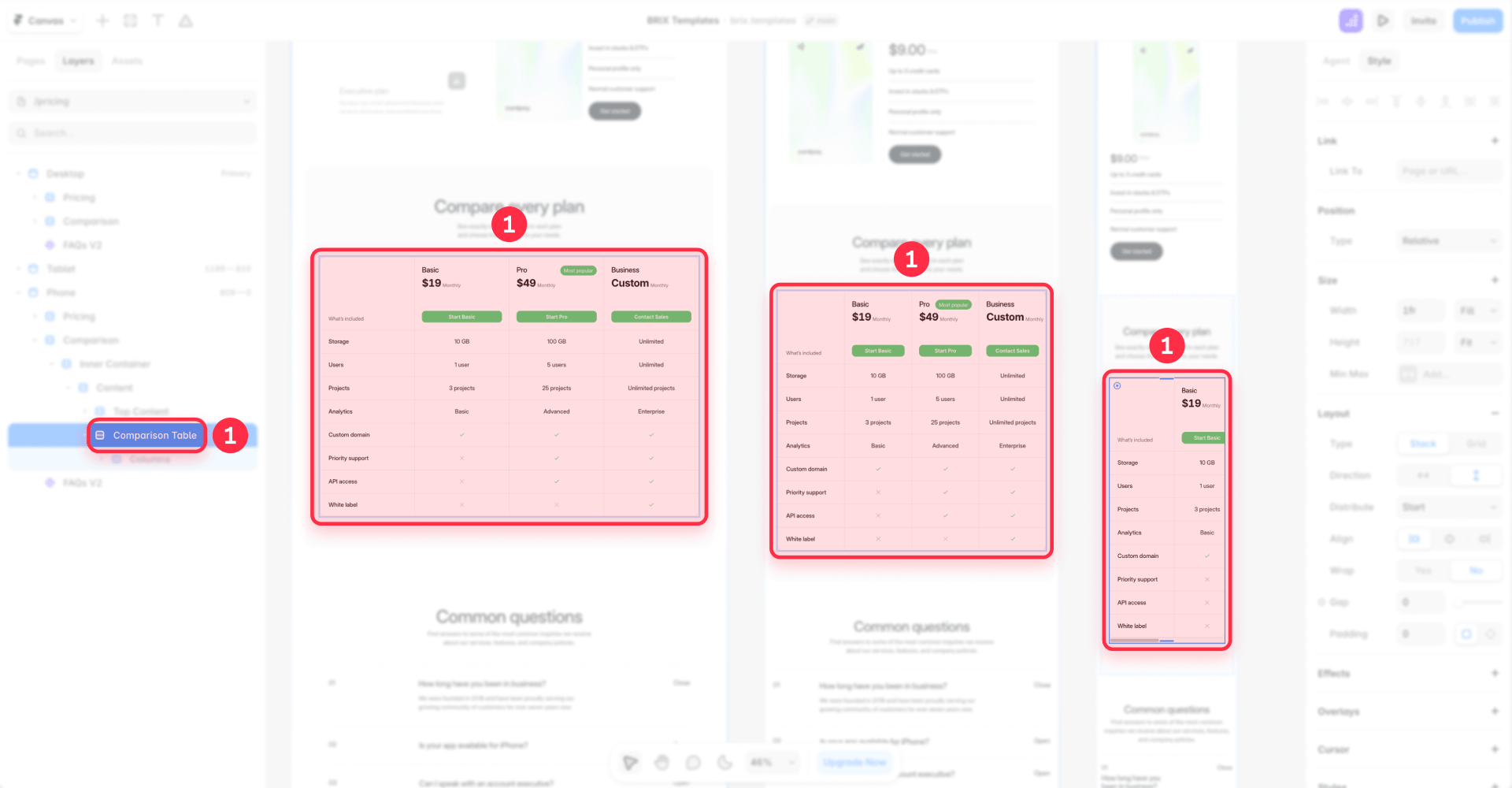
Three or four columns don't fit on a phone. Set your mobile breakpoints to one of these:
- Stack into cards (recommended) — turn each column into a standalone card stacked vertically, so every plan is a block the user scrolls through. This may mean a second layout for the mobile breakpoint, but it's the option that stays readable.
- Horizontal scroll — keep the table and let it scroll sideways. Preserves the side-by-side view, but users must swipe. You can keep the feature-label column sticky, but treat that as an advanced extra.
For most pricing pages, stacked cards are the right call.
Troubleshooting common Framer CMS comparison table issues
- Columns stack vertically instead of side by side — The list is still using its default vertical layout. Select the Collection List and set its layout container to a horizontal Stack or Grid. Verify in the canvas that items line up left to right, and check that no parent wrapper forces them back into a column.
- Rows misalign across columns — The cause is inconsistent structure between columns. Replace per-column layouts with one shared plan-column Component and make the columns equal height. Verify by selecting the same row in two columns and confirming they sit at the same height.
- Checkmarks or dashes don't change when you toggle a field — Confirm the variant swap is bound to the Toggle through a conditional, not hardcoded. Flip the Toggle, republish, and verify the cell updates on the live page.
- A new plan doesn't appear as a column — Check that the Collection List limit is high enough and that the item matches the list's filters and sorting. Publish the item and verify the new column renders; if not, raise the limit or widen the filter.
- The table breaks on mobile — Set the mobile breakpoint to stack each column into a full-width card. Verify in Framer's mobile preview that every plan is readable without horizontal scrolling.
Frequently asked questions about Framer CMS comparison tables
These questions cover the most common searches around Framer CMS comparison tables. They're also a good candidate for rich results — see how to add FAQ schema to your Framer site.
What is a Collection List in Framer?
A Collection List is a Framer element that repeats a design once for every item in a CMS Collection. By default it stacks items vertically, but you can set its layout to a horizontal Stack or Grid so each item becomes a column. That's the core of a dynamic comparison table: each plan is one item, and the Collection List turns each item into a column. Bind a reusable Component to the list so every column shares the same structure. Tip: think of the Collection List as the repeater and the Component as the column template. Start with one item per column and expand from there.
How is a Collection List different from a Framer CMS Table?
A Framer CMS Table lives inside one item's Rich Text field and is authored by hand — good for a static spec sheet for one product. It can't pull values from several items into columns. A Collection List renders one item per column and updates automatically when your data changes. Use CMS Tables for static, single-item tables; use a Collection List for dynamic, multi-item comparisons. If your columns should come from your CMS, skip native Tables and build the Collection List layout.
How do I create a comparison table in Framer?
Create a Plans Collection where each plan is one item, add a field for every value you want to compare, then drop a Collection List on the page and set its layout to a horizontal Stack or Grid so items line up side by side. Bind the fields to a reusable plan-column Component and the layout repeats once per item. Add a new plan and a new column appears, as long as it matches your filters and the list limit allows it. Model the data first — one item per column, every value as its own field — then let the Collection List handle the repetition.
Can I build a pricing table in Framer using CMS Collections?
Yes — pricing is the most common use case. Model each tier as one item in a Plans Collection, with fields for plan name, price, billing cycle, description, CTA, and a Toggle for each included feature. Render the Collection List as columns and each tier becomes a pricing card. Use a Toggle like Recommended to highlight your most popular plan, and Boolean fields to drive ✓/— icons. Change a price in the CMS and the bound values stay in sync across every column — no manual edits.
How do I align rows across columns in a Framer comparison table?
Alignment comes from structure, not spacing. Build one plan-column Component with a fixed internal row order — Plan name, Price, Storage, Features, CTA — and reuse it for every column. Because every column is the same component, each row sits at the same height automatically. Make the columns equal height, and give predictable rows like Price a fixed height while leaving variable rows like descriptions flexible. You can't rely on CSS subgrid in Framer, so the shared component is the reliable fix. If rows drift, the cause is almost always inconsistent structure between columns.
How do I make a Framer comparison table responsive on mobile?
Don't squeeze columns onto a narrow screen. Transform each column into a stacked card on Framer's mobile breakpoints, so every plan becomes a full-width block the user scrolls through. This may mean designing a second layout for mobile, but it's the approach that stays readable. The alternative is horizontal scroll, which keeps the side-by-side view but forces users to swipe; you can keep the feature-label column sticky as an advanced extra. For most pricing pages, stacked cards are the better choice.
If I add a new feature or plan, will my Framer comparison table update automatically?
Adding a new plan appears automatically if the table runs on a Collection List — a new item renders as a new column, as long as it matches the filters and the list limit allows it (Collection and item limits depend on which Framer plan you're on). The layout may need a tweak if the extra column breaks the design.
Adding a new feature depends on your structure. If each feature is a separate field on the Plans Collection, you'll add the field and bind a new row before it appears. If features live as items in a separate Features Collection rendered dynamically, a new feature can appear on its own — but each plan still needs a way to provide its value. Recommendation: if your features change often, model them as referenced items so new ones appear with minimal design work.
Conclusion
A dynamic comparison table in Framer is a Collection List rendered as columns, with one reusable Component keeping the rows aligned. Build it in order: one item per plan, the right fields, a horizontal layout, then checkmarks, a recommended badge, and a mobile layout. After that, plan changes flow from the CMS to the page without rebuilding the design.
If you'd rather have it built right the first time, our experienced Framer team at BRIX Templates can design and build a CMS-driven comparison table tailored to your plans, features, and brand.








Join readers commenting on this post!