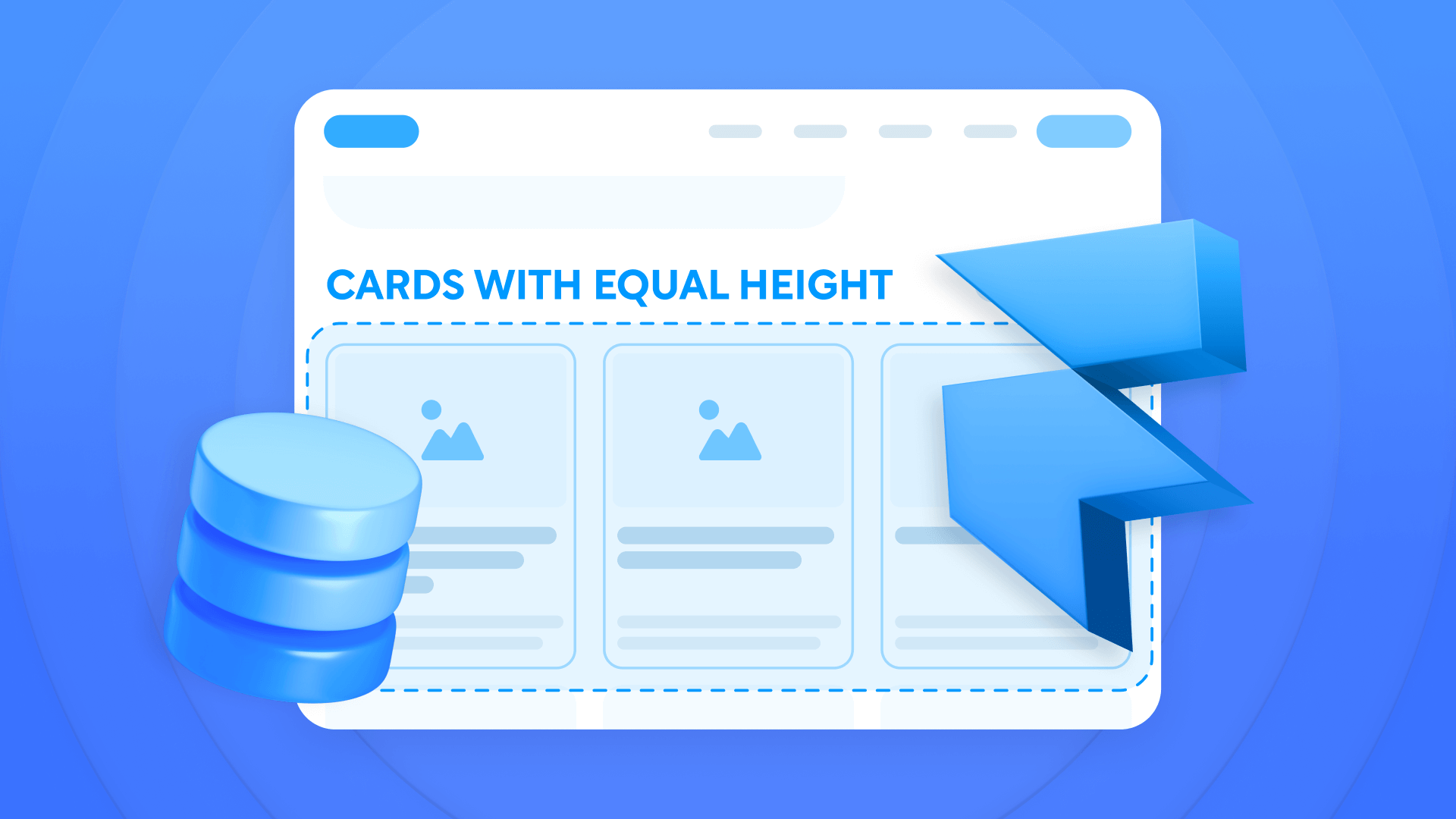
Grid layouts with inconsistent card heights compromise your Framer site's professional polish. Dynamic CMS content—blog posts, portfolio showcases, or feature listings—naturally varies in text length, creating visual disruption that undermines even the most thoughtfully planned designs. This guide delivers practical solutions for achieving impeccably aligned card layouts that preserve their refined appearance regardless of content variations.
You'll master four effective approaches to overcome this common challenge—from direct prevention using CMS character limits, to technical solutions with text truncation and relative height. All solutions leverage Framer's native capabilities without requiring complex code or third-party tools.
Why card height consistency matters for Framer grids
Grid layouts form the backbone of contemporary web design, yet inconsistent card heights sabotage their impact. Understanding why this challenge demands resolution is crucial for your Framer projects:
Professional appearance: Uniform card heights establish visual harmony and reflect meticulous attention to detail, instantly boosting your site's perceived quality.
Enhanced scanning experience: Properly aligned cards enable users to scan content more efficiently, moving their eyes horizontally rather than jumping up and down following misaligned elements.
Better responsive behavior: Equal height cards transition more smoothly between different screen sizes, maintaining their visual relationship without awkward spacing issues.
Improved visual hierarchy: With consistent card heights, you direct attention toward content differences rather than users getting distracted by layout inconsistencies.
Simplified maintenance: As you add new content to your Framer site, equal height cards ensure fresh entries automatically conform to your established design system.
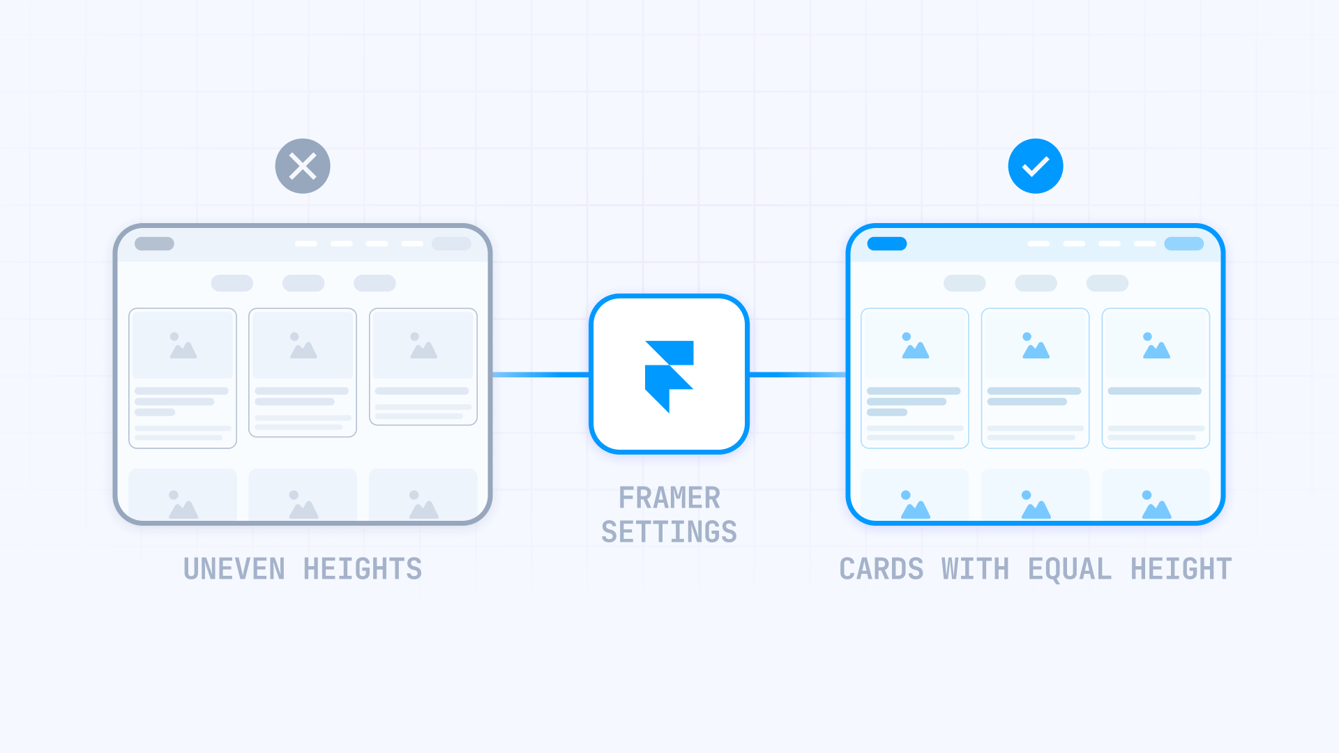
What causes uneven card heights in Framer grids?
The uneven heights problem in Framer stems from how the platform handles content containers by default. When you create a card grid, each card naturally expands to accommodate its content. If one card contains three lines of text while another contains five, the second card grows taller, creating visual misalignment across your grid.
This behavior occurs because Framer's default settings prioritize content accommodation over layout consistency. The platform's responsive design principles ensure content never gets cut off, which is generally beneficial but creates challenges when you need visual uniformity.
This problem manifests in several ways:
Title length variation: Some blog posts have 30-character titles while others have 100 characters, creating noticeable height differences.
Inconsistent descriptions: Excerpts can range from 50 to 250 words, resulting in misaligned cards.
Images with different proportions: When cards contain images with variable aspect ratios, this compounds height inconsistency.
Variable CMS content: Dynamic content from collections naturally has different lengths between entries, compounding the height problem.
This creates visual inconsistency in your grid layouts, particularly noticeable in blog listings, portfolio showcases, and feature sections where content variations are inevitable.
Methods to fix card heights in Framer
This guide covers four main methods for solving the uneven heights problem:
Method 1 - CMS character limits: Prevents the problem by establishing limits on CMS fields. Ideal for new content.
Method 2 - Text truncation: Limits visible text lines. Perfect for existing content with moderate variations.
Method 3 - Relative height (100%): Forces all cards to have the same height. Ideal for large content variations.
Method 4 - Combined: Combines truncation with relative height. For extreme content variations.
Method 1: Configure character limits in Framer CMS fields
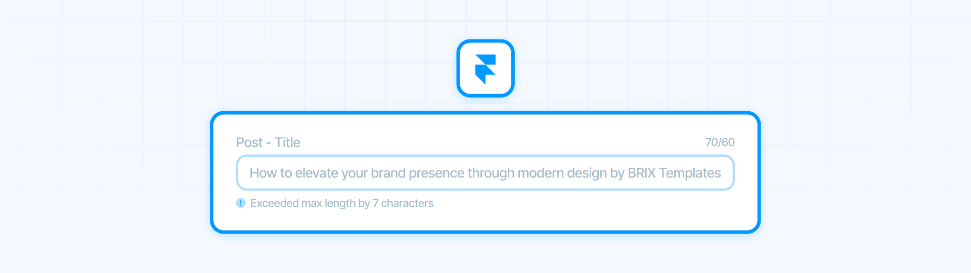
Framer's Max Length function lets you establish character limits directly on your CMS collection fields. This is the most effective solution because it prevents the problem before it occurs, ensuring all future content maintains consistent lengths.
Why this is the best method for prevention:
This approach maintains consistency from the source. When you establish a Max Length on a CMS collection field, content editors cannot exceed that limit when creating entries. This means all new entries automatically stay within agreed-upon parameters, naturally maintaining uniform card heights without requiring additional technical solutions.
Steps to configure Max Length in Framer CMS collections:
- In your Framer project, open the CMS panel (Collections)
- Select the collection containing your card data (e.g., Blog Posts, Products, etc.)
- Find the field you want to limit (typically the title or description field)
- Click on the field to open its settings
- In the field properties, look for the Max Length option
- Enter the maximum number of characters allowed
- Save the collection changes
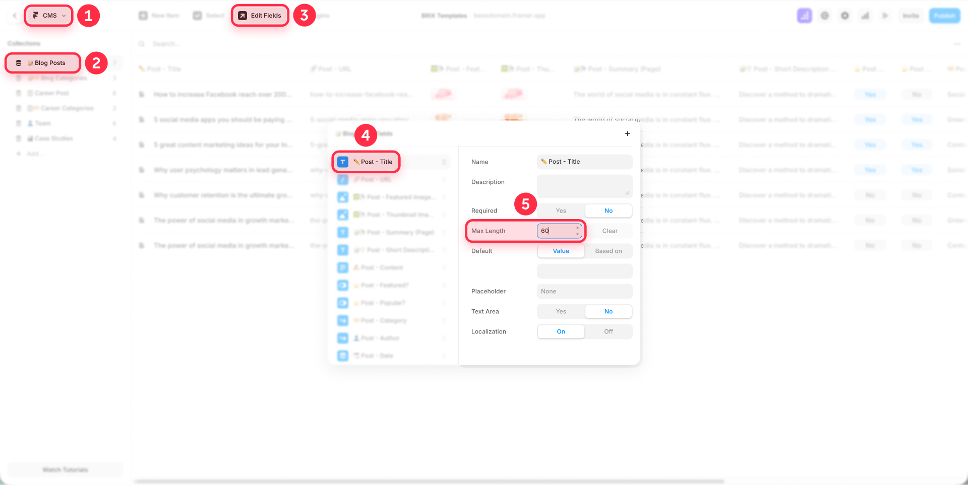
Important: This setting applies at the CMS collection level, not the component level. When an editor attempts to create or edit an entry and writes more characters than the established limit, Framer will display a warning indicating "Exceeded max length by X characters", as seen in the collection editing interface.
Recommended ranges for character limits:
For card titles:
- Blog posts: 60-80 characters
- Feature headlines: 50-70 characters
- Case study titles: 70-90 characters
- Product names: 40-60 characters
For descriptions or excerpts:
- Short descriptions: 120-150 characters
- Medium excerpts: 150-200 characters
- Detailed summaries: 200-250 characters
This method works best for new content and projects where you have complete editorial control. For existing content that already exceeds these limits, combine this method with Methods 2, 3, or 4.
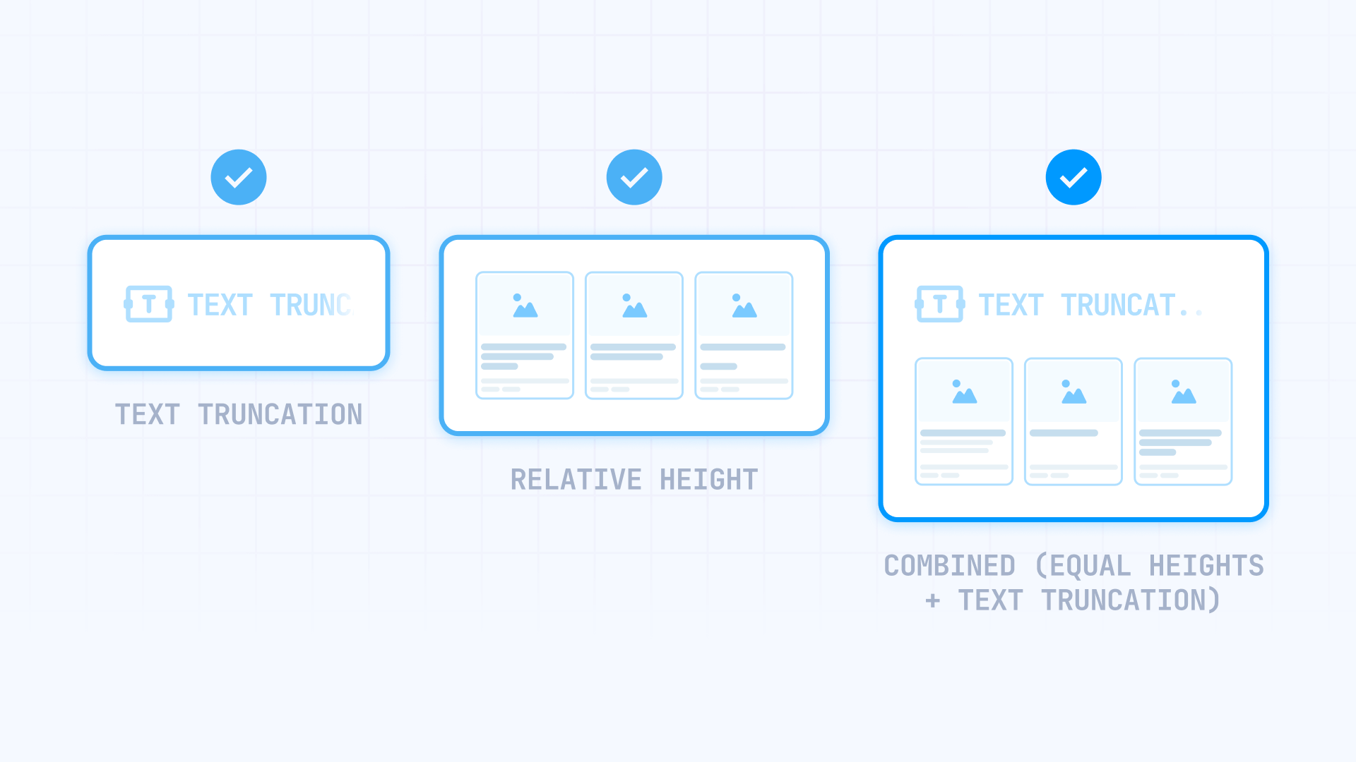
Method 2: Use text truncation for consistent card heights in Framer

This is a quick and easy method that maintains visual consistency by limiting the number of lines displayed in card titles or descriptions. Text truncation ensures all cards have the same amount of text space, preventing height variations caused by longer titles. This method is ideal for existing content that already has length variations.
Step 1: Access the card component in Framer
- In your Framer project, locate the card component you want to modify
- Select the text element within the card that causes height variations (usually the title or description)
- Open the Properties panel on the right side
Step 2: Enable text truncation in Framer
1 - In the Properties panel, scroll down to the Text section
2 - Find the Truncate property
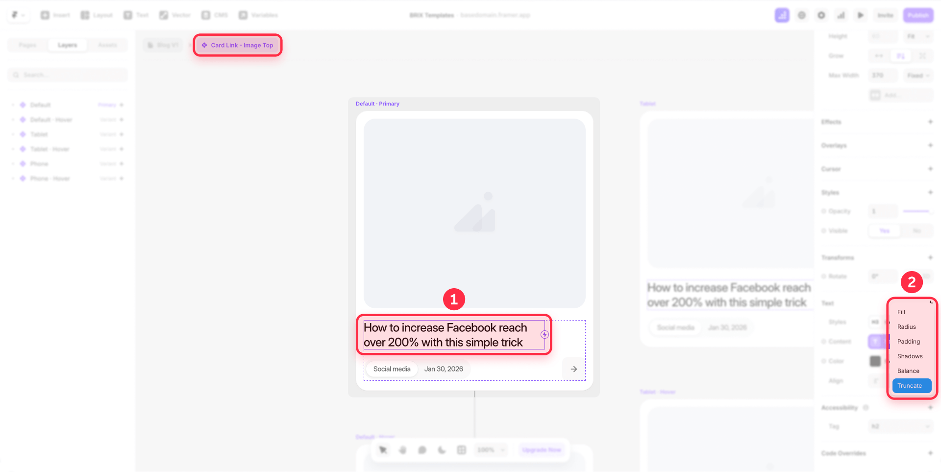
3 - Click on Truncate to expand the options
4 - Change from None to Lines
5 - Set the number of lines you want to display (typically 2-3 lines for titles, 3-4 lines for descriptions)
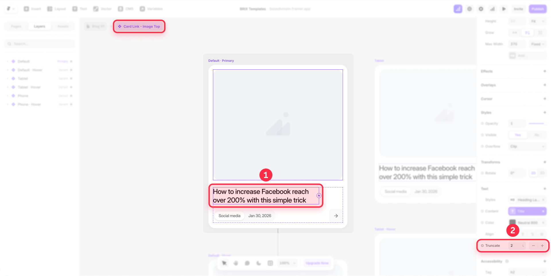
When you enable line truncation, Framer automatically adds an ellipsis (...) at the end of the truncated text, indicating there's more content. This maintains a clean appearance while ensuring visual consistency.

Recommended line counts:
For titles:
- Blog post titles: 2-3 lines
- Feature headlines: 1-2 lines
- Case study titles: 2-3 lines
For descriptions:
- Short descriptions: 3-4 lines
- Medium excerpts: 4-5 lines
- Detailed descriptions: 5-6 lines
Important considerations for text truncation:
This method works best when combined with appropriate line heights and font sizes. If you're seeing inconsistent results, verify that your text element has a fixed line height (not Auto) to ensure predictable spacing.
Text truncation handles display consistency but doesn't solve extremely large height variations. For content with massive differences, consider combining this method with Method 3 (relative height) for maximum control.
Method 3: Use relative height (100%) for equal card heights in Framer

This method forces all cards within a grid to match the height of the tallest card by using relative height properties. It's the most powerful solution for handling large content variations because it equalizes all cards regardless of their individual content length.
Understanding the height hierarchy in Framer
Before implementing this method, understand Framer's height hierarchy:
- Collection List: The container holding all cards
- Collection Item: The wrapper for each individual card (automatically created)
- Card: Your actual card component
For this method to work properly, both the Card and Collection Item need relative height (100%), while the Collection List uses Fit height.
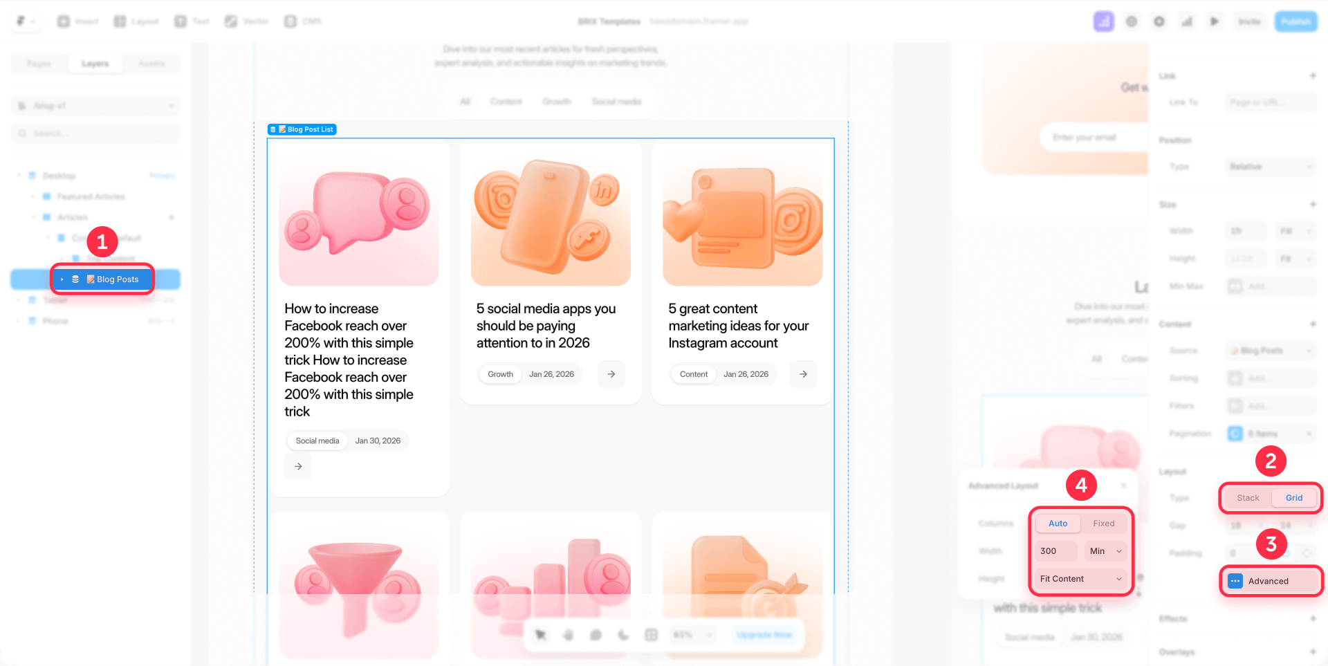
Step 1: Configure your Framer Grid layout with advanced settings
The first step is to set up your grid with responsive settings that adapt to different screen sizes:
- Create or open your existing grid layout in Framer
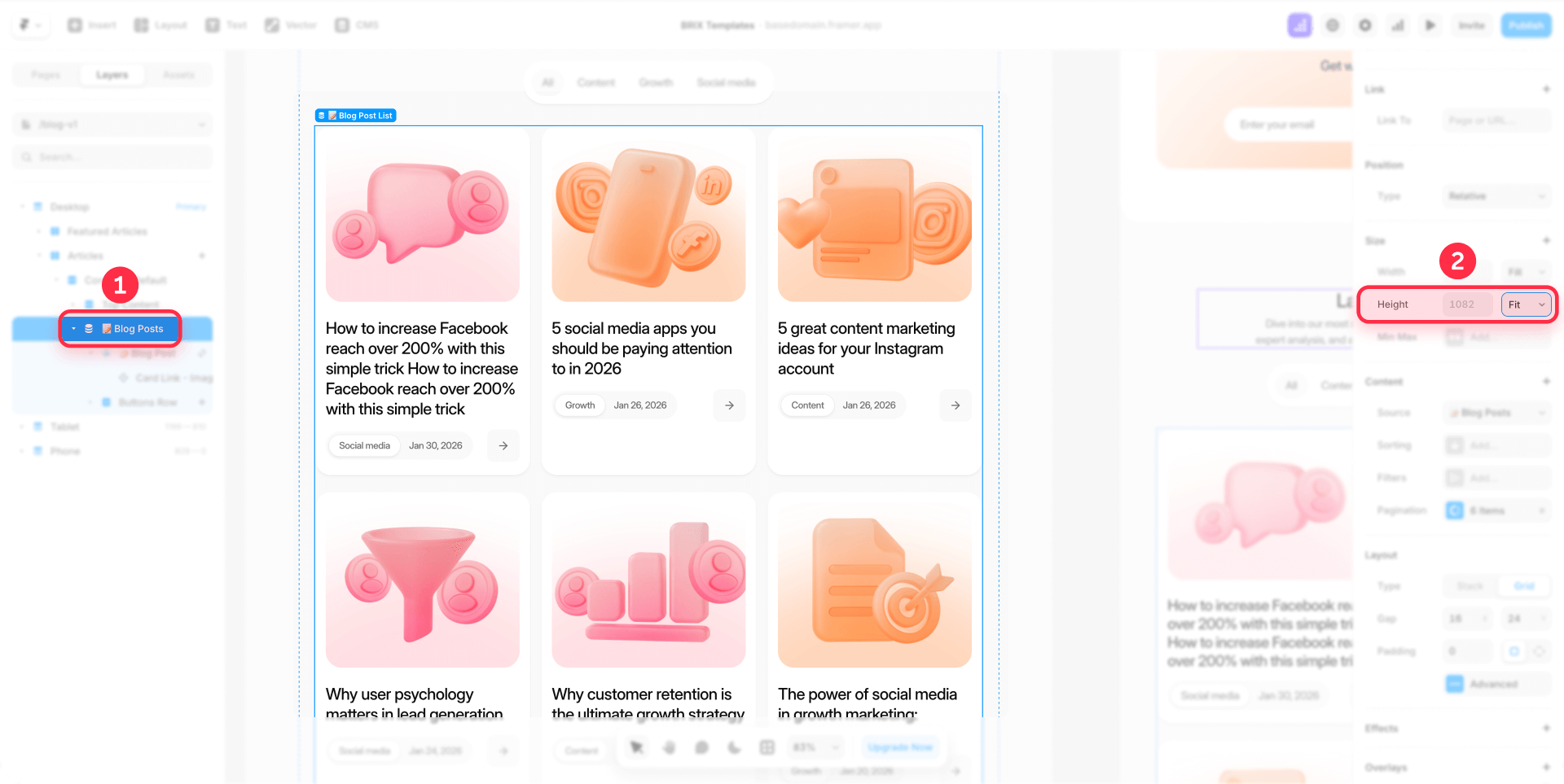
- Select your grid container element (the "Blog Posts" container in the layers panel)
- In the right sidebar, under the Layout section, ensure you have Grid selected as your layout type
- Click on Advanced to access advanced layout settings
- Under Advanced Layout, set Columns to Auto for responsive behavior
- Set the minimum width to approximately 300px for a 3-column layout (adjust based on your desired number of columns)
- Set Height to Fit Content to allow the grid to adjust based on content
Important note: Setting a fixed number of columns makes your layout less responsive. Using the Auto setting with a minimum width ensures your grid adapts beautifully across different screen sizes.
Step 2: Configure the Card component height in Framer
- Select your Card component (not the Collection Item)
- In the Properties panel on the right, locate the Layout section
- Find the Height property
- Change the dropdown from Fit (or Fixed) to % (Relative)
- Set the value to 100
This tells the Card to fill 100% of its parent container's height.

Step 3: Configure the Collection Item height in Framer
- In your canvas, click to select the Collection List
- In the left sidebar Layers panel, expand the Collection List to see its children
- You'll see Collection Item (this is automatically created by Framer)
- Select the Collection Item
- In the Properties panel, locate the Layout section
- Find the Height property
- Change it to % (Relative)
- Set the value to 100

Step 4: Verify the Collection List height in Framer
When you change the Card and Collection Item to relative height, Framer automatically changes the Collection List to Fixed height. You need to manually change this back:
- Select the Collection List (the parent container)
- In the Properties panel, find the Height property
- Ensure it's set to Fit (not Fixed)
This is crucial—if the Collection List stays on Fixed, your cards won't equalize properly.
Important notes for relative height method:
This method works identically for both Grid and Stack layouts. Whether you're using a grid or stack layout in your Collection List, the same height configuration applies to all three levels (Card, Collection Item, and Collection List).
The relative height approach forces all cards in a row to match the tallest card's height. Cards with less content will have extra white space, so consider how you want to align content within those cards (see content alignment section later).
Method 4: Combine truncation with relative height for extreme variations in Framer

For content with extreme variations—where some entries have 50 characters while others have 300—neither truncation alone nor relative height alone provides optimal results. The combined approach delivers the best outcome by preventing both excessive text and uneven heights.
The limitation of each solution separately:
Relative height only: While it equalizes card heights, extremely long content creates cards that are too tall, pushing your entire grid down and creating awkwardly spaced layouts. The tallest card determines everyone's height, which can be problematic.
Truncation only: It cuts long text correctly with "...", but doesn't actually equalize the card heights. Cards with short content will still be smaller than cards with longer content that got truncated. Truncation limits text display, not card height.
The combined solution provides:
- Text truncation (Method 2) prevents any single card from growing excessively tall by limiting visible lines
- Relative height (Method 3) then equalizes whatever height variations remain after truncation
This two-layer approach ensures your cards stay within a reasonable height range while maintaining perfect alignment across the grid.
Implementation steps for combined method in Framer:
- First apply text truncation to your card's text elements:
- Select the title or description text element
- Enable Truncate > Lines in Properties
- Set to 2-3 lines for titles, 3-4 lines for descriptions
- Then apply relative height to your card structure:
- Set Card height to 100% (Relative)
- Set Collection Item height to 100% (Relative)
- Set Collection List height to Fit
- Test and adjust:
- Preview your grid with various content lengths
- If cards seem too tall, reduce truncation line count
- If alignment issues persist, verify all height settings are correct
When to use the combined method:
This approach is ideal when:
- Your content has extreme variations (some entries with 50 characters, others with 300+)
- You want maximum control over both content display and layout consistency
- You're working with user-generated content or legacy content with unpredictable lengths
- Standard solutions (Methods 2 or 3 alone) don't provide satisfactory results
The combined method is particularly valuable for blog grids where titles and excerpts vary dramatically, or portfolio showcases where project descriptions range from brief to detailed.
Best practices for maintaining card consistency in Framer
Beyond implementing technical solutions, establishing smart workflows prevents height inconsistency problems from recurring. Here are essential practices for long-term maintenance:
Build consistency into your components
Transform your card component into a "smart component" that enforces best practices automatically:
Set default truncation: Enable text truncation in the component itself so all instances inherit this behavior
Configure relative height: Build 100% height into your component structure so it works correctly out of the box
Document restrictions: Communicate character limits in your content guidelines so editors know the constraints before creating entries
Create variants for different needs: If some cases require more text, create component variants with different settings instead of removing restrictions
Implementation based on project phase
If you're starting a new project:
- Configure Max Length in your CMS collections from day one (Method 1)
- Add truncation as a backup within the component (Method 2)
- Configure relative height in the component structure if necessary (Method 3)
If you're working with an existing project:
- Identify which method solves your current situation (Methods 2, 3, or 4)
- Apply the solution to your existing component
- Update CMS collections to include Max Length on new fields
This "smart component" approach makes best practices automatic. Component users don't need to remember limits or settings—the system itself enforces them. This is especially valuable in large teams or when multiple people create content.
Troubleshooting common card height issues in Framer
If your card heights still appear inconsistent after implementing these solutions, check these common issues:
Cards still appear at different heights despite following Method 3 steps: Verify that both the Card and Collection Item have their height set to 100% (Relative). Also confirm the Collection List has its height set to Fit (not Fixed). When you change the Card and Collection Item to Relative, Framer automatically changes the Collection List to Fixed, so you need to manually set it back to Fit. This method works for both Grid and Stack layouts.
Cards look equal on desktop but break on mobile: Check your responsive settings and breakpoints. Ensure your grid's advanced layout settings use Auto columns with an appropriate minimum width rather than a fixed number of columns. Test each breakpoint individually and adjust the minimum width values if cards appear too narrow or wide on smaller screens.
Text truncation is cutting important content: If Method 2 is hiding crucial information, consider increasing the number of allowed lines in the truncation settings, or switch to Method 3 which allows full content to display while maintaining equal heights.
Cards with images have inconsistent heights: Ensure all images within your cards have the same aspect ratio or are set to a fixed height with the Fill or Fit object-fit property. If using Method 3, cards will equalize despite image variations, but controlling image dimensions provides additional visual consistency.
Layout settings aren't taking effect: Verify there are no override settings or custom code that might be interfering with your height configurations. Also ensure you're selecting the correct elements in the hierarchy—sometimes it's easy to accidentally select a parent or child element when you intend to modify the card itself.
Max Length limit doesn't appear or doesn't work: Max Length is configured directly in the CMS collection settings, in the specific field configuration (not on the component). Go to your CMS collection, select the field you want to limit, and set the Max Length in the field properties. This setting will apply to all entries in that collection.
Frequently asked questions about card heights in Framer
How do I make Framer cards the same height in a grid?
Set both your card and its parent element to 100% relative height, while ensuring the grid container uses Fit Content for its height. Alternatively, use Framer's text truncation feature to limit title lengths, or set Max Length limits on the component's CMS fields to prevent the problem at the source.
Can I use equal height cards with Framer CMS collections?
Yes, all methods work perfectly with CMS collections. For Method 1, configure Max Length on the card component. For Method 2, apply truncation to the component. For Method 3, apply the 100% height setting to the card component itself. Method 4 combines truncation with relative height for maximum control.
Do equal height cards work with Stack layouts in Framer?
Absolutely. The relative height method (Method 3) works identically with both Grid and Stack layouts. Simply ensure your Stack container has its height set to Fit Content, and apply 100% height to both the cards and their parent elements.
What's the best way to handle long titles in Framer card layouts?
The best preventive solution is Method 1: set Max Length limits on the component's CMS fields (60-80 characters for blog titles). For existing content, text truncation (Method 2) with 2-3 lines maintains visual consistency. For extreme variations, use Method 4 which combines both approaches.
Will equal height cards slow down my Framer site?
No, all methods use native Framer styling and have no impact on site performance. The relative height approach uses standard CSS flexbox properties, text truncation is a lightweight native feature, and Max Length limits are editor-side validation that doesn't affect the published site.
How do I align content at the bottom of equal height Framer cards?
Use a vertical stack layout within your card with the spacing set to Space between. Place your main content (title, description) in one container at the top, and your button or metadata in another container. This automatically pushes bottom elements down while keeping top content aligned.
Can I use different truncation settings for different card types in Framer?
Yes, create component variants with different truncation settings. For example, create a "Blog Card" variant with 2-3 line title truncation and a "Feature Card" variant with 1-2 line title truncation. This gives you flexibility while maintaining consistency within each card type.
What happens to content that exceeds the Max Length in Framer CMS?
When editors attempt to create or edit an entry and exceed the Max Length, Framer displays a warning: "Exceeded max length by X characters". The entry won't save until they reduce the content to meet the limit. This enforcement ensures all content stays within your defined parameters.
Should I use Method 2, 3, or 4 for my Framer project?
Use Method 2 (truncation) for moderate variations when you want to hide excess text. Use Method 3 (relative height) for large variations when you want all content visible but cards equalized. Use Method 4 (combined) for extreme variations when you need both content limiting and height equalization. Always start with Method 1 (Max Length) for prevention.
Can I apply equal height cards to non-CMS content in Framer?
Yes, all methods work with both CMS collections and static content. For static cards, you can't use Method 1 (Max Length) since it's CMS-specific, but Methods 2, 3, and 4 all work perfectly with manually created card layouts using components or frames.
Conclusion
Creating equal height cards in Framer is essential for maintaining professional and polished layouts. The most effective strategy combines prevention (Method 1: Max Length in CMS) with technical solutions based on content type: text truncation (Method 2) for moderate variations, relative height (Method 3) for large variations, or the combination of both (Method 4) for extreme cases.
For new projects, always start with Method 1 by setting Max Length limits on your components and creating clear editorial guidelines for your team. This prevents the problem at its source. For existing content, Method 3 with relative height is generally the simplest and most effective solution—it requires only setting a few height configurations and works seamlessly with both CMS collections and static content.
Need help with advanced Framer layouts, custom component systems, or building scalable design systems? Our Framer development team specializes in creating professional Framer sites that combine beautiful design with practical functionality.


Join readers commenting on this post!