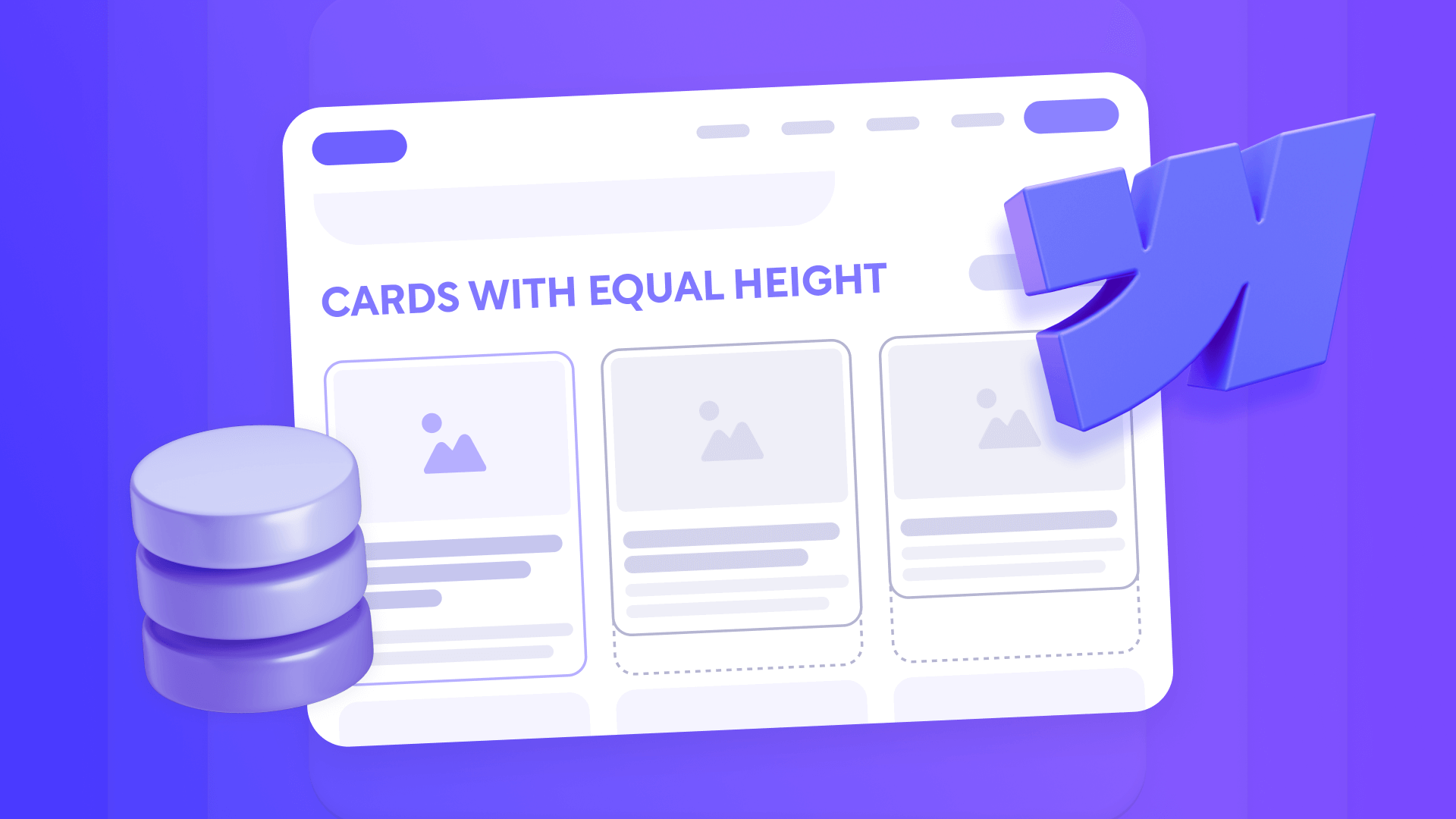
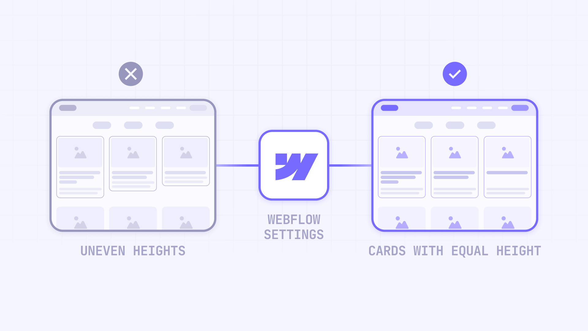
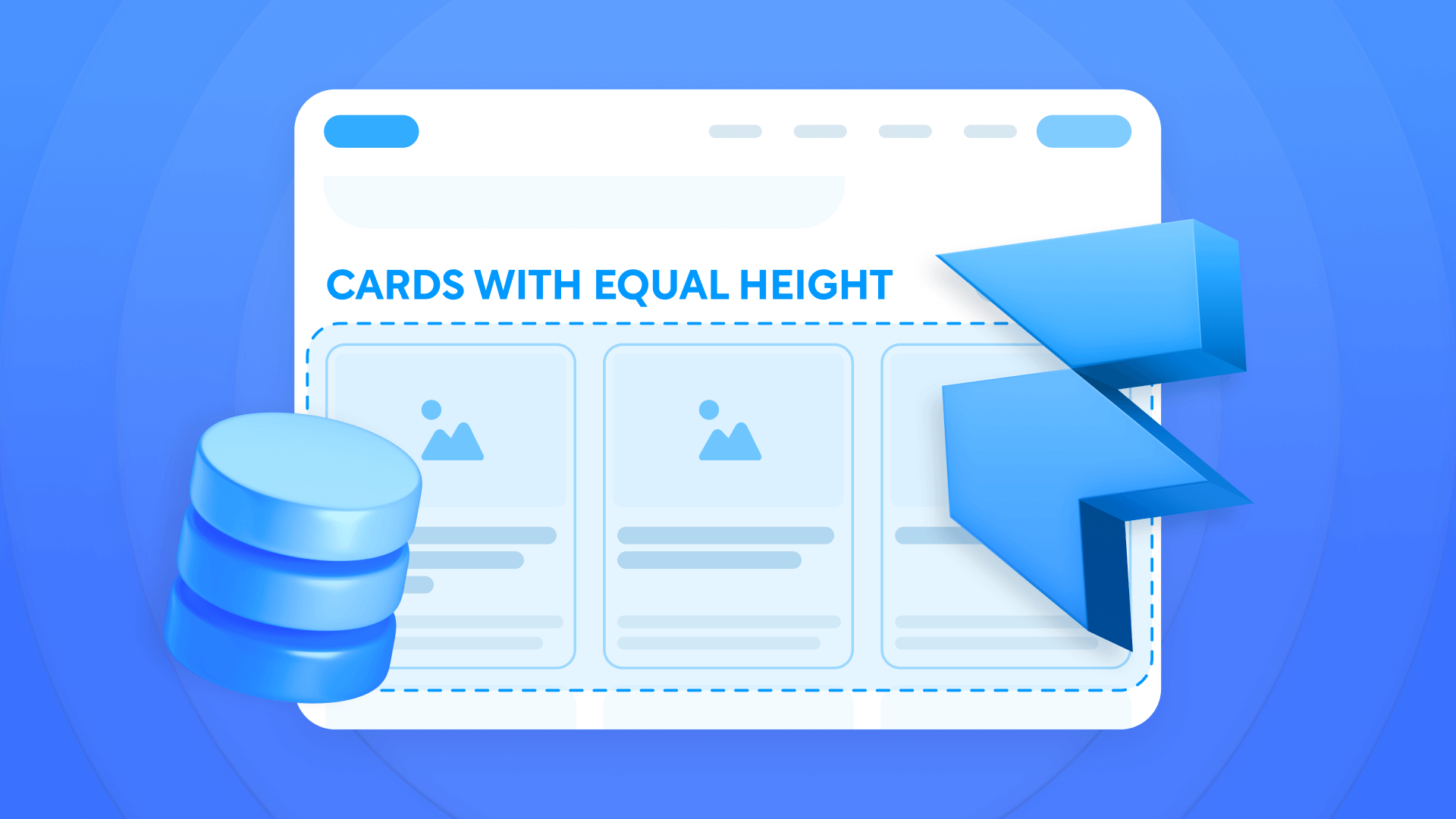
Uneven card heights in grid layouts can make your Webflow site look unprofessional and inconsistent. When you work with dynamic CMS content like blog posts, case studies, or product listings, varying text lengths create visual chaos that disrupts your carefully planned design. This guide presents practical solutions for achieving perfectly aligned card layouts that maintain their polish regardless of content length.
You'll learn multiple approaches to solve this common challenge—from strategic content rules that prevent the problem at its source, to native Webflow Designer solutions that work without custom code.
Why card height consistency matters for Webflow grids
Grid layouts are fundamental to modern web design, but inconsistent card heights undermine their effectiveness. Here's why solving this challenge is essential for your Webflow projects:
Professional appearance: Uniform card heights create visual harmony and demonstrate attention to detail, immediately elevating your site's perceived quality.
Improved readability: When cards align properly, users can scan content more efficiently without their eyes jumping between different vertical positions.
CMS flexibility: Your Webflow CMS dynamic content naturally varies in length—solving height inconsistency lets you maintain design integrity without manually editing every entry.
Responsive consistency: Proper height management ensures your grids look polished across all device sizes, from mobile to desktop.
Brand credibility: Misaligned layouts suggest carelessness, while consistent spacing and alignment reinforce your brand's professionalism.
What causes uneven card heights in Webflow grids?
Uneven card heights in Webflow occur when dynamic CMS content varies in length between different entries. Since Webflow's default grid behavior allows each element to size naturally based on its content, cards with longer titles or descriptions become taller than those with minimal text.
This problem manifests in several ways:
Text variation: Some blog posts have 30-character titles while others have 80 characters, creating noticeable height differences.
Inconsistent excerpt lengths: Descriptions can range from 50 to 300 characters, resulting in misaligned cards.
Legacy content: Content created before establishing editorial guidelines often has extremely variable lengths.
Multiple content authors: Different content creators naturally write in different styles and lengths without clear guidelines.
This creates visual inconsistency in your grid layouts, particularly noticeable in blog listings, case studies, and product cards where content authors create entries with different lengths.
Methods to fix card heights in Webflow
This guide covers four main methods for solving the uneven heights problem. Each method works best in specific situations:
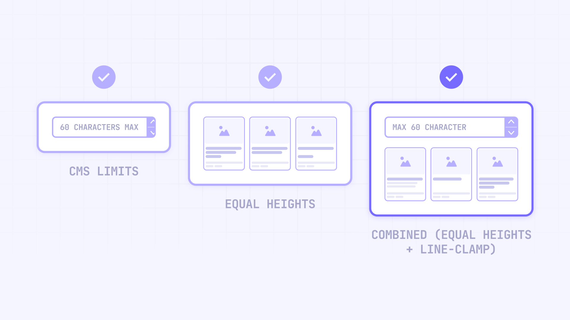
Method 1 - CMS limits: Prevents the problem at its source by establishing character limits on CMS fields. Ideal for new projects where you control content creation.
Method 2 - Equal heights: Uses native Webflow settings (Grid height 100% or Flexbox Align: Stretch) to equalize heights. Works for most cases with moderate content variations.
Method 3 - Combined (Equal heights + Line-clamp): Combines equal heights with text truncation for extreme variations. Prevents both excessive text and uneven heights.
Method 4 - Advanced truncation: Programmatic implementation with granular control. For special cases requiring dynamic truncation respecting word boundaries.
Method 1: Configure content limits in your Webflow CMS
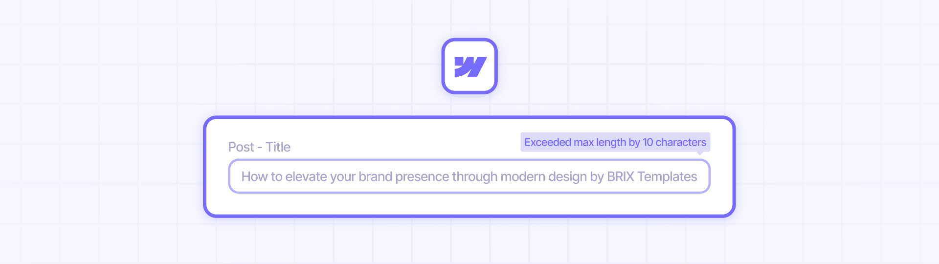
The Webflow CMS includes built-in validation tools that enforce content length requirements directly on your Plain text collection fields.
Steps to configure limits:
- Open your Collections panel in the Webflow Designer
- Select the collection containing your card content (e.g., blog posts, case studies)
- Click on the Plain text field you want to regulate (typically Title or Description)
- In the field settings, locate the Validation section
- Enable Character Limit and set appropriate minimum and maximum values
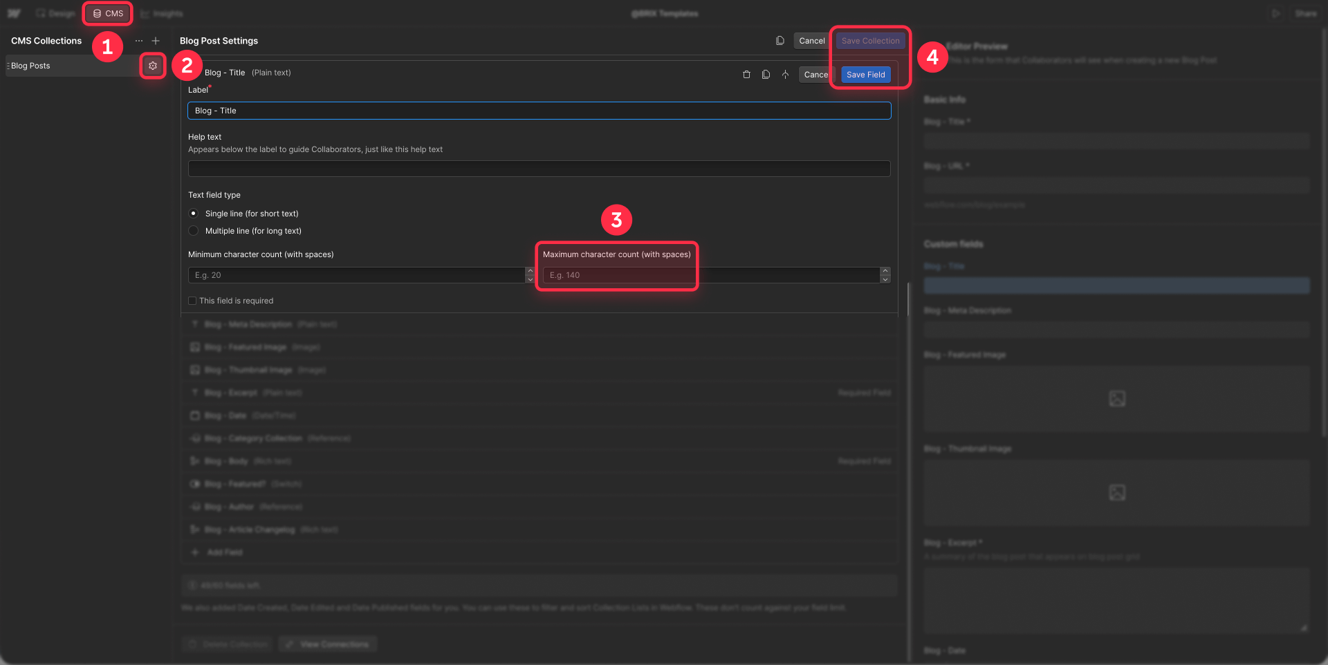
Important note: Webflow's default "Name" field doesn't allow custom limits. You need to create additional Plain text fields for specific character limits.
Keep in mind that character limits are only available on Plain text fields, not Rich text fields.
Recommended ranges for title fields:
- Blog post titles: 40-70 characters
- Product card headlines: 30-50 characters
- Case study titles: 50-80 characters
- Team member names: 20-40 characters
Recommended ranges for description or excerpt fields:
- Short descriptions: 100-150 characters
- Medium excerpts: 150-250 characters
- Detailed summaries: 200-300 characters
This method works best for new content and projects where you have complete editorial control.
Method 2: Equalize card height using native Webflow settings

When working with existing content or when CMS limits aren't enough, native Webflow Designer settings provide a reliable technical solution. This approach forces all cards within a grid row to match the height of the tallest card.
The correct solution depends on whether your Collection List uses Grid or Flexbox. Both methods produce the same result using only native Webflow Designer settings—no custom code required.
Option A: If you use Grid layout in your Collection List
This is the most common and simple method. It works if your Collection List is configured with Display: Grid.
Steps for Grid:
- Open your Webflow Designer and navigate to the page with your blog grid
- In the Navigator, expand your Collection List
- Select the Collection Item (this is the element that repeats for each entry)
- In the Style panel on the right side, locate the Size section
- Under Height, click the dropdown and select % as the unit
- Set the value to 100
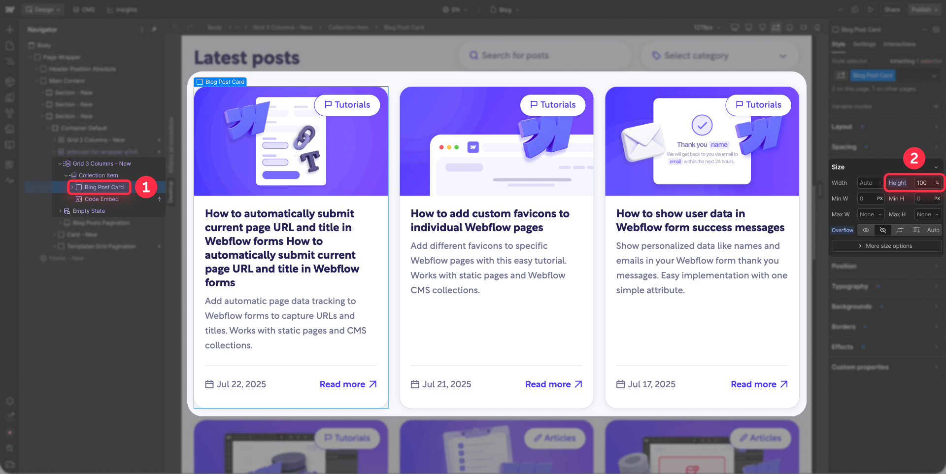
This tells the Collection Item to fill 100% of the available height in its grid cell. Since CSS Grid automatically makes all cells in a row match the tallest cell, your cards will now have uniform heights.
Important: Your Collection List must have Display: Grid configured for this to work. Verify this by selecting your Collection List and checking the Style panel > Layout > Display.
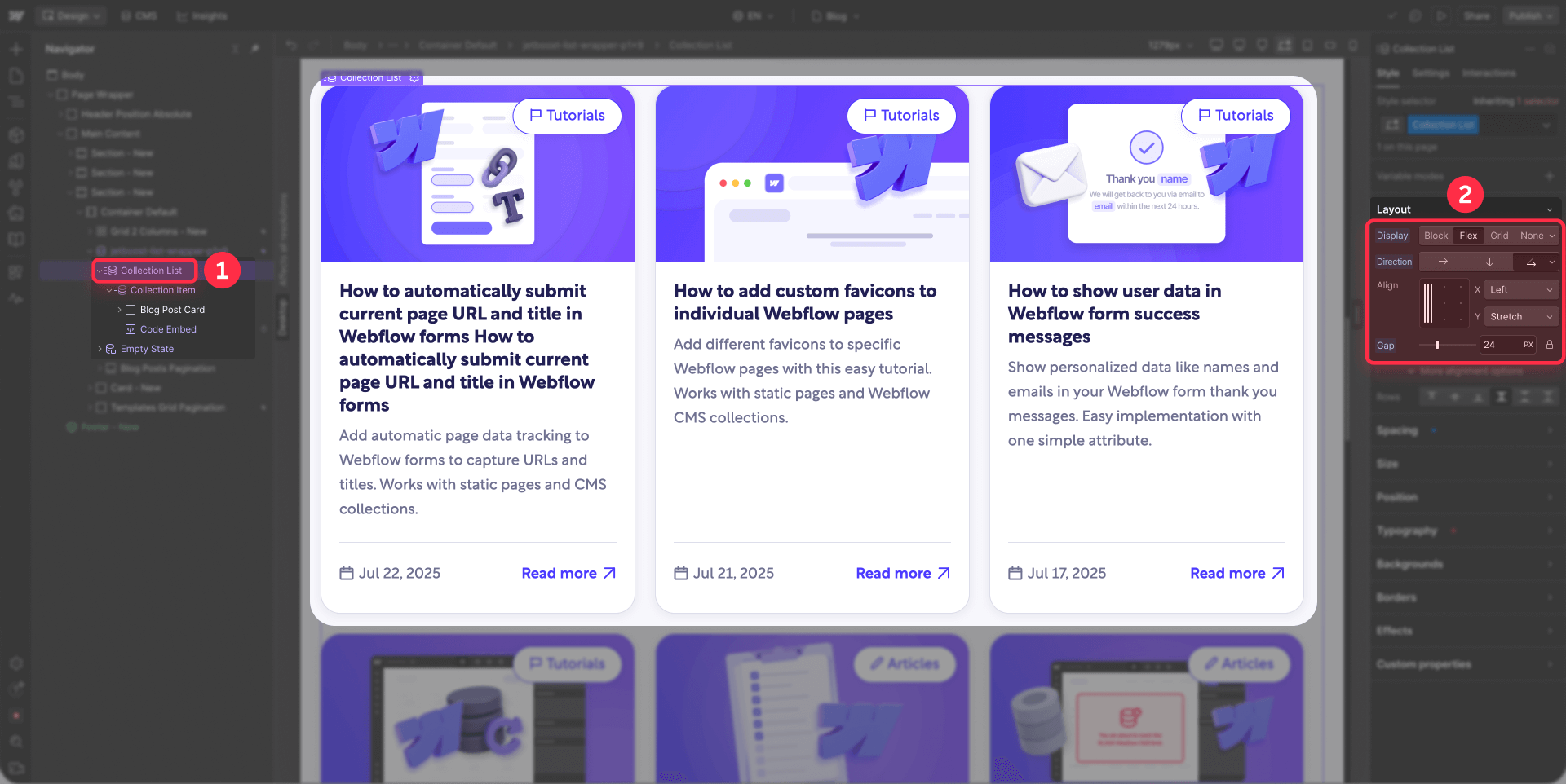
Option B: If you use Flexbox layout in your Collection List
If your Collection List uses Display: Flex instead of Grid, you need a different approach that works with Flexbox properties.
Steps for Flexbox:
- Select your Collection List in the Navigator
- In the Style panel > Layout, verify that Display is set to Flex
- In the Align section, set Align to Stretch
This tells Flexbox to stretch all child items (your Collection Items) to match the tallest item in the row.
Additional Flexbox configuration for card widths:
- Select your Collection Item
- In the Style panel > Size, locate Width
- Click the function icon (fx)
- Enter this calc function: calc(33.333% - 16px)
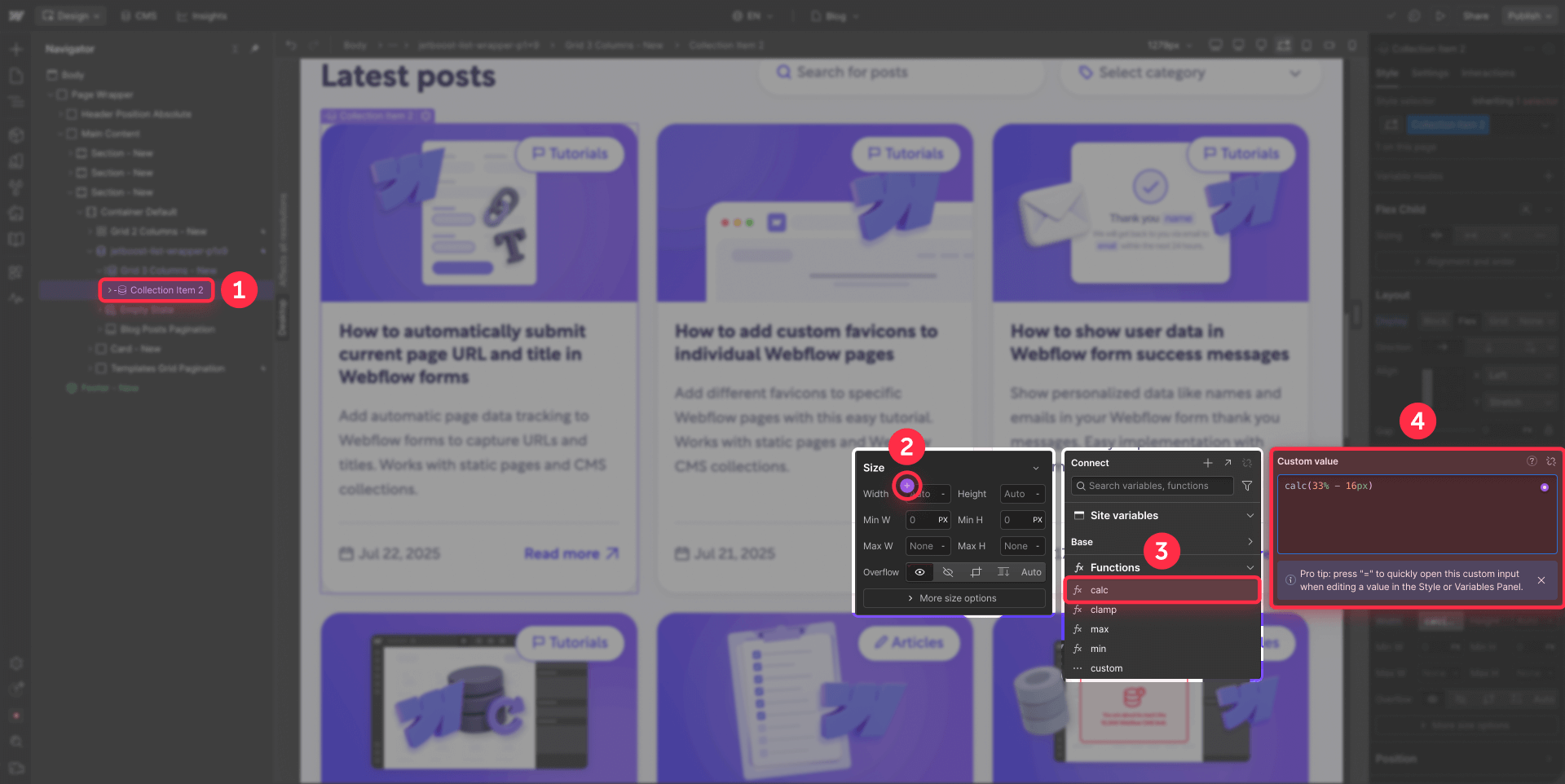
Adjust the percentage based on how many columns you want:
- 2 columns: calc(50% - [your gap])
- 3 columns: calc(33.333% - [your gap])
- 4 columns: calc(25% - [your gap])
Replace [your gap] with your actual spacing. If your gap is 24px, use calc(33.333% - 24px).
Important about the gap: The value you subtract must match your Flexbox gap spacing. To find your gap, select your Collection List and look at Style panel > Spacing > Gap.
When to use Grid vs Flexbox
Use Grid (Option A) when:
- Starting a new project—Grid is simpler
- You want the fastest solution—literally one setting change
- You need consistent spacing between cards
Use Flexbox (Option B) when:
- You already have an existing Flexbox layout—no need to rebuild
- You need flexible order or item reordering
- Working with single-row layouts
Both methods are equally effective for achieving equal height cards.
Method 3: Combine equal heights with text truncation

For content with extreme variations, where some excerpts have 300+ characters while others have less than 50, you need to combine two techniques to get the best results.
The problem with each solution separately
Equal heights only: Extremely long content creates cards that are too tall, pushing the entire grid down and creating awkwardly spaced layouts. Works fine for moderate variations, but fails with extreme differences.
Line-clamp only: Long text gets cut correctly with "...", BUT cards with short content will still be smaller than cards with long content. Truncation does NOT equalize card heights—it only limits text.
The combined solution
To get the best results with extreme variations, use both techniques together:
- First apply equal heights (Method 2: Grid height 100% or Flexbox Align: Stretch) - this ensures all cards in a row have the same height
- Then apply text truncation (line-clamp) on text fields - this prevents excessively long content from making cards too tall
Benefits of the combination:
- Truncation prevents extreme text length variations
- Equal heights handle the remaining minor differences
- You get perfectly aligned grids without excessively tall cards
Basic line-clamp implementation in Webflow
To implement basic text truncation in Webflow:
- Select the text element you want to truncate (usually the excerpt or description)
- In the Style panel > Typography, locate Line Clamp
- Enable Line Clamp and set the number of lines (typically 2-4 lines)
This will cut the text after the specified number of lines and add "..." automatically.
Important: Line-clamp must be used together with equal heights to prevent the different-sized cards problem.
Method 4 (Advanced solution): Advanced text truncation in Webflow

For situations requiring more granular control over text truncation—like attribute-based custom truncation or respecting word boundaries—there's an advanced solution that goes beyond basic CSS line-clamp.
Advanced truncation uses JavaScript along with custom attributes to detect elements that need truncation, calculate appropriate lengths respecting word boundaries, and apply truncation dynamically without cutting words mid-way. This approach provides much more flexibility than basic line-clamp.
Consider this method when you need dynamic truncation based on custom attributes, want to truncate respecting word boundaries instead of characters, or work with user-generated content where you need maximum flexibility.
For a complete guide on how to implement advanced text truncation in Webflow, including all technical steps, necessary code, and detailed examples, check out our specialized article: How to programmatically truncate text in Webflow: Step-by-step guide
Define how you want to align content within your Webflow cards

Once you've equalized your card heights, you need to decide how you want content distributed within each card. This decision affects how empty space is handled in cards with less content.
There are two main approaches to internal content alignment.
Option 1: All content aligned at the top in Webflow cards
Content (image, title, excerpt, and button) displays together at the top of the card, leaving any empty space at the bottom.
This approach works well when you have moderate content variations and don't mind the additional white space on shorter cards.
Steps to configure:
- In the Navigator, within your Collection Item, locate the div or container that wraps the content (title, excerpt, button) - usually it's below the image
- Select that content container
- Verify that it does NOT have configured:
- Display: Flex with Direction: Vertical
- Or any Flex Child: Grow settings
- If it already has these settings and you want to change to this option:
- In Style panel > Layout, set Display to Block (or leave it in its default state)
- Select the button within the card
- In Style panel > Spacing, verify that Margin Top is NOT on Auto (change it to 0 or a fixed value if it's on Auto)
Option 2: Content at top, button aligned to bottom of Webflow cards
Main content (image, title, excerpt) stays at the top, while the "Read More" button always positions at the bottom of the card, regardless of how much content is above.
This option creates the most polished and professional appearance because buttons align perfectly across all cards.
Required structure:
For this option to work, you need two separate containers within your card content:
- A container for text content (title + description/excerpt)
- A container for bottom elements (Read more button, date, metadata, etc.)
Steps to configure:
- In the Navigator, within your Collection Item, locate the main container that wraps all content below the image (can have any name like "Card Content", "Content Wrapper", etc.)
- Select that main container
- In the Style panel > Layout, set:
Display: Flex
Direction: Vertical (↓)
- Within that container, select the first div (the one containing the title and description/excerpt)
- In the Style panel > Flex Child, set: Grow if possible (or Grow: 1)
This flexbox structure automatically pushes bottom content down while allowing the text container to grow and fill available space.
When to use each alignment option
Use Option 1 (all top) when:
- You have small to moderate content variations
- You don't mind white space at the bottom of cards
- You want the simplest possible setup
- Your design emphasizes minimalism and negative space
Use Option 2 (button bottom) when:
- You have larger content variations
- You want the most polished and professional appearance
- You need buttons or calls-to-action to align perfectly
- You distribute white space more attractively throughout the card
Final recommendation: Establish content rules for long-term prevention
While the technical methods presented in this guide effectively solve the uneven heights problem, the most solid long-term strategy is preventing the problem at its source through strategic content rules.
Create editorial guidelines for your content team
Beyond technical solutions, establishing clear content creation guidelines provides the strongest foundation for maintaining consistency:
- Document character count standards in a shared style guide
- Provide examples of ideal length content for each field type
- Include visual references showing how content appears in your layouts
- Explain the reasoning behind each limit to help writers understand the context
This strategic approach prevents height inconsistency problems before they occur. When your future content consistently falls within defined parameters, your grids naturally maintain uniform heights without constant technical adjustments.
Combine the technical solutions from this guide (Methods 2, 3, and 4) for your existing content, while implementing CMS limits (Method 1) and editorial guidelines for all new content. This combined strategy gives you the best of both worlds: immediate solutions for current problems and solid prevention for the future.
Troubleshooting common card height issues in Webflow
If your card heights still appear inconsistent after implementing these solutions, check these common issues:
Incorrect Grid structure: Ensure your Collection List has Display: Grid configured when using Method 2A. Select your Collection List and verify Style panel > Layout > Display.
Collection Item height not set: Confirm your Collection Item has Height: 100% established. Select the Collection Item and check Style panel > Size > Height.
Flexbox structure problems: If using Flexbox, ensure your Collection List has Align: Stretch configured. Select your Collection List and verify Style panel > Align.
Content validation not applying: Check that your CMS field validation settings are saved properly and that Character Limit is enabled with minimum and maximum values set.
Flexbox conflicts: If you have existing flex properties on your cards, they can override grid height behavior—remove conflicting flex properties from the card elements themselves.
Frequently asked questions about card heights in Webflow
What causes uneven card heights in Webflow grids?
Uneven heights occur when dynamic CMS content varies in length between entries. Cards with longer titles or descriptions become taller than those with minimal text, creating visual inconsistency in your grid layouts.
How do I make all Webflow CMS cards the same height?
Select your Collection Item in the Navigator and set Height to 100% in the Style panel if using Grid layout. If using Flexbox, set your Collection List to Align: Stretch. Both methods use only native Webflow settings without custom code.
Can I fix card heights in Webflow without custom code?
Yes, completely. For Grid layouts, set the Collection Item to Height: 100%. For Flexbox layouts, use Align: Stretch on the Collection List. These methods work immediately without any custom code.
What's better for equal height cards: Grid or Flexbox?
Grid is generally simpler—you only need to set Collection Item height to 100%. Flexbox requires Align: Stretch and calc() functions for widths. If you're starting a new project, Grid is recommended for its simplicity. Both produce identical results.
Should I use Webflow CMS character limits or height solutions?
Use both for best results. Webflow CMS limits prevent the problem at its source for new content. Height solutions (Grid height 100% or Flexbox Align: Stretch) handle existing content. The ideal approach is to set CMS limits first, then apply height settings as a safety net.
How do I truncate text in Webflow cards without code?
Use Webflow's native Line Clamp feature found in Style panel > Typography. Set it to 2-4 lines for excerpts. However, line-clamp alone won't equalize card heights—you must combine it with equal height settings (Grid height 100% or Flexbox Align: Stretch).
Why do my Webflow cards still have different heights after setting height to 100%?
Check that your Collection List has Display: Grid configured. The 100% height only works with Grid layouts. If using Flexbox, you need Align: Stretch instead. Also verify there are no conflicting flex properties on your card elements.
Can I align buttons at the bottom of Webflow cards?
Yes, use a Flexbox structure with two containers: one for text content (title + excerpt) set to Flex Child: Grow, and another for bottom elements (button). This pushes the button to the bottom while keeping text at the top.
What's the best character limit for Webflow blog post titles?
For blog post titles, use 40-70 characters. This provides enough space for descriptive headlines while preventing excessively long titles that create tall cards. Set this limit in your CMS field validation settings under Plain text fields.
Do equal height cards work on mobile Webflow layouts?
Yes, both Grid height 100% and Flexbox Align: Stretch methods work responsively across all devices. The cards will maintain equal heights within each row at every breakpoint, though you may want to adjust the number of columns per row on smaller screens.
Conclusion
Achieving consistent card heights in your Webflow grids requires choosing the right method for your specific situation:
Method 1 (CMS Limits): Best long-term prevention—set character limits on Plain text fields fornew content
Method 2 (Equal heights): Essential technical solution—use Grid height 100% or Flexbox Align: Stretch to equalize heights
Method 3 (Combined): For extreme variations—combine equal heights with line-clamp for maximum control
Method 4 (Advanced): For special cases—implement programmatic truncation when you need granular control
For most Webflow projects, Method 2 with Grid layout is the simplest and fastest solution (literally one setting change). CMS content rules (Method 1) provide long-term prevention, while height settings handle any remaining variation.
If you already have existing content with extreme length variations, consider combining Method 1 and Method 2, and only use Method 3 or 4 when other solutions aren't sufficient.
Need help implementing these solutions or custom Webflow development? Our Webflow agency can help you create professional and polished sites with perfect attention to detail in every aspect of your design.


Join readers commenting on this post!