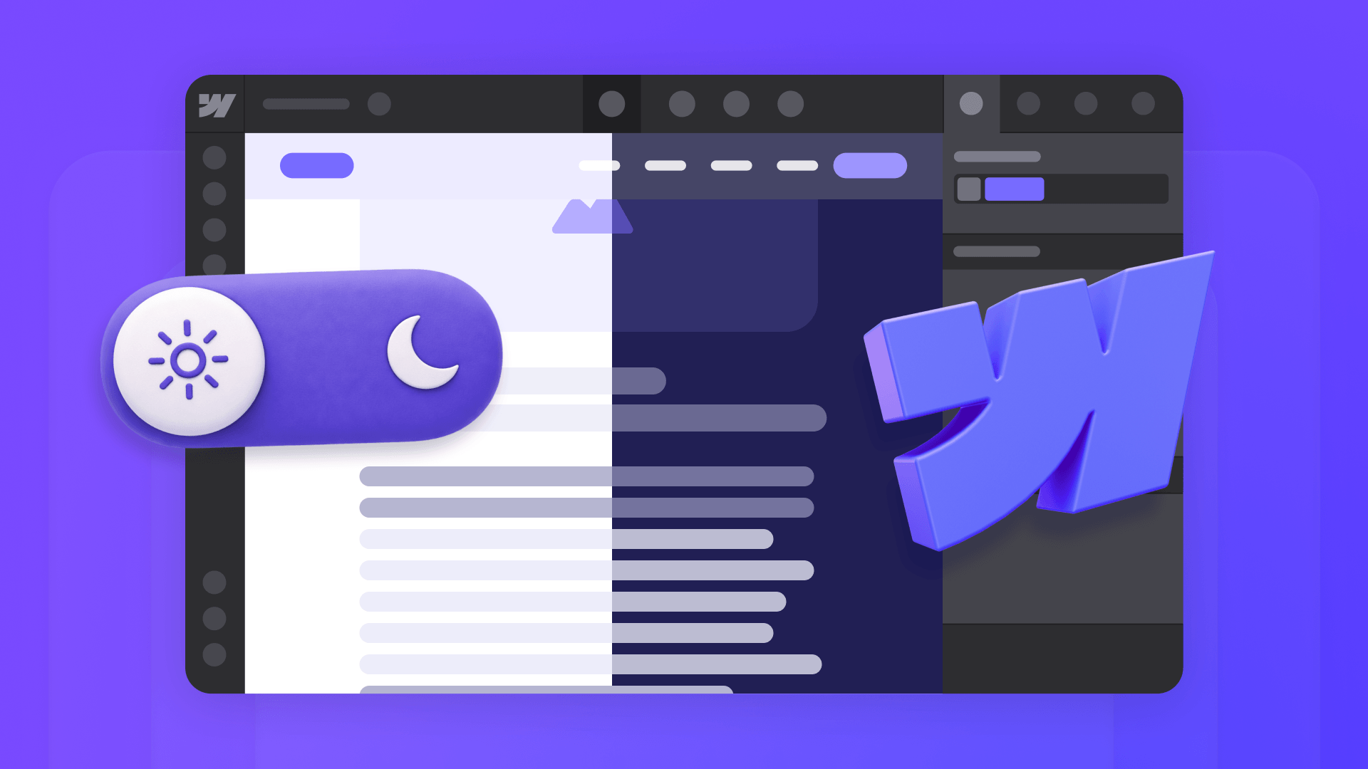
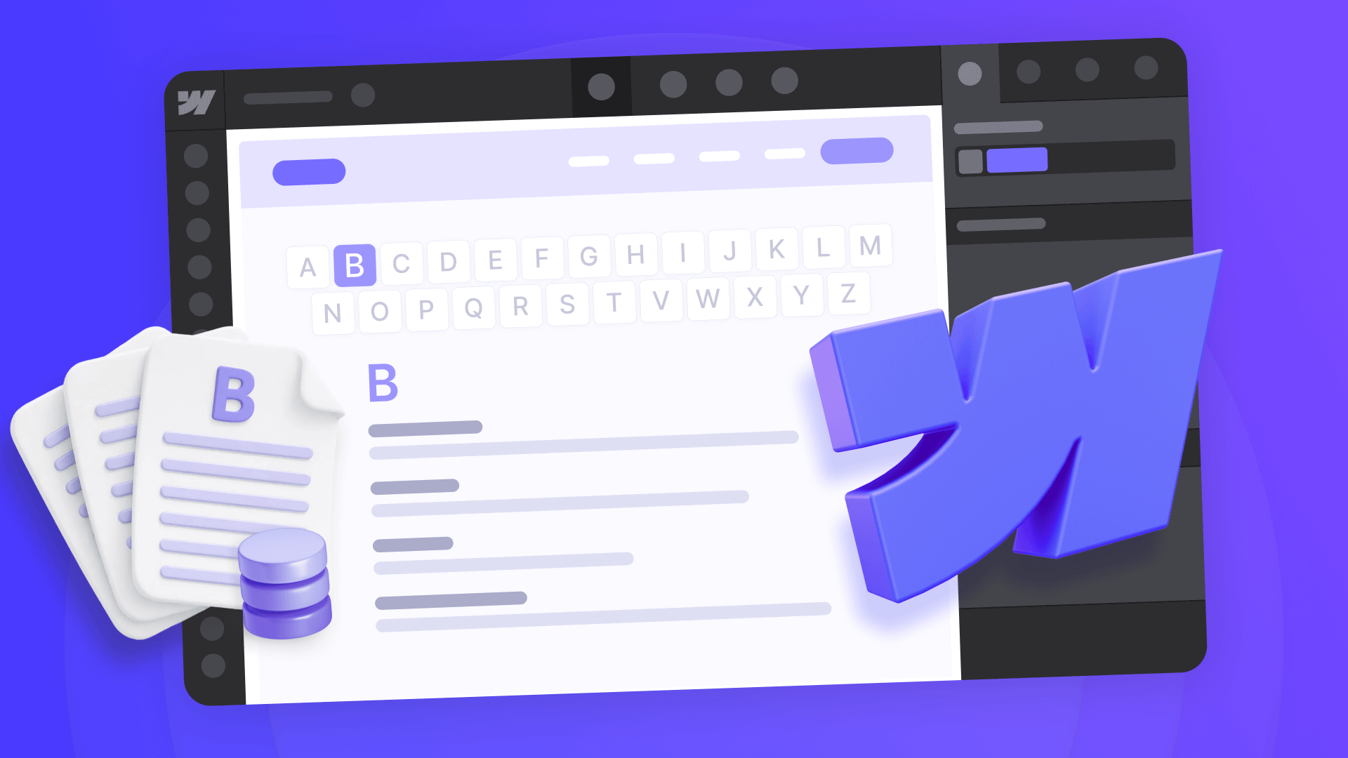
Webflow doesn't include a built-in dark mode toggle, but it does give you the right foundation to build one properly. Since January 2025, Webflow supports variable modes — which means one variable can hold different values for light and dark themes. That changes the approach entirely. Instead of duplicating classes and managing parallel color systems, you set up your colors once as variables, define a second set of values for dark mode, and let one CSS class switch the entire site.
This guide explains how the system works from the ground up, then walks you through the full implementation: variable architecture, mode setup, toggle UI, and the JavaScript that ties it all together. The result is a clean, scalable theme system that follows the user's OS preference by default, remembers their manual choice across pages, and loads without a white flash.
Why Webflow variable modes are the right approach for dark mode
Older Webflow dark mode tutorials rely on duplicating classes — creating section-dark, card-dark, text-on-dark for every component. That works initially, but it becomes maintenance debt fast. Every new section, card, or button needs a light version and a dark version, and keeping them in sync across the site is tedious and error-prone.
Webflow variable modes solve this differently. Instead of duplicating styles, you create one set of variables that your styles reference, then define alternate values for those variables in a Dark mode. When dark mode is active, every element using those variables automatically gets the dark values — no class duplication needed.
The important thing to understand is what variables handle and what they don't. Variables control the design values — which colors, borders, and surfaces to use in each theme. They don't control when to switch themes. Detecting the user's OS preference, saving their manual choice, and applying the right theme before the page paints — that's the job of a small JavaScript layer. The two pieces work together: variables own the design, JavaScript owns the behavior.
How Webflow variables work for theming
Here's the simplest way to understand what variables do for theming. Imagine your site has 30 sections, each with a white background and dark text. Without variables, switching to dark mode means going into every section and changing the background to dark, the text to light, the borders, the card colors — one by one. Change your mind about the exact shade of dark? Do it 30 times again.
With variables, each of those sections points to section/bg/1 instead of a specific color. That variable resolves to light gray in light mode and dark gray in dark mode. You change the value once, and all 30 sections update.
That's the whole idea. The rest is just organization.
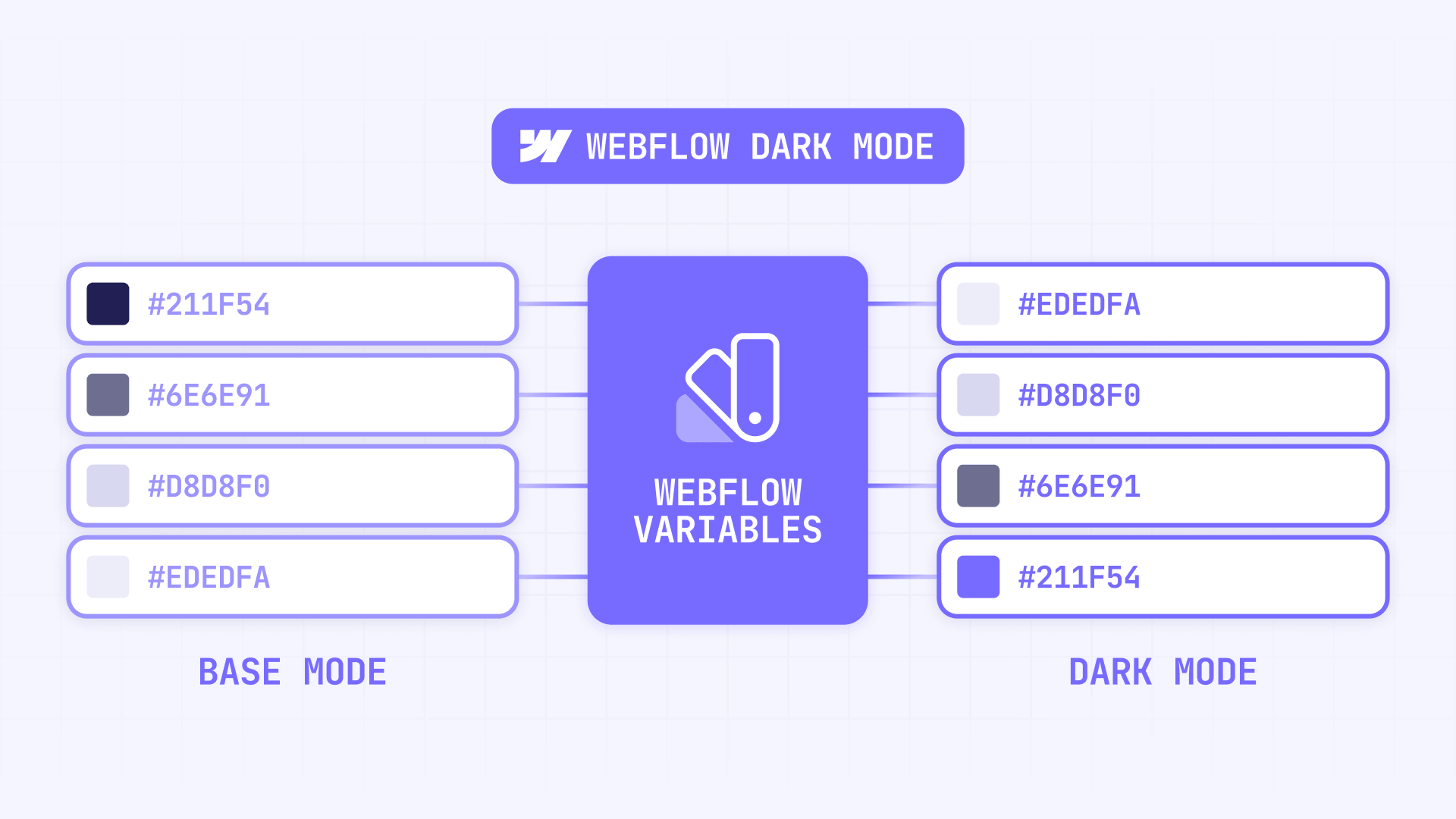
Your color palette is the first layer — the actual colors available to your site. You name them by what they look like: neutral/slate/100 for light gray, neutral/slate/900 for very dark gray, brand/blue/500 for your primary brand color. Numbers represent lightness (lower = lighter, higher = darker), and you can create as many shades as your design needs. These raw colors don't change between themes — they're your building blocks.
Your theme variables are the second layer — they describe what each color is for. Names like page/bg, page/text, card/bg, card/text tell you the role, not the color. Each one points to a different raw color depending on the active theme:
- page/bg → Light: white / Dark: near black
- page/text → Light: dark gray / Dark: white
- section/bg/1 → Light: light gray / Dark: dark gray
- section/text/1 → Light: dark text / Dark: light text
The pattern is straightforward: backgrounds and text flip together. Every surface that changes in dark mode has a matching text color that changes with it. This keeps contrast correct everywhere without touching individual elements.
One technical detail that matters: keep all variables that need to switch together in the same Webflow collection. Aliases across different collections only return the Base mode value — meaning dark mode values silently fail. This is a documented Webflow limitation, and it's hard to debug because the setup looks correct but the dark values never appear.
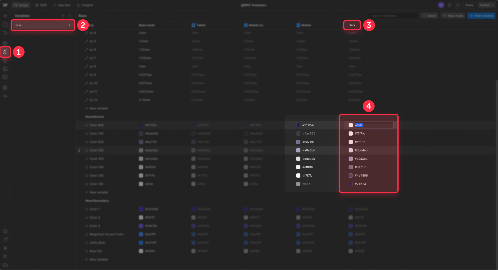
How to set up variable modes for dark mode in Webflow
Once your variable structure is in place, creating the dark mode itself is straightforward.
- Open the Variables panel in Webflow
- Click New mode
- Name the mode Dark
- Set Responsive to No — this is a manual theme mode, not a breakpoint mode
- Click Create
- For each semantic variable, set the dark mode value (typically the inverse of your light value)
- Leave your light theme as the Base mode
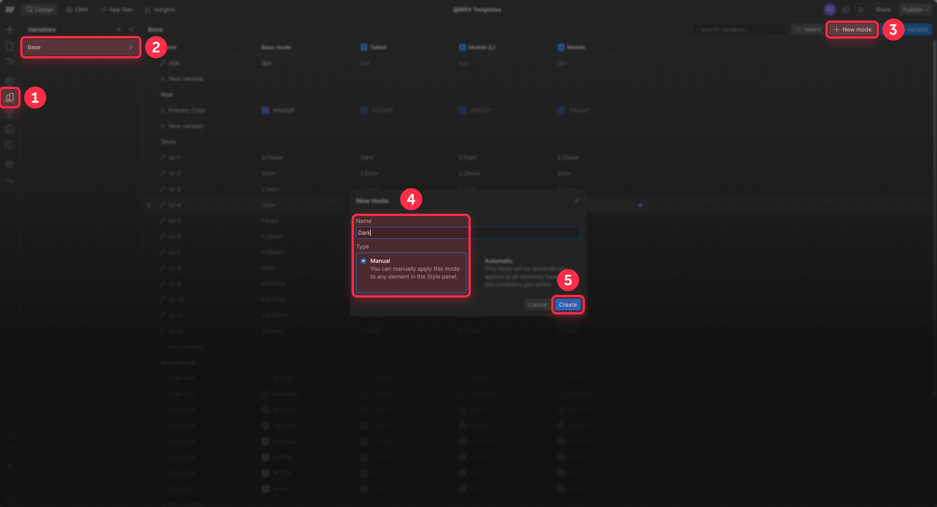
After this step, Webflow knows what every variable should resolve to in both themes. The missing piece is telling Webflow when to use the dark values — which is what the helper class and JavaScript handle.
How to create the helper class that activates dark mode in Webflow
This is the bridge between your variable modes and the runtime toggle. The idea is simple: you create a CSS class that, when present, tells Webflow to use the Dark mode values for all your variables. JavaScript will add or remove this class on the root element to switch themes.
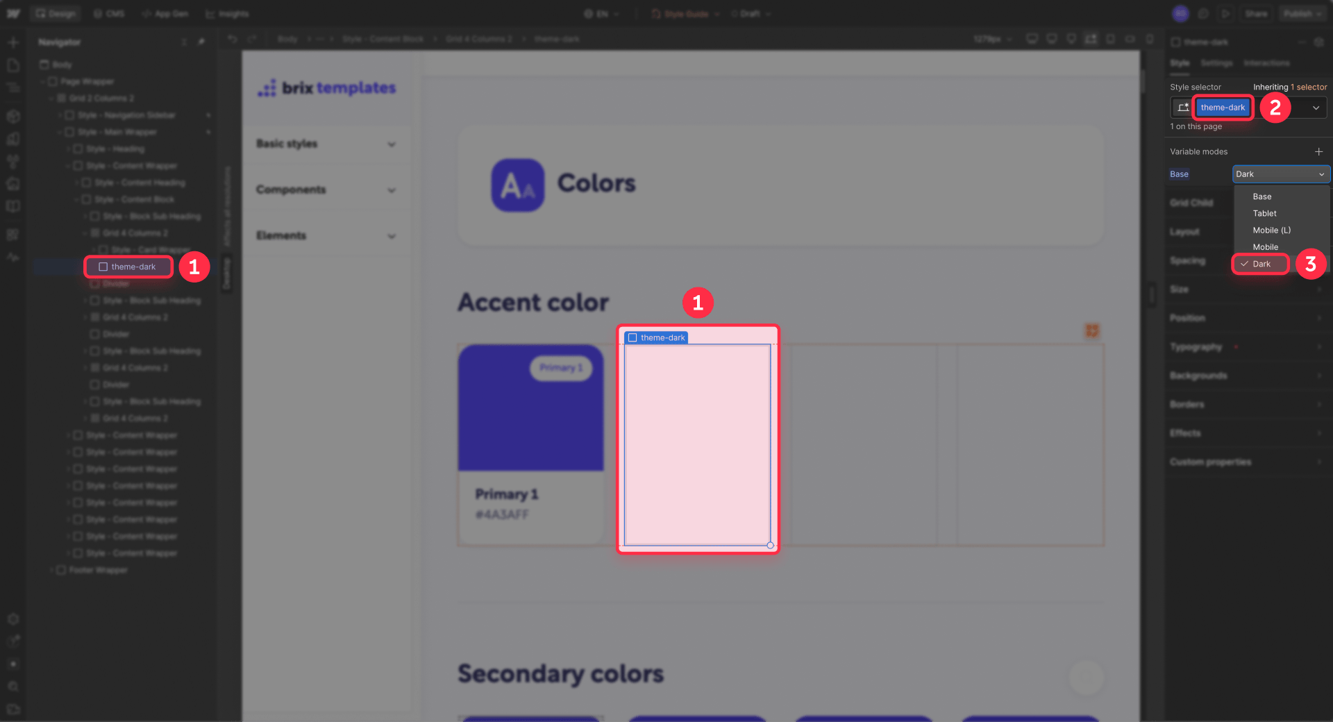
- Add a hidden Div Block on a style guide page or any safe page
- Give it the class theme-dark
- With that class selected, go to Style panel → Variable modes
- Choose your theme collection and apply the Dark mode to the theme-dark class
- Leave the element in the project — if the class gets removed from the project entirely, the mode mapping disappears with it
Now when the theme-dark class is present on any element, every child element using those variables gets the dark values. Since JavaScript will add this class to the html element (the root of the page), the entire site switches at once.
How to build the toggle button in Webflow
The toggle UI should be simple and accessible. Its only job is to fire an event when clicked — it doesn't contain any theme logic itself. If you need to wire up other button interactions beyond the theme toggle, our guide to running functions on button clicks in Webflow explains the general pattern.
Create a Button element in your navbar (or wherever you want the toggle) and add these custom attributes in Element settings:
- data-theme-toggle with value true
- role with value switch
- aria-checked with value false
- aria-label with value Toggle color mode
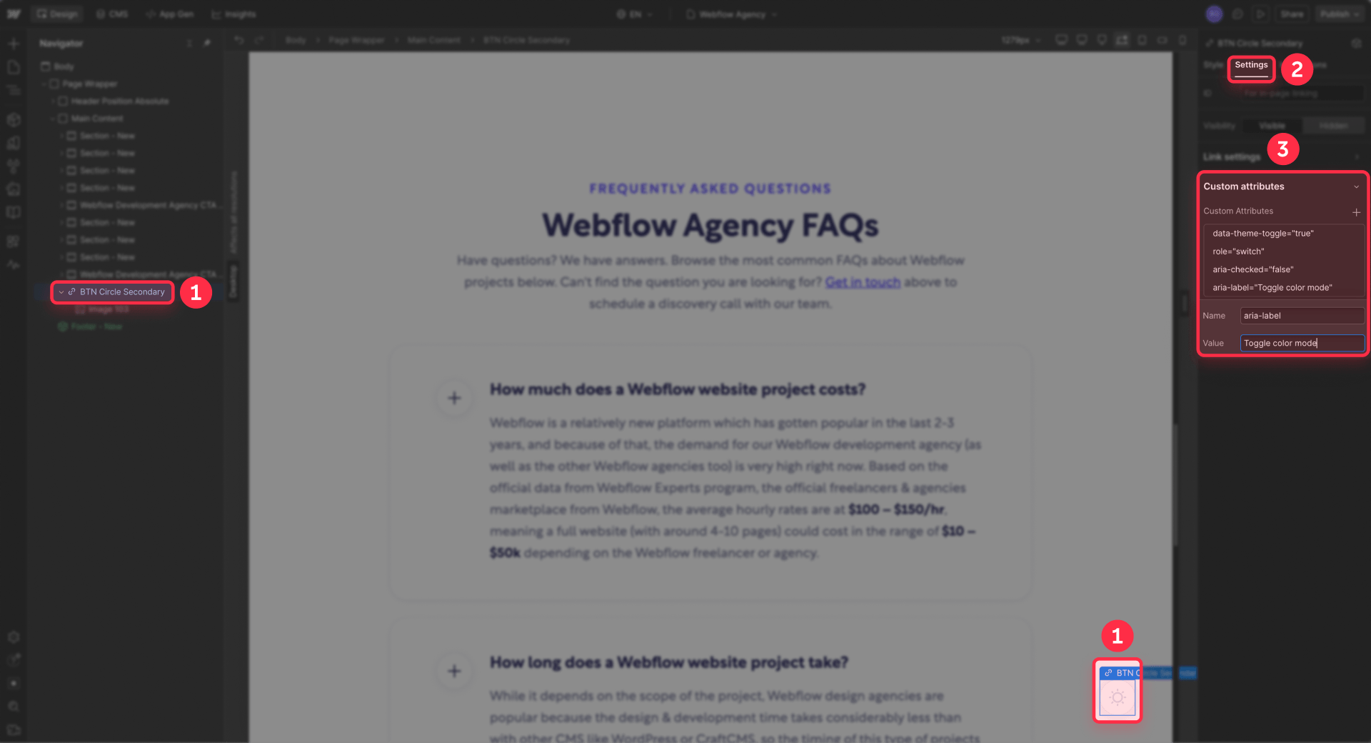
You can put sun and moon icons inside the button for a visual indicator. The switch role with aria-checked is the accessible way to communicate the current state to screen readers — the JavaScript will update aria-checked when the theme changes.
How to add the JavaScript for theme switching in Webflow
The JavaScript does three things: detect the right theme on page load, handle toggle clicks, and save the user's preference. It's split into two scripts for a specific reason.
Why two scripts instead of one
If you put all the theme logic in the footer (where Webflow recommends most scripts), the page renders with the wrong theme first, then jumps to the correct one — causing a white flash. To prevent this, a tiny script runs in the Head code before the page paints, and the interactive logic runs in the Footer code after the page loads.
The head script only answers one question: "Should dark mode be on right now?" It checks for a saved preference in localStorage, falls back to the OS preference via prefers-color-scheme, and adds the theme-dark class if needed — all before the browser renders anything.
The pre-paint script (Head code)
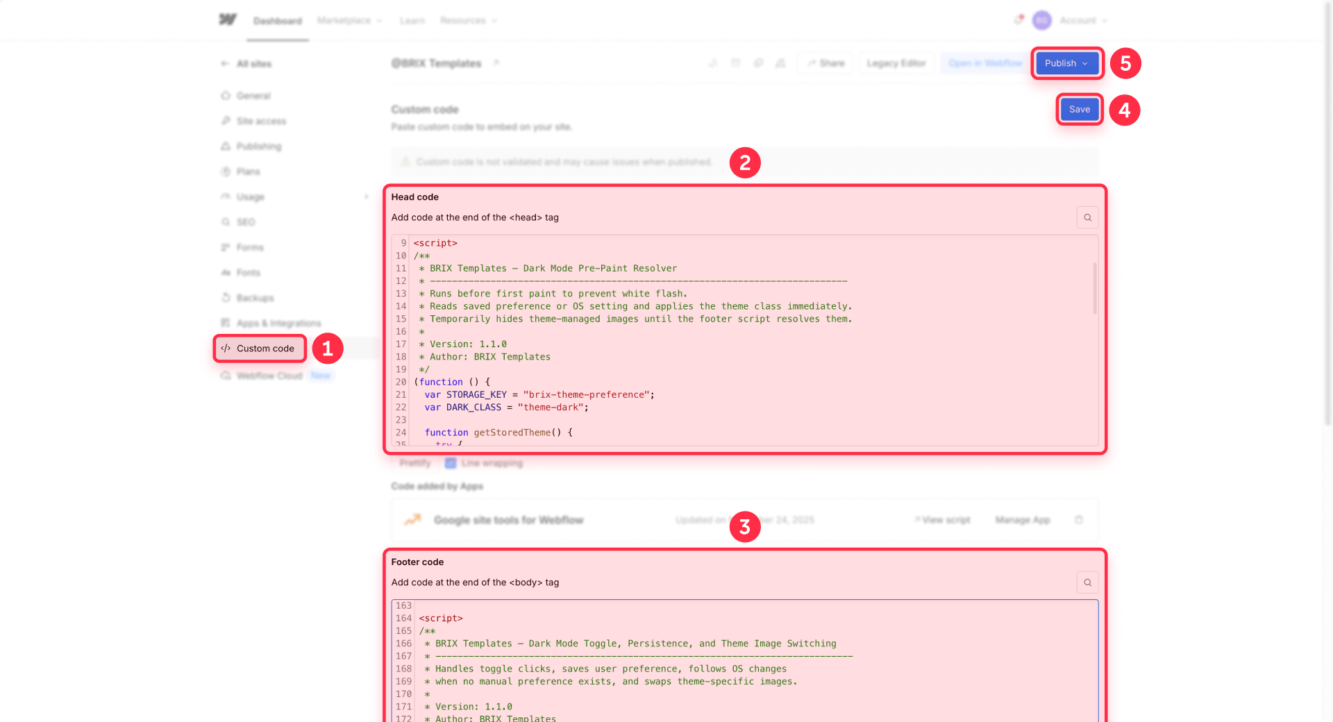
Paste this into Site settings → Custom code → Head code:
This script is intentionally small. It runs synchronously in the head, so keeping it minimal avoids slowing down page rendering. The colorScheme line tells the browser to style native UI elements (form controls, scrollbars) to match the active theme. It also temporarily hides any images with theme-swap attributes until the footer script resolves the correct source.
The toggle, persistence, and image switching script (Footer code)
Paste this into Site settings → Custom code → Footer code:
The logic flow is straightforward:
- When the page loads, the script checks for a saved preference. If none exists, it follows the OS setting.
- When the user clicks the toggle, it flips the theme, applies it immediately, and saves the choice to localStorage.
- When the OS theme changes (the user switches system dark mode on or off), the script follows that change — but only if the user hasn't manually chosen a theme. A manual choice always takes priority.
- On every theme change — whether from page load, toggle click, or OS switch — the script also swaps any images that have data-theme-light-src and data-theme-dark-src attributes to match the active theme.
Both scripts wrap localStorage access in try/catch because some browsers block storage in privacy-restricted contexts. If storage fails, the toggle still works for the current session — the preference just won't persist.
How to switch logos and images between light and dark mode in Webflow
Variables handle colors, but they don't change image files. If your logo, illustration, or decorative graphic needs a different version for dark mode, the script handles that too — you just need to tell it which images to swap and where to find both versions.
For any Image element that needs a dark mode alternative, open Element settings and add two custom attributes:
- data-theme-light-src — paste the URL of the light mode version
- data-theme-dark-src — paste the URL of the dark mode version
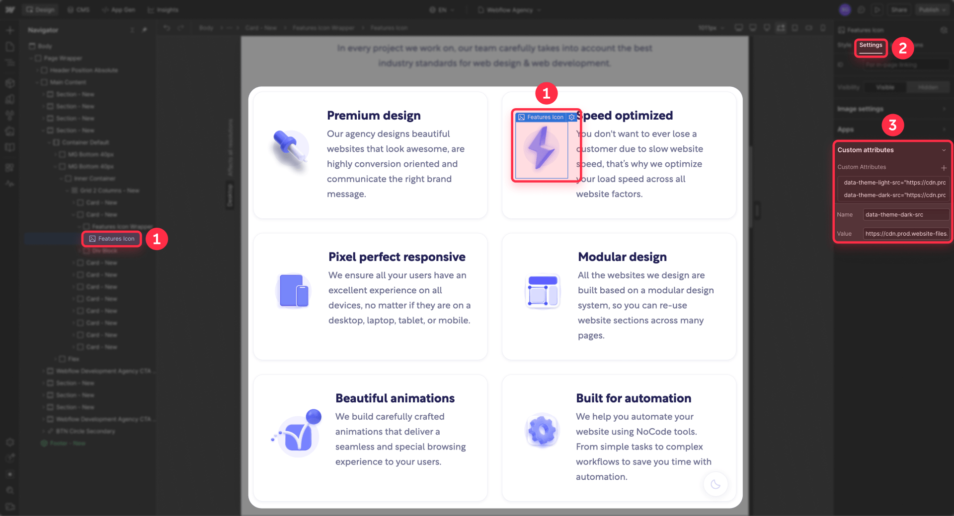
Leave the image's normal src as your default fallback. When the page loads, the script checks the active theme and swaps the src to match. The same swap happens whenever someone clicks the toggle, so images stay in sync with the rest of the site.
The head script temporarily hides theme-managed images until the footer script resolves the correct source — so visitors won't see the wrong logo flash before the swap happens. A built-in fail-safe reveals the images after 2.5 seconds if something unexpected prevents the footer script from running.
This approach works well for brand marks, icons with light fills, and artwork that would disappear or look off on dark backgrounds. For best results, use optimized files and keep this pattern only for images that truly need alternate versions — not every image on the site.
How to wire your Webflow styles to the variable system
With the JavaScript and helper class in place, the last step is making sure your Webflow styles actually use the variables.
Apply default theme variables at the body level
Set your page/bg and page/text variables on Body (All pages). This gives the entire site a default background and text color that switches automatically when the theme changes. Most elements will inherit these values without any additional work.
Override only where needed
Not every element needs its own variable assignment. Sections that should have a different surface color get section/bg/1 and section/text/1. Cards that need a distinct background get card/bg and card/text. But if a section uses the same colors as the page default, don't add variables to it — let it inherit.
The goal is to keep the number of explicit variable assignments small. The fewer overrides you have, the easier the system is to maintain and the less likely you are to miss something when adding new sections later.
Keep class names structural, not theme-specific
Your classes should describe what an element is, not what color it currently has. hero-section is good. dark-hero-section is unnecessary with variable modes — the same class works in both themes because the variables handle the color change.
If you find yourself creating classes like card-dark, text-light, or section-alt-dark, that's a sign you're falling back into the old duplication pattern instead of letting variables do the work. For a broader look at how to organize your Webflow classes effectively, our guide to Webflow class systems covers the most popular naming methodologies.
Common mistakes to avoid with Webflow dark mode
These are the issues that come up most often in practice:
- Splitting variables across collections: If your semantic tokens and raw tokens live in different collections and reference each other with aliases, dark mode values won't resolve correctly. Webflow aliases across collections only return Base mode values. Keep all mode-aware variables in the same collection.
- Putting all JavaScript in the footer: For most scripts, footer placement is correct. For the theme resolver, it causes a white flash because the page renders before the script runs. The tiny resolver belongs in Head code.
- Hard-coding hover colors in interactions: Hover states set with fixed color values in Webflow interactions won't switch with the theme. Route hover colors through variables or class-based states instead, and test hover behavior on the published site in both themes.
- Relying on inheritance for all text colors: Webflow documents that some child elements may not inherit variable values correctly from a mode applied higher up. If specific text stays in the wrong color after toggling, link that element's text color directly to the appropriate semantic variable.
- Letting the helper class disappear: If theme-dark only exists in your JavaScript and has no element using it in the Webflow project, Webflow may remove it during cleanup. Keep at least one hidden element with the class in your project to preserve the mode mapping.
- Forgetting that theme-swapped images may have responsive markup: Webflow often generates srcset and sizes attributes for uploaded images. If a dark mode script only changes src, the browser may still use the old responsive candidates and show the wrong image. The BRIX script handles this automatically by clearing those attributes on theme-managed images, but if you build your own solution, keep this in mind.
Frequently asked questions about Webflow dark mode toggles
Does Webflow have a built-in dark mode toggle?
No. Webflow does not include a native dark mode toggle for published sites. What Webflow does provide is variable modes — a system where one variable can hold different values for light and dark themes. You define the design values inside Webflow, but the actual toggle behavior (detecting the user's OS preference, saving their choice, and switching themes at runtime) requires a small JavaScript layer added through Webflow's custom code settings.
How do Webflow variable modes work for dark mode?
Webflow variable modes let one variable hold a Base value (for light mode) and a Dark value. You create semantic variables like page/bg and page/text, assign different colors for each mode, then map a CSS class like theme-dark to the Dark mode in the Style panel. When that class is added to the page's root element, every element using those variables automatically switches to the dark values — no class duplication needed across your site.
How do I prevent the white flash when loading Webflow dark mode?
The white flash happens because the browser paints the page before the theme script runs. The fix is to place a tiny JavaScript snippet in Site settings → Custom code → Head code that checks the user's saved preference or OS setting and applies the dark mode class before the first paint. The rest of the interactive logic (toggle clicks, preference saving) goes in the Footer code. This split keeps the page fast while preventing the wrong theme from flashing.
How does a Webflow dark mode toggle save the user's preference?
The toggle script saves the user's choice to localStorage when they click it. On every subsequent page load, a head script reads that stored value before rendering and applies the correct theme immediately. This means the user's preference persists across pages and browser sessions.
If localStorage is blocked in certain privacy-restricted browsers, the toggle still works for the current session — the preference just won't carry over to the next visit.
Does Webflow dark mode follow the operating system theme automatically?
Yes, when set up correctly. The JavaScript uses prefers-color-scheme to detect the user's OS preference. If no manual choice has been saved, the site follows the system setting — dark OS means dark site, light OS means light site. The script also listens for real-time OS changes, so switching system dark mode on or off updates the site automatically. Once the user clicks the toggle manually, their choice takes priority over the OS setting.
Can I switch logos and images between Webflow light and dark mode?
Yes. Variables handle colors, but they don't change image files. For images that need a dark mode version — like logos, icons, or illustrations — you add two custom attributes in Element settings: data-theme-light-src (with the light version URL) and data-theme-dark-src (with the dark version URL). The theme script automatically swaps the image source whenever the theme changes, including on page load, toggle click, and OS preference changes.
Why should I use Webflow variables for dark mode instead of duplicating classes?
Duplicating classes — creating section-dark, card-dark, text-on-dark for every component — becomes maintenance debt fast. Every new section needs both a light and dark version, and keeping them in sync across the site is error-prone.
Webflow variable modes solve this by letting one variable resolve to different values depending on the active theme. Your classes stay structural (like hero-section or pricing-card), and the variables handle the color switching. You maintain one set of styles instead of two.
Does Webflow dark mode with variable modes work on CMS Collection pages?
Yes. The variable modes and helper class work on CMS Collection pages the same way they work on static pages. The JavaScript applies the theme-dark class to the root html element, which means every page on the site — static or CMS — gets the correct theme automatically. No per-page configuration or CMS-specific setup is needed.
Conclusion
A proper Webflow dark mode setup is a clean separation of two responsibilities: variables and modes handle the theme values, and a small JavaScript layer handles when to apply them. That gives you a system that's simple to build, easy to maintain, and scales naturally as you add new sections and components.
The full setup is: semantic variables with paired surface and text tokens, one manual Dark mode, one helper class mapped to that mode, and two small scripts — one in the head to prevent flash, one in the footer for interactivity and persistence. Everything else is just styling your site normally and letting the variables do the switching.
If you want this implemented properly on your site — or you need a more advanced setup with multiple themes, shared libraries, or multi-site systems — our Webflow team can build it so the theme system works correctly from day one.


Join readers commenting on this post!