

A static comparison table built directly on the Webflow canvas works until a client wants to update a price, change a feature value, add a new plan, or move which column is recommended. Every column is drawn by hand, so each update means opening the Designer and editing the layout manually.
The better pattern is a CMS-powered comparison table: one Plans Collection, one Collection List that generates the table, and CMS fields bound to every visible value. Each item in the Plans Collection becomes one comparison column. The moment a client changes a CMS field — a price, plan name, feature value, CTA, or recommended status — the table updates on the next publish, with no design work.
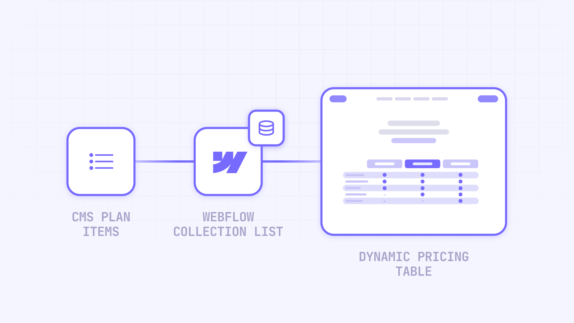
In this guide you'll build a dynamic comparison table in Webflow where the Collection List repeats a single column template for every plan or product in the CMS.
Webflow tables vs Collection Lists: which one should you use?
Not every comparison needs the CMS. Picking the right structure up front saves rework later.
- Static HTML table — best for fixed content that rarely changes. If your rows and columns are stable and you update them by hand, a static table is simple and reliable.
- Collection List — better when the columns need to come from CMS items. A single Collection List repeats one column structure for every plan or product in the CMS, so adding or editing a plan is a content change, not a design change.
- For a dynamic comparison table, use a Collection List. Each CMS item becomes one table column, and every value inside that column comes from a CMS field.
- If both rows and columns need to be fully dynamic, a single Collection List is not enough on its own. That case requires a more advanced CMS structure (reference fields, a separate Features Collection) or custom code. The setup in this guide covers the common case: dynamic columns with a stable set of feature rows.
What you are going to build in Webflow
By the end of this guide you will have:
- a Webflow CMS Plans Collection where each item is one comparison column
- one Collection List that generates the full table
- a single repeated column template inside the Collection Item
- plan names, prices, descriptions, feature values, and CTA links bound to CMS fields
- Switch fields powering checkmark and dash cells
- a highlighted recommended column driven by a CMS field
- a Sort Order field controlling column order
- a responsive layout that shows columns side by side on desktop and stacks comparison columns on mobile
Let's build it step by step.
Step 1: Create the Plans Collection in Webflow
In the CMS tab, create a new Collection and name it Plans. Each item in this Collection is one plan or product tier — and each item will become one comparison column in the table.
Example items:
- Basic
- Pro
- Business
- Enterprise
Add these fields. Each field becomes a cell or value inside the comparison table:
- Plan Name — Plain Text (the column header)
- Price Label — Plain Text
- Billing Cycle — Plain Text or Option
- Description — Plain Text
- CTA Text — Plain Text
- CTA URL — Link
- Recommended — Switch
- Sort Order — Number
- Storage — Plain Text or Number
- Users — Plain Text or Number
- Custom Domain — Switch
- Priority Support — Switch
One CMS item becomes one comparison column later. Do not build one static column per plan by hand — let the CMS generate them.

Step 2: Build one reusable comparison column inside the Collection Item
Drag a Collection List onto your comparison page and connect it to the Plans Collection. Inside the Collection Item, build one table column template. Webflow will repeat this column for every CMS item.
This is the single biggest difference between a maintainable comparison table and a manual one: you design one column, and the Collection List generates every comparison column from the CMS.
Use this structure inside the Collection Item:
Collection List Wrapper
  Collection List
    Collection Item
      Comparison Column
        Column Header
        Price Row
        Description Row
        Feature Rows
        CTA Row
Use the exact same internal row order in every repeated column so the rows stay visually aligned across the table. When the Storage row appears in the same vertical position in every column, readers can compare values horizontally without effort.
Do not build a separate column for each plan by hand. Build one column template inside the Collection Item and let Webflow repeat it for every plan in the CMS.
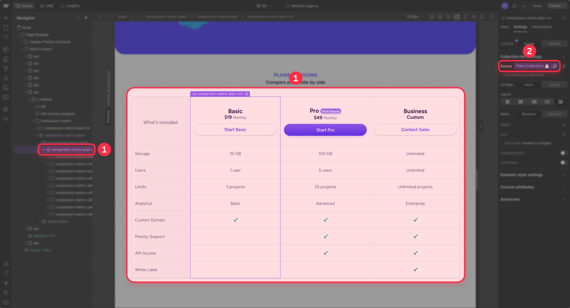
Step 3: Bind table cells to CMS fields
Every visible value in the table should come from a CMS field. Connect each row or cell to its field:
- Column header → Plan Name
- Price row → Price Label
- Billing row → Billing Cycle
- Description row → Description
- Storage row → Storage
- Users row → Users
- CTA text → CTA Text
- CTA link → CTA URL
This is the moment the table becomes dynamic. Change a value in the CMS and every matching cell updates on publish. Connect each table cell or row value to its field — never type a price or feature directly onto the canvas.
Step 4: Use Switch fields for checkmark and dash cells
For yes/no features, use Switch fields combined with Conditional Visibility to create checkmark and dash cells:
- Add one Switch field per yes/no feature (for example, Custom Domain and Priority Support).
- Show a checkmark cell when the Switch is on.
- Show a dash cell when the Switch is off.
- Bind both the checkmark and the dash to the same Switch field so the CMS item controls which one appears.
- Do not hardcode a checkmark or a dash — bind each cell's visibility to its Switch field.
Keep row alignment in mind. Hiding a row in only one column can break the alignment of the rest of the table, because that column loses a row that the others still show. For most comparison tables it is better to show a dash in that cell than to hide the row entirely. To fully remove a row that no plan uses, see how to hide empty CMS sections in Webflow — but apply it to the whole table, not a single column.
Step 5: Highlight a recommended column
To draw attention to one plan, add a Recommended Switch field to the Plans Collection. Inside the column template, add a "Most Popular" badge and set it to show only when Recommended is on. You can use the same field to trigger a highlighted border, background, or style on that column.
Because the highlight is field-driven, moving the recommended column to another plan is a CMS change — no editing in the Designer. The client simply turns Recommended on for a different item.
Step 6: Sort columns and make the table responsive
Open the Collection List settings and sort by Sort Order, ascending. Lower numbers appear first. Reordering columns is now a data change — the client updates the Sort Order value in the CMS instead of moving columns manually in the Designer.
For the layout:
- Desktop: display the comparison columns side by side using a Grid or Flex layout so readers can scan across rows.
- Mobile: either stack comparison columns vertically, or use horizontal scroll when the side-by-side comparison is essential.
Use stacked comparison columns for most pricing and plan tables — they are easier to read on a narrow screen than squeezed columns. Reserve horizontal scroll for dense, spec-heavy tables where comparing values side by side matters more than vertical flow.
When you need a fully dynamic row-and-column table
The native setup above makes the columns fully dynamic — each CMS item is a new comparison column. The feature rows, however, are built into the column template and are usually fixed in the design. That is the right tradeoff for most pricing and plan comparison pages: plans change often, but the feature list stays stable.
If the feature list also needs to be editable from the CMS, a single Collection List is not enough. That more advanced case typically needs:
- a separate Features Collection for the rows
- Reference or Multi-reference fields to connect features to plans
- custom code to render the matrix
- a tool like Finsweet Table or another advanced solution
- real HTML
<table>semantics if accessibility or technical data tables matter
Be honest with yourself about the requirement. For most pricing and plan comparison pages, one CMS item per column is enough — start there, and only move to a dynamic row-and-column structure if the feature list truly has to come from the CMS.
If a large catalog pushes you against Webflow's CMS item limits, see how to overcome the Webflow CMS item limit when your catalog grows.
Troubleshooting common Webflow CMS comparison table issues
- Every column shows the same plan information. You placed static text inside the Collection Item instead of binding it to CMS fields. Replace each value with its field.
- Columns stack vertically instead of side by side. The Collection List layout is not set to columns. Use a Grid or Flex layout for desktop.
- Rows do not align across columns. The internal row order differs between columns. Use one shared column template inside the Collection Item so every repeated column has the same rows in the same order.
- Checkmark and dash cells do not update. The icons are hardcoded. Bind each cell's visibility to its Switch field with Conditional Visibility.
- A new plan does not appear as a column. The new item is likely set to draft. Set it to published and republish the page.
- The recommended column does not highlight. The badge or style is not bound to the Recommended field. Set its visibility to show only when Recommended is on.
- The CTA row does not link correctly. The button is not connected to the CTA URL field. Bind the link to CTA URL.
- The mobile table is hard to read. The desktop layout is forcing narrow columns. Stack comparison columns vertically on mobile, or enable horizontal scroll for dense spec tables.
- Changing Sort Order does not change the column order. The Collection List is not sorted by Sort Order. Set the sort to Sort Order, ascending.
Frequently asked questions about Webflow CMS comparison tables
These questions cover the most common searches around Webflow CMS comparison tables. They are also a good candidate for rich results — see how to add schema rich snippets to your Webflow CMS articles.
How do I build a dynamic comparison table in Webflow CMS?
Create a Plans Collection where each item is one plan, then display it through a Collection List laid out as columns. Inside the Collection Item, build one column template — column header, price row, description row, feature rows, and a CTA row — and bind every value to its CMS field. Use Switch fields with Conditional Visibility for checkmark and dash cells, and a Sort Order field to control column order. Each CMS item becomes one comparison column, so the table updates whenever the client edits the CMS. Tip: build one column template, not one per plan, so every repeated column stays aligned. Start with this pattern and only add complexity if your use case demands it.
Can Webflow CMS create a dynamic pricing comparison table?
Yes — a pricing comparison is one of the strongest native use cases. Create a Plans Collection, add fields for plan name, price label, billing cycle, CTA, and a Recommended Switch, then render those items in a Collection List laid out as comparison columns. Use Switch fields and Conditional Visibility for checkmark and dash cells. Change a price in the CMS and every column updates without touching the Designer. Tip: keep one column template inside the Collection Item so all columns stay aligned as you add plans. For most pricing pages, this native setup is all you need.
How do I make each CMS item appear as a table column?
Connect a Collection List to your Plans Collection, then build one column template inside the Collection Item. Webflow repeats that column template once for every item in the Collection, so each plan or product becomes its own comparison column. Bind the column header, price row, feature rows, and CTA row to CMS fields so every cell comes from the item's data. Tip: never build a separate static column per plan — the Collection List is what turns CMS items into table columns.
How do I align rows across Webflow CMS comparison columns?
Use one shared column template inside the Collection Item and give every repeated column the exact same internal row order. When the Storage row sits in the same vertical position in every column, readers can compare values across the table without confusion. Do not hide a row in only one column — that breaks alignment because the column loses a row the others still show. For a missing value, show a dash cell instead of removing the row. Tip: build the row structure once inside the Collection Item and reuse it for every column.
How do I show checkmarks and dashes from CMS Switch fields?
Add one Switch field per yes/no feature, then create two cells inside the column template: a checkmark set to show when the Switch is on, and a dash set to show when it is off. Bind both to the same field so the CMS item controls which cell appears. Tip: never hardcode a checkmark or a dash — bind it to the field so flipping the Switch is all it takes to update the cell. This keeps every checkmark and dash tied to real plan data instead of manual editing.
Can I add a new plan without editing the Webflow Designer?
Yes — that is the main benefit of a CMS comparison table. Once your Collection List and one column template are built, adding a plan means creating a new item in the Plans Collection: fill in the name, price, feature values, CTA, and the Recommended and Sort Order fields, then publish. Webflow generates the new comparison column automatically using the existing column template. Tip: make sure the new item is set to published, not draft, or it will not appear on the live page. No Designer access is needed.
Can both rows and columns be fully dynamic in Webflow?
Not with the simple native setup. A single Collection List repeats one column per CMS item well, but making both the feature rows and the plan columns fully dynamic usually requires a separate Features Collection, Reference or Multi-reference fields, custom code, or a tool like Finsweet Table. If only your plans change and your feature list is stable — the common pricing case — the native setup is enough. Tip: most pricing and plan comparison tables never need full row-and-column dynamism. Start with one CMS item per column and only go further if a true product comparison matrix is required.
Do I need custom code for a Webflow CMS comparison table?
Only if the comparison is advanced. Simple pricing and plan comparisons work natively with a Plans Collection and a Collection List. Selectable product comparisons, large spec matrices, and fully dynamic row-and-column tables usually need custom code or a tool like Finsweet Table. If readers only compare your own plan tiers, stay native. Tip: the vast majority of comparison pages are well served by the native CMS setup — reach for custom code only when the native pattern genuinely cannot do the job.
Conclusion
A dynamic CMS comparison table in Webflow comes down to one pattern: a Plans Collection where each item is one comparison column, one column template inside a Collection List, every visible value bound to a CMS field, Switch fields for checkmark and dash cells, and a Sort Order field so reordering is a data change.
Two things people miss most often:
- building multiple static columns instead of one repeated column template
- hardcoding prices, feature values, or CTA links instead of binding them to CMS fields
Get the column template right once and your team can update plans, prices, and features from the CMS without rebuilding the layout. If you'd rather have it built right the first time, our experienced Webflow team at BRIX Templates can design and build a CMS-driven comparison table tailored to your plans, features, and brand.










Join readers commenting on this post!