
If you've ever wondered, "What size should my images be in Webflow?"—you're not alone. Clients, designers, and content editors ask this question all the time. And while there's no one-size-fits-all answer, there are some best practices that will keep your website looking great and running smoothly.
The short answer is that you generally want to upload images at 2x the size they're displayed at on your Webflow site—especially for devices with ‘retina’ or other high-density screens. But there's more to it than just picking "2x". Let's explore why it matters, how to set guidelines in the Webflow CMS, and more.
Why image sizing matters in Webflow
Webflow's design-to-live-site approach gives you direct control over your visual elements. When it comes to image sizing, this means you have more control—and also more responsibility—for ensuring your images display perfectly across all devices.
- Performance: Large, unoptimized images can slow down your site (a lot). In a platform like Webflow, performance is a big deal: users expect pages to load quickly, and search engines reward sites with faster load times.
- Visual clarity (especially on Retina screens): High-DPI screens (often referred to as "retina") have more pixels per inch, so images need higher resolutions to look crisp. By using images that are 2x the display size, you ensure they'll appear sharp across a wide range of devices.
- Design consistency: By establishing a system for image dimensions, you'll maintain a consistent look and feel across your entire site—even as new content is added over time.
The 2x rule: how it works in Webflow
When we say "2x," we're referring to the width and height at which an image is displayed on your site. For instance, if an image container in Webflow displays at 500px wide, you should ideally upload an image that's around 1000px wide. This extra resolution helps to:
- Ensure crispness on Retina and high-density screens
- Avoid blurriness when images are scaled up by devices or browsers
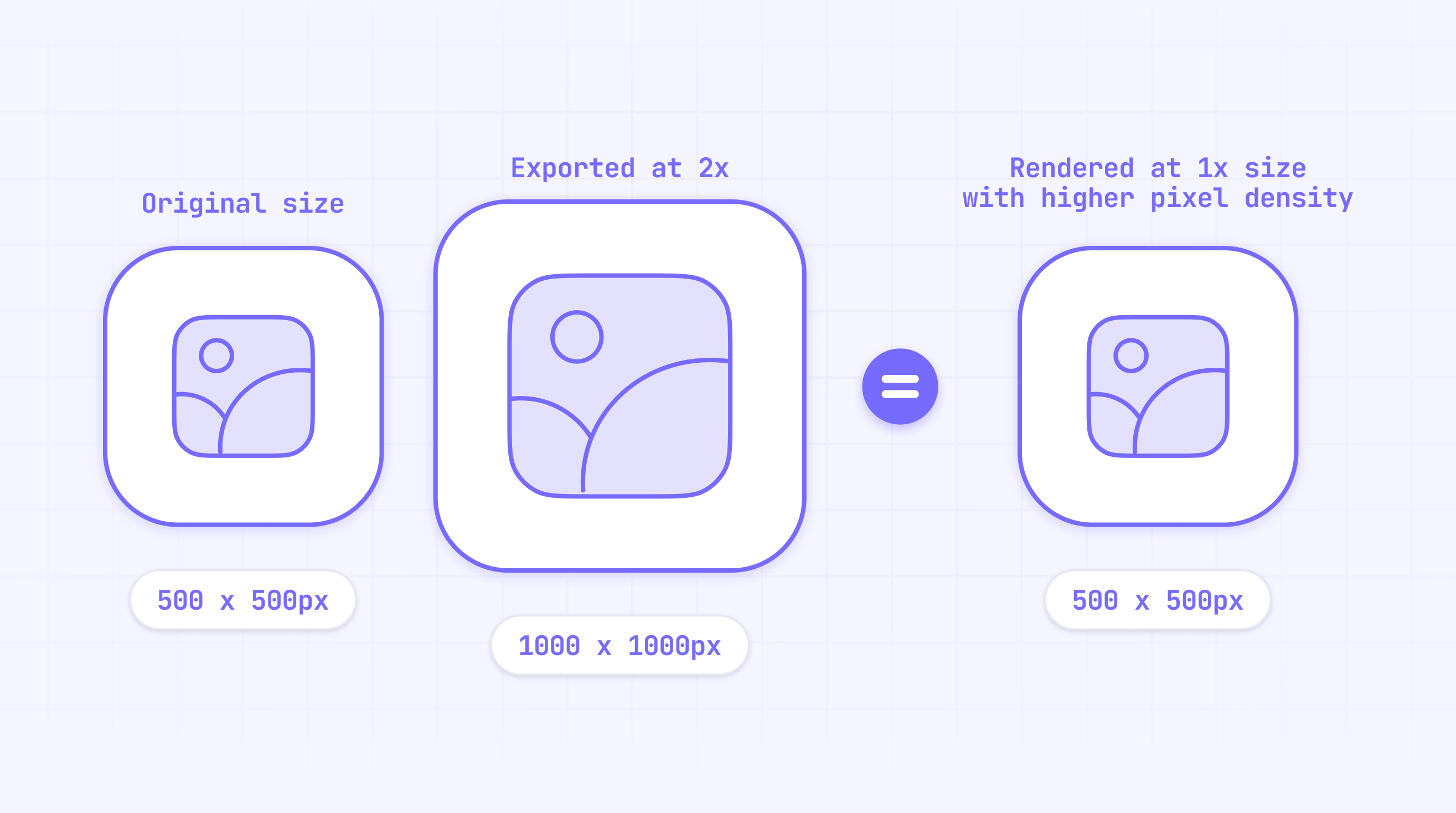
Going much larger than necessary (e.g., 4000px wide for a 500px display area) can be counterproductive—leading to slower load times and excessive file sizes. It's important to understand that uploading enormous images won't make them look any sharper, but will make them MUCH heavier in terms of file size. Balance is key.
Advantages of Webflow's responsive images feature
Webflow automatically generates different image variants (in multiple sizes) to serve the best version for the user's device and screen resolution. This means if you upload a larger image, Webflow can create smaller variants for mobile screens or slower connections.
This approach offers several benefits:
- Better performance: Visitors on small devices aren't forced to download huge files
- Automatic scaling: Webflow serves up the right size based on screen size and device pixel density
- No maintenance overhead: You don't need to manually create multiple image versions
Still, starting with a well-sized image (generally 2x the display size) is a crucial first step to ensure each generated variant is crisp and optimized.
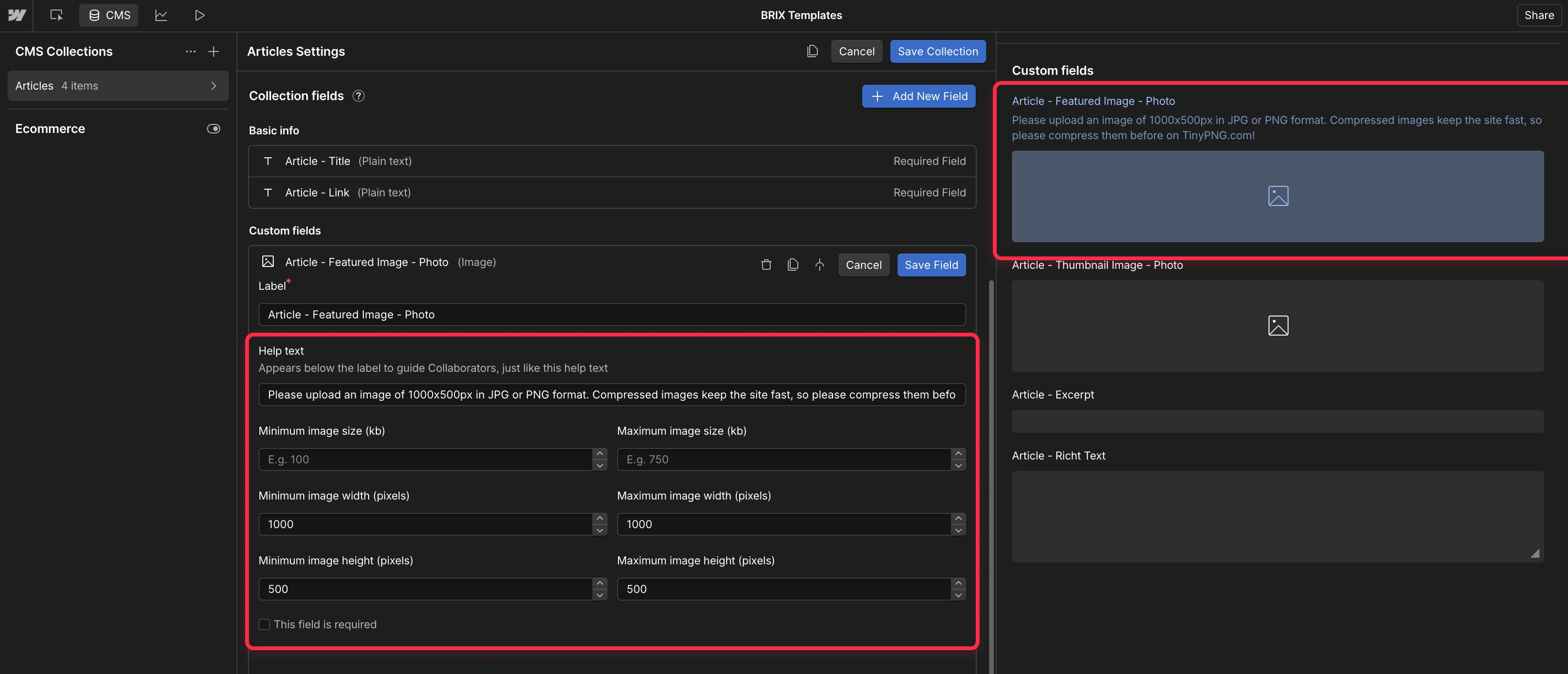
Setting up CMS help text for image consistency
If you're using Webflow's CMS, it's a good idea to add a short help text under each Image field. This could be something like:
"Please upload an image of 1000x500px in JPG or PNG format. Compressed images keep the site fast, so please compress them before on TinyPNG.com!"
By doing this, you:
- Provide immediate guidance to anyone adding content
- Keep image assets consistent across the entire website
- Reduce the risk of oversized, unoptimized images creeping into your project
This approach is especially valuable for clients or team members who might not be familiar with web image optimization best practices
Conclusion
Choosing the right image size in Webflow is all about striking a balance: you want crisp, high-quality visuals for Retina screens while keeping file sizes manageable for performance. A good rule of thumb is 2x the displayed size, combined with compression to keep things snappy.
By adding help text in the Webflow CMS and establishing clear guidelines, you'll ensure that everyone who uploads images—today or a year from now—knows how to keep your site looking sharp and loading fast.
Our Webflow agency can help you optimize not just your images, but your entire Webflow website speed. We'll implement performance best practices, set up proper image guidelines, and ensure your site delivers the best possible user experience. Contact our team today to learn how we can help keep your Webflow site fast and visually stunning.
Frequently asked questions about Webflow image sizes
How do I balance image quality and file size in Webflow?
Use compression tools or services (like TinyPNG.com) to reduce file size without noticeable quality loss. This ensures visitors on all connection speeds can enjoy your site without long load times. For photographs, a good compression level typically reduces file sizes by 60-80% with minimal-to-none visual impact.
What file format should I use for Webflow images?
- JPEG: Great for photographs; can achieve smaller file sizes
- PNG: Better for graphics, icons, or images needing transparency
- SVG: Perfect for logos, icons, and simple illustrations; scales infinitely without quality loss or size concerns
- WebP: Modern format offering compression benefits of JPEG with support for transparency (like PNG); just be mindful of browser support
Can I rely solely on Webflow's automatic responsive images?
Webflow's responsive image feature is extremely helpful, but it can't fix an initially poor-quality or massively oversized image. Start with a well-prepared base image (around 2x the display size, optimized for web), and then let Webflow handle the rest.
What's the difference between image resolution and file size in Webflow?
Resolution refers to the dimensions of your image (width x height in pixels), while file size is measured in kilobytes (KB) or megabytes (MB). For web performance, both matter. You need adequate resolution for sharpness, but you also need to compress the file to reduce its size. A properly optimized image achieves the right balance between these two factors.
Should I resize images before uploading to Webflow?
Yes, it's best practice to resize images to their intended display dimensions (multiplied by 2 for retina support) before uploading. This prevents Webflow from having to serve unnecessarily large files, improving your site's performance. Always compress images after resizing and before uploading.
How do Webflow images affect SEO?
Image optimization directly impacts page speed, which is a ranking factor for search engines. Additionally, properly sized images with descriptive filenames and alt text contribute to better image SEO. Webflow makes it easy to add alt text to images, which helps search engines understand the content of your images.


Join readers commenting on this post!