
Mobile users abandon cluttered websites. When desktop layouts include messy secondary navigation, decorative graphics, or lengthy content that crowds mobile interfaces, you need precise visibility control.
Webflow's responsive design tools let you selectively hide elements on mobile while keeping them visible on larger screens.
Why hiding elements on mobile matters for Webflow sites
- Navigation optimization: Hide complex mega-menus that don't work on touch interfaces
- Content prioritization: Remove decorative elements that distract from primary mobile goals
- Layout performance: Hide large images or animations that slow mobile loading
- Touch interface adaptation: Remove hover-dependent elements that don't work with touch
- Conversion optimization: Streamline mobile flows by hiding non-essential elements
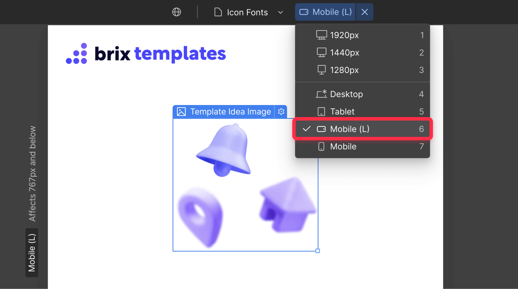
How to hide elements on mobile breakpoints in Webflow
The process involves switching to mobile view in Webflow Designer and adjusting the display properties of specific element.
- Open your Webflow project in the Designer.
- Click the Mobile landscape icon at the top center (or choose Mobile portrait if preferred).
Now, before actually selecting which element to hide, let’s understand how this works:
Webflow's cascade-down approach: Styles flow from larger to smaller breakpoints. If you set a button blue on Desktop, it stays blue on Mobile. Change it to red on Mobile, and it becomes red only on Mobile while staying blue on Desktop. When you hide an element on mobile, it only affects mobile devices.
How to hide elements only on mobile in Webflow
- Select your target element by clicking it in the canvas
- Open the Styles panel (brush icon) in the right sidebar
- Find the Layout section and locate the Display property
- Change Display from "Block" or "Flex" to "None"
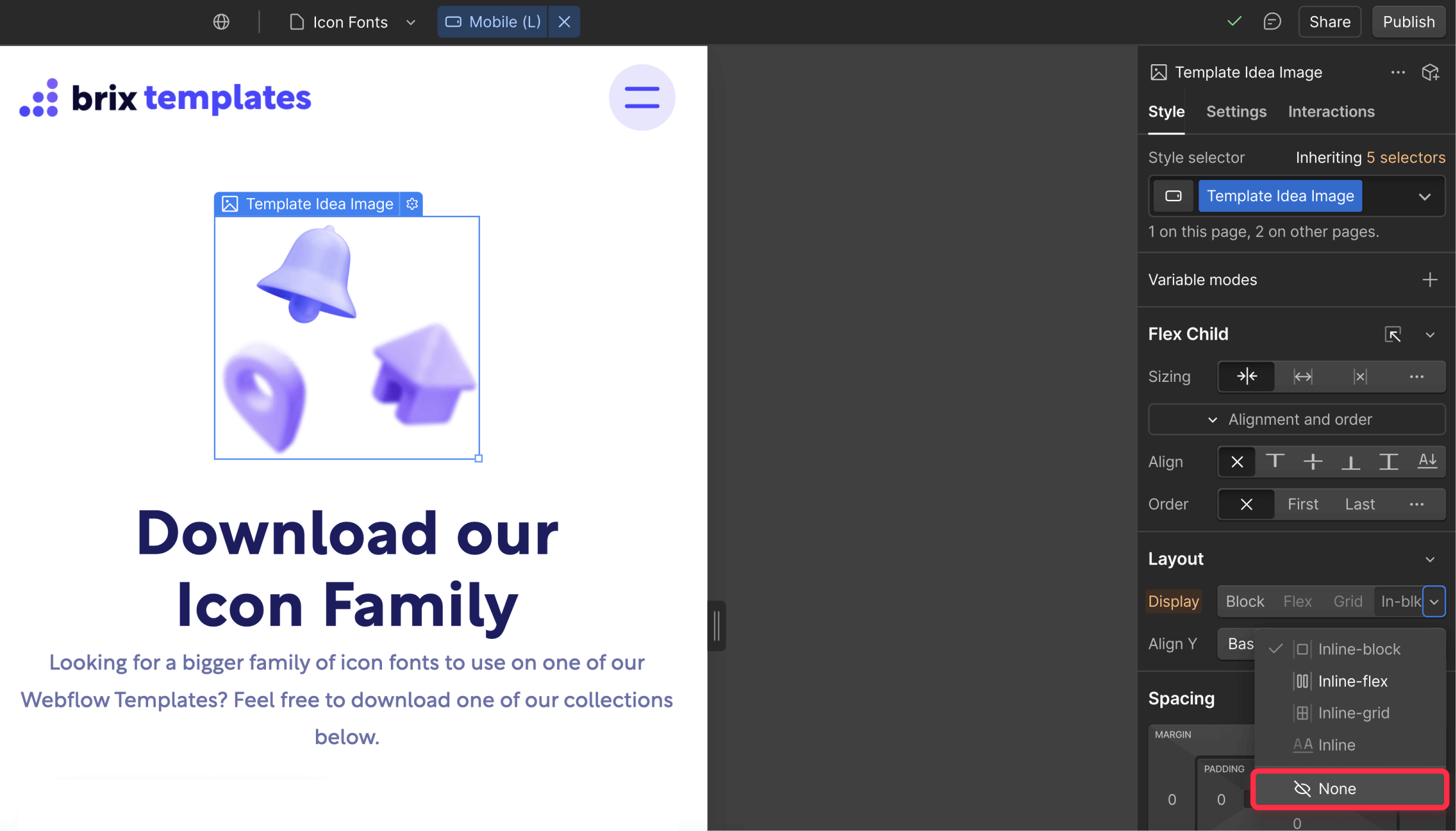
The element disappears from the mobile preview, confirming it's hidden on mobile devices.
How to show elements only on mobile in Webflow (hide on Desktop)
For mobile-exclusive elements:
- Start in Desktop view and select the element
- Set Display to "None" to hide from desktop/tablet
- Switch to Mobile view and select the same element directly from the Navigator view, as otherwise you may be unable to select it
- Change Display from “None” to "Block" or "Flex" to show on mobile
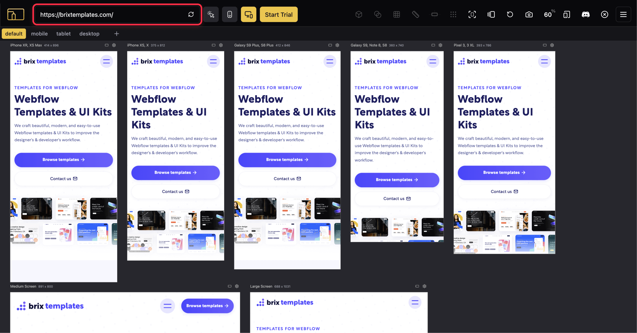
Testing your Webflow site mobile visibility changes
Verify across breakpoints:
- Desktop/Tablet: Element visible (unless intentionally hidden)
- Mobile: Element hidden as intended
Test on real devices:
- Publish your site using the Publish button
- Test on actual mobile devices with the different phones you have available
- Use Responsive Viewer Chrome extension to emulate multiple devices / screen sizes simultaneously
Troubleshooting common issues
- Wrong breakpoint: Verify you're in the correct mobile breakpoint, not Desktop/Tablet
- Display not set to None: Ensure Display shows "None" not "Hidden"
Frequently asked questions
What's the difference between hiding and removing elements on Webflow? Display: none hides elements on specific breakpoints while keeping them in your HTML. Deleting removes them from all devices. Hidden elements can be restored by changing the display property.
How to hide multiple elements simultaneously on Webflow? Apply the same class to multiple elements, then set that class to ‘display: none’ in mobile view. All elements with that class will hide on mobile devices.
Does hiding elements on Webflow affect mobile page speed? Hidden elements still load initially, consuming bandwidth but not affecting rendering performance. For heavy elements like large images, consider Webflow's conditional visibility instead.
Conclusion
Mastering element visibility control creates optimized mobile experiences in Webflow. Strategic hiding reduces clutter, improves performance, and guides users toward primary goals. Always test changes across multiple devices to verify improvements.
Need help with advanced responsive design? Our experienced Webflow agency specializes in building responsive designs that perform beautifully across all devices.


Join readers commenting on this post!