You've seen it before: you're reading a page, about to click a button, and suddenly everything jumps because an image just loaded. You click the wrong thing. You lose your place. The site feels broken.
This "page jumping" problem happens when images load without the browser knowing how much space to reserve for them. The good news is that fixing this in Webflow takes just a few minutes once you understand the core concept.
In this tutorial, you'll learn how to reserve space for images in Webflow using two reliable methods: intrinsic dimensions and aspect-ratio wrappers. You'll also learn how to handle the trickier cases like CMS images, Rich Text content, and hero cover images.
Why fixing image layout shift matters for Webflow sites
The core issue is simple: layout shift destroys user experience. When your page content moves unexpectedly, users suffer in concrete ways.
- Accidental clicks: Users tap a button right as content shifts, and they end up clicking something else entirely — often navigating away from where they wanted to be
- Lost reading position: Users scrolling through your content suddenly lose their place when an image loads and pushes everything down
- Perception of low quality: Pages that "jump around" feel unpolished and unreliable, which erodes trust in your brand
- Mobile frustration amplified: On smaller screens with slower connections, the problem becomes even more noticeable and annoying
- Above-the-fold damage: Shifts in your hero section or top content are the most damaging because that's where users are actively trying to engage
This problem also shows up in metrics like Cumulative Layout Shift (CLS), which Google uses as part of Core Web Vitals. Tools like PageSpeed Insights can help you identify problem areas, but remember: the goal isn't a perfect score — it's a smooth experience for real users.
How to identify if images cause layout shift on your Webflow site
Before changing anything, confirm that images are actually causing the problem. Layout shift can also come from fonts, embeds, or late-loading scripts.
The real-world test for Webflow layout shift
The most reliable way to check is to experience your site like a user on a slow connection.
- Open your published Webflow site in Chrome
- Open DevTools (press F12 or right-click and select Inspect)
- Go to the Network tab
- Find the throttling dropdown (usually says "No throttling") and select Slow 3G or Fast 3G
- Reload the page and watch carefully — do elements jump around as images load?
Pay special attention to content above the fold. If you see text, buttons, or sections moving as images appear, you've confirmed the problem.
Using PageSpeed Insights as a secondary check in Webflow
PageSpeed Insights and Lighthouse can point you toward specific problem elements.
- Go to PageSpeed Insights
- Enter your published Webflow URL
- Look for warnings like "Avoid large layout shifts" or "Image elements do not have explicit width and height"
- Click into the diagnostics to see which specific elements are flagged
These tools are useful for finding potential issues, but don't treat their scores as absolute truth. A page can score well and still have noticeable shifts, or score poorly due to factors that don't affect real users much (for example, adding tracking scripts like Google Analytics or Facebook Pixel will tank your PageSpeed score due to "render-blocking JavaScript," yet removing them would hurt your business far more than a slightly lower score).
Why images cause layout shift in Webflow (the core concept)
Understanding why this happens makes the fix intuitive.
When a browser starts rendering your page, it needs to know how much space each element will occupy. For text, headings, and most elements, the browser can calculate this immediately. But for images, there's a problem: the browser doesn't know the image dimensions until the image file starts downloading.
So here's what happens:
- Browser renders your page layout without knowing image sizes
- Image starts loading
- Browser discovers the actual image dimensions
- Browser recalculates the entire layout to accommodate the image
- Everything below the image shifts down — this is the "jump"
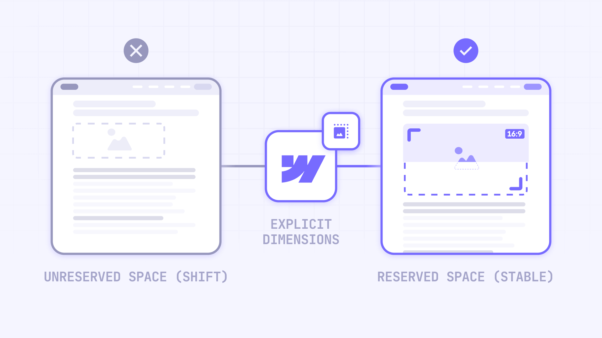
The fix is always some version of the same idea: tell the browser how much space to reserve before the image loads.
You can do this two ways in Webflow:
- Intrinsic dimensions: Set width and height values directly on the image element
- Aspect-ratio wrapper: Create a container that defines the space, then make the image fill it
Both approaches work. Which one you use depends on your specific layout needs.
How to set intrinsic image dimensions in Webflow
This is the most straightforward fix for standard Image elements in Webflow. You're essentially telling the browser: "This image will be X pixels wide and Y pixels tall."
How to access Webflow image settings
Webflow gives you several ways to open image settings:
- Double-click the image element
- Select the image and press Enter or Return
- Click the cog icon in the element panel
- Press D to open the Element Settings panel
Setting width and height in Webflow image settings
- Select your Image element on the canvas
- Open Image settings using any method above
- Find the Image width and Image height fields
- Enter the actual pixel dimensions of your image (or the size you want it to render at)
- Publish your site and test again
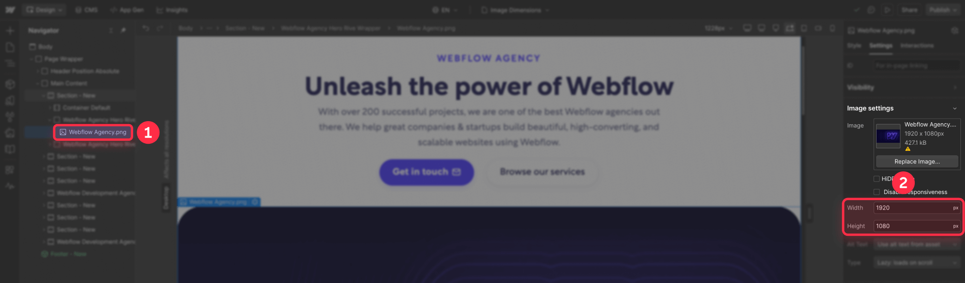
This adds width and height attributes directly to the HTML img element, which is exactly what browsers need to reserve space early.
Important distinction: Setting dimensions in Image settings is different from setting them in the Style panel. The Image settings add HTML attributes that browsers read immediately during parsing. The Style panel adds CSS, which browsers process later. For layout shift prevention, you want the HTML attributes.
Keeping Webflow images responsive after setting dimensions
A common fear is that setting explicit dimensions will "lock" the image size and break responsiveness. This isn't true.
When you set width and height attributes, browsers use those values to calculate the aspect ratio and reserve space. Your CSS can still make the image scale responsively.
The key is ensuring your image has responsive styling applied. In Webflow's Style panel, you typically want:
- Width: 100% (so the image scales with its container)
- Height: Auto (so it maintains aspect ratio while scaling)
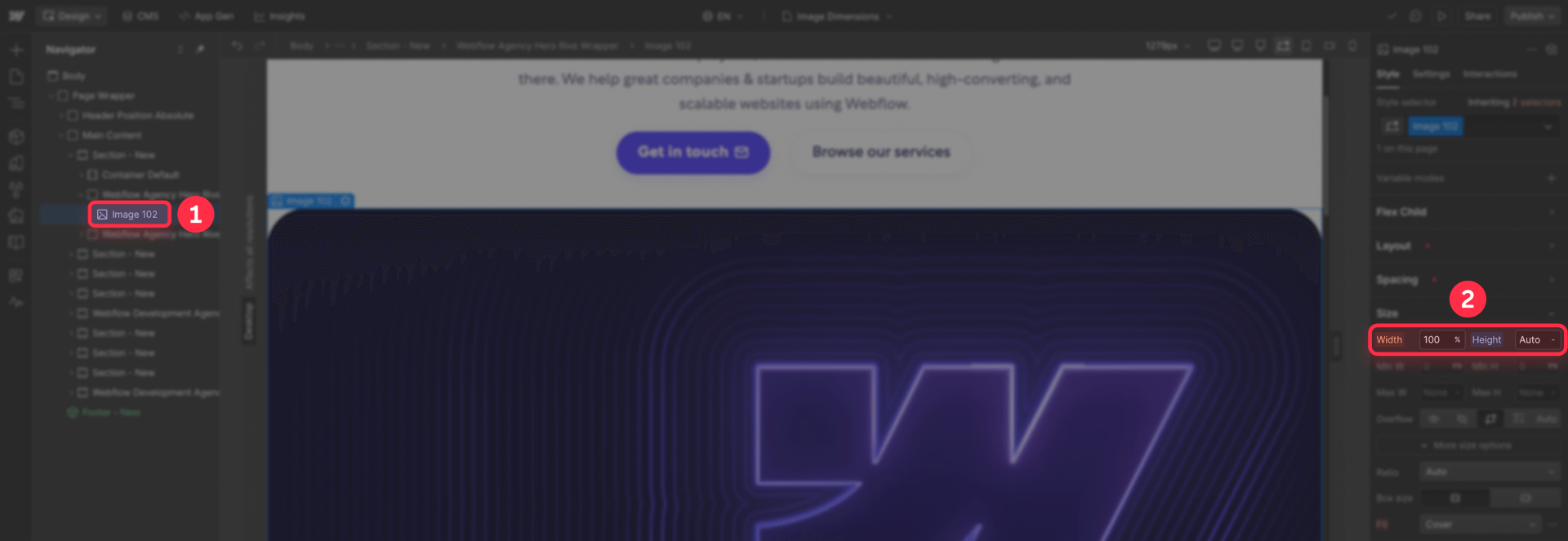
With this combination, the browser reserves the correct proportional space immediately, and the image still scales fluidly across breakpoints.
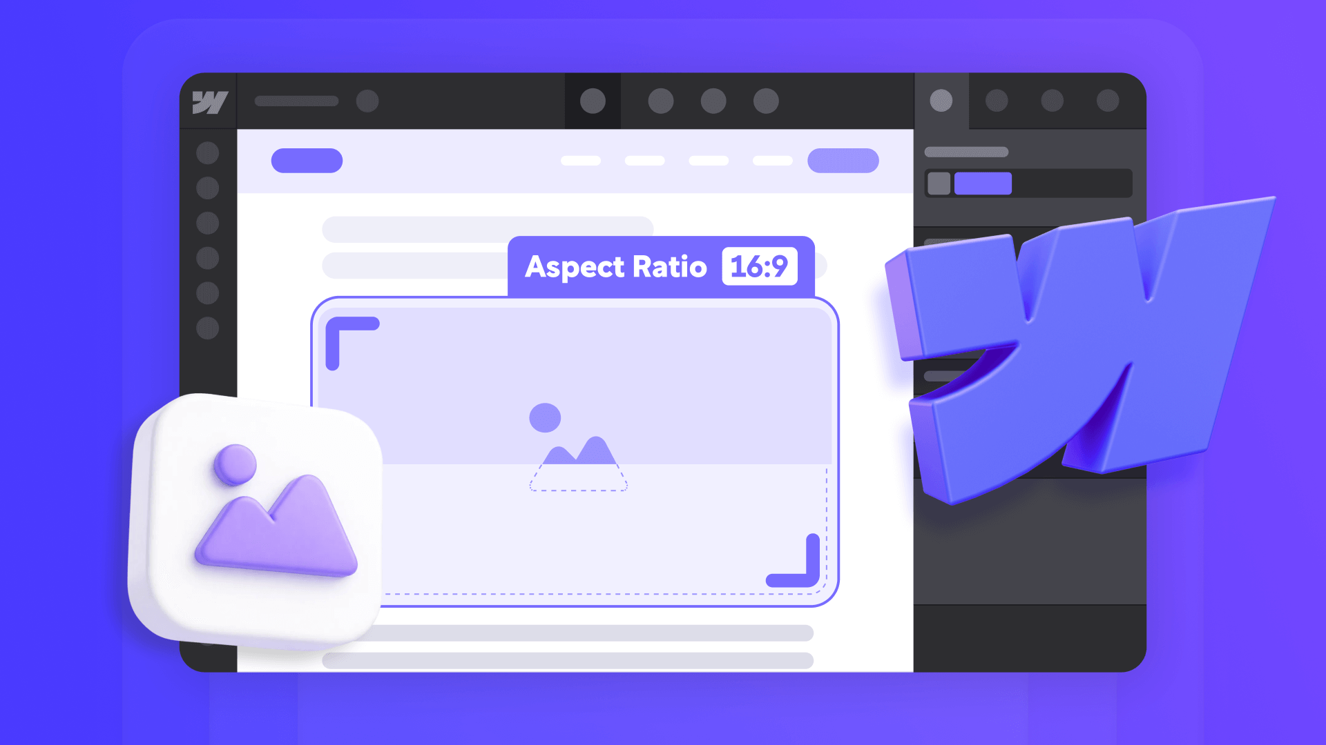
How to reserve space with aspect-ratio wrappers in Webflow
For many layouts — especially cards, grids, and CMS-driven content — an aspect-ratio wrapper is more reliable than intrinsic dimensions. This approach is also essential when you need "cover" style cropping (where the image fills the entire container and crops the excess, like a background image that spans edge-to-edge).
The concept: create a container that defines the space, then make the image fill that container.
Setting aspect ratio in the Webflow style panel
Webflow has native aspect ratio controls built into the Style panel.
- Create or select a Div Block that will wrap your image
- With the div selected, open the Style panel
- Find the Size section
- Look for Aspect ratio (you may need to click More options)
- Choose a preset ratio like 16:9, 4:3, or 1:1 — or enter a custom ratio
- Give the wrapper a width (like 100% or a fixed pixel value)
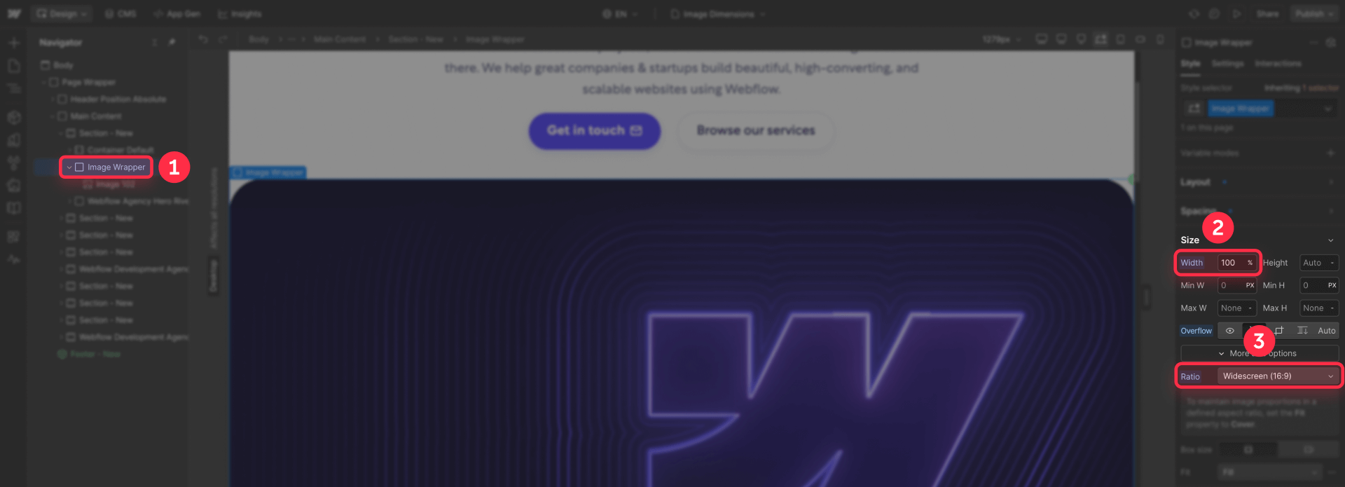
The wrapper now maintains that exact proportion regardless of content.
Making the image fill the wrapper in Webflow
With your aspect-ratio wrapper defined, configure the image inside it:
- Place your Image element inside the wrapper div
- Select the image and open the Style panel
- Set Width to 100%
- Set Height to 100%
- Set Object fit (found under Fit) to Cover or Contain
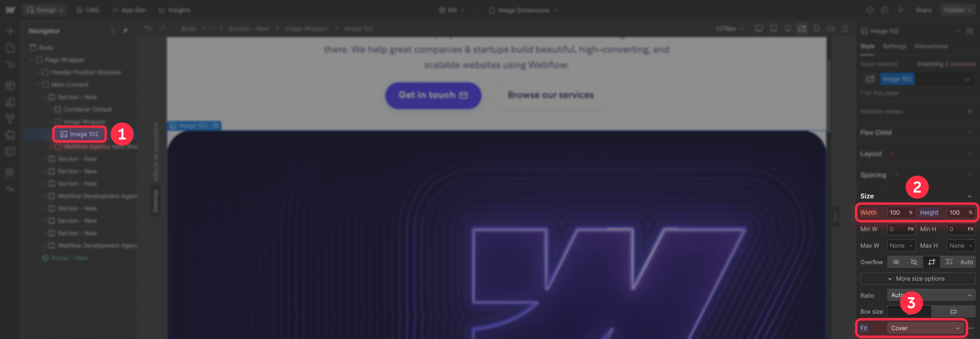
Cover crops the image to fill the entire wrapper (best for hero images and cards where you want edge-to-edge visuals). Contain scales the image to fit entirely within the wrapper without cropping (best when you need to show the complete image).
Now your layout is stable: the wrapper reserves exact space immediately, and the image fills it when it loads. No shift.
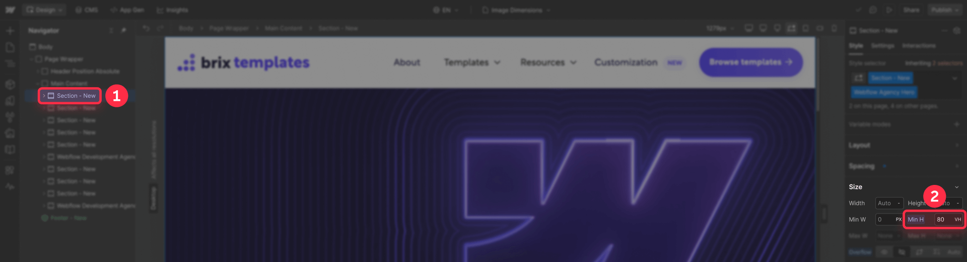
How to fix layout shift for Webflow hero cover images
Hero sections with full-bleed cover images are a classic layout shift trap. The typical setup uses Position: absolute on the image, but if the parent has no defined height, the section collapses until the image loads — then suddenly expands.
Building a stable Webflow hero with cover image
1 - Create a Section or Div Block for your hero
2 - Set the wrapper to Position: relative (so absolute children are contained)
3 - Give the wrapper a stable height using one of these methods:
- Set Aspect ratio in the Style panel (best for consistent proportions)
- Set Min height to a specific value like 80vh or 600px (best for "full screen" heroes)
4 - Add your Image element inside the wrapper
5 - Set the image to Position: absolute
6 - Set all position values (Top, Right, Bottom, Left) to 0
7 - Set image Width to 100% and Height to 100%
8 - Set Object fit to Cover
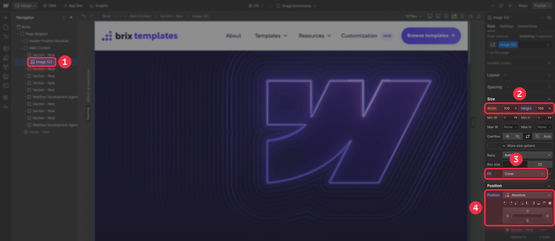
The critical point: the wrapper must have a defined height before the image loads. Whether you use aspect ratio or min-height, the layout is now stable from the first render.
How to fix layout shift for Webflow CMS images
CMS-driven layouts introduce a specific challenge: you can't always control what images editors upload. If someone uploads a 16:9 image today and a 4:3 image tomorrow, your layout becomes unpredictable.
Enforcing consistent image uploads in Webflow CMS
The best fix is upstream — prevent inconsistent images from entering the system.
- Go to your CMS Collection settings
- Select the image field you want to constrain
- Under field settings, configure validation rules:
- Set minimum dimensions (e.g., 1200×675 for 16:9 content)
- Set maximum dimensions if needed
- Set aspect ratio requirements
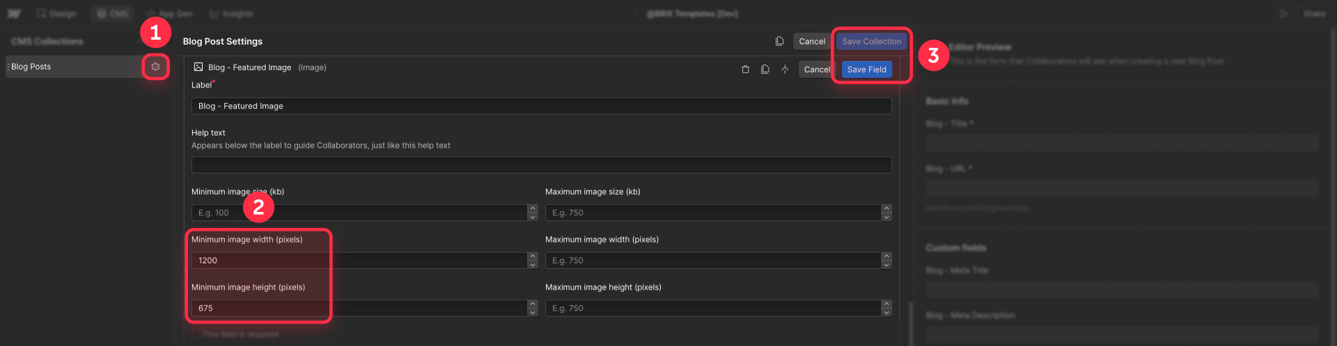
Webflow's CMS validation ensures editors can only upload images that match your layout requirements.
Using aspect-ratio wrappers for Webflow CMS images
Even with validation, wrapping CMS images in aspect-ratio containers provides a safety net.
- In your Collection List or Collection Page, create a wrapper div around the image
- Apply an Aspect ratio to the wrapper that matches your expected image ratio
- Set the image inside to fill the wrapper (Width: 100%, Height: 100%, Fit: Cover)
This guarantees stable layout even if an image with unexpected dimensions somehow gets uploaded.
Handling Webflow CMS multi-image fields
Multi-image fields and dynamic galleries present a limitation: you often can't set per-image intrinsic dimensions in a native way.
The practical solution is the same pattern:
- Standardize at the CMS level using image validation
- Wrap each gallery image in a fixed aspect-ratio container
- Use Fit: Cover so images fill their containers consistently
If you genuinely need unique dimensions per image, you'd need to store width and height as separate CMS fields and apply them programmatically — but this is rarely necessary if you enforce consistent ratios.
How to fix layout shift for Webflow Rich Text images
Rich Text blocks present a unique challenge because you have less control over the generated markup. Webflow may apply lazy loading to Rich Text images, and the HTML might not include width/height attributes consistently.
A practical workaround shared in the Webflow community removes the lazy loading attribute from Rich Text images to improve layout stability.
Add this script to your page's Before tag custom code:
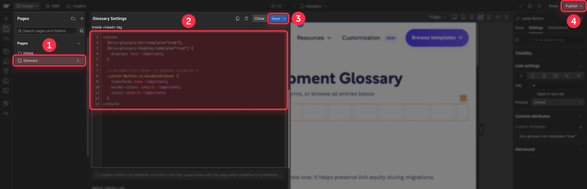
<script>
/*!
 * BRIX Templates Rich Text Image Layout Fix for Webflow
 * ----------------------------------------------------------------------------
 * Removes lazy-loading from Rich Text images to prevent layout shift.
 * This improves layout stability at the cost of some lazy-load performance.
 *
 * Version: 1.0.0
 * Author: BRIX Templates
 */
(function() {
  'use strict';

  document.addEventListener("DOMContentLoaded", function() {
    const richTextImages = document.querySelectorAll('.w-richtext img');

    richTextImages.forEach(function(img) {
      img.removeAttribute('loading');
    });

    if (richTextImages.length > 0) {
      console.log('BRIX Rich Text Fix: Removed lazy-loading from ' + richTextImages.length + ' Rich Text image(s)');
    }
  });
})();
</script>
This trades some lazy-load performance benefit for layout stability. Whether this tradeoff makes sense depends on your specific case — if your Rich Text content has many images and you're seeing noticeable shifts, it's usually worth it. Hopefully Webflow will implement native width/height attribute support for Rich Text images soon.
How to verify your Webflow layout shift fix worked
After implementing fixes, verify with actual testing — not just tool scores.
Real-world verification for Webflow layout shift
- Publish your site (fixes won't show in Designer preview)
- Open the published page in an incognito/private window (avoids cached assets)
- Open DevTools and throttle the network to Slow 3G
- Reload and carefully watch above-the-fold content
- Scroll through the page while images load — does anything jump?
- Test on mobile viewport as well (toggle device mode in DevTools)
If content stays stable while images load, your fix is working.
Using tools as secondary verification in Webflow
After real-world testing confirms improvement, you can check tools for additional confidence:
- Run PageSpeed Insights on your published URL
- Check if "Image elements do not have explicit width and height" warnings are reduced
- Look at the CLS score in the diagnostics — it should be lower
Remember: a good score is nice, but stable user experience is the actual goal.
Troubleshooting Webflow image layout shift issues
"Image elements do not have explicit width and height" still appears
- Confirm you set dimensions in Image settings, not just the Style panel
- Make sure you published after making changes
- Check if the flagged images are Rich Text images (which need the script workaround) or CMS multi-image fields (which need wrapper approach)
Images stopped being responsive after setting dimensions
- Ensure your image has Width: 100% and Height: auto in the Style panel
- If using a wrapper approach, set the image to Width: 100%, Height: 100%, and use Fit settings
Hero cover image still causes layout shift
- Verify the parent wrapper has a defined height via Aspect ratio or Min height
- Confirm the wrapper is set to Position: relative
- Confirm the image is set to Position: absolute with all position values at 0
CMS images still jump because of varying upload sizes
- Add CMS field validation to enforce consistent aspect ratios
- Use an aspect-ratio wrapper around every CMS image in your templates
Rich Text images break anchor links or shift content
- Apply the script workaround to remove the loading attribute from Rich Text images
- Test anchor links on a throttled connection after publishing
Frequently asked questions about fixing Webflow image layout shift
What causes images to make my Webflow page jump while loading?
When images load without the browser knowing their dimensions beforehand, the browser can't reserve the correct space. It renders your layout first, then recalculates everything once the image dimensions are known — causing visible shifts.
The fix is always giving the browser dimension information early, either through HTML width/height attributes or an aspect-ratio container. Test your site on a slow connection to see exactly where shifts occur, then apply the appropriate fix to those images.
Is layout shift the same as Cumulative Layout Shift (CLS) in Webflow?
Layout shift is the visible problem — content moving unexpectedly. CLS is Google's metric that attempts to quantify this problem for Core Web Vitals scoring. While related, they're not identical.
A page can have a "good" CLS score but still have noticeable shifts, or have a "poor" score due to measurement timing issues. Focus on eliminating visible shifts for your users first, then use CLS scores as a secondary reference point.
Should I use intrinsic dimensions or aspect-ratio wrappers in Webflow?
Use intrinsic dimensions (width/height in Image settings) when you have standard Image elements with predictable sizes. Use aspect-ratio wrappers when building responsive components like cards and grids, when working with CMS-driven content where upload sizes may vary, or when you need cover-style image cropping.
For most CMS-heavy Webflow sites, aspect-ratio wrappers are the more reliable default.
Will setting image dimensions break responsive design in Webflow?
No. Width and height attributes tell the browser the aspect ratio for space reservation, not the final rendered size. Your CSS styling (like width: 100% and height: auto) still controls how the image actually scales.
This is the recommended approach from web performance experts — set intrinsic dimensions for stability, use CSS for responsive scaling.
How do I fix layout shift for Webflow CMS Collection images?
Two complementary approaches work best. First, add validation rules to your CMS image fields to enforce consistent aspect ratios and minimum dimensions — this prevents the problem at the source.
Second, wrap all CMS images in aspect-ratio containers so your layout stays stable even if an unexpected image gets uploaded. Combine both for maximum reliability.
Why does lazy loading seem to cause layout shift in Webflow?
Lazy loading doesn't cause layout shift — it reveals it. When images load immediately, the shift happens so fast you might not notice. Lazy loading delays image loading, making the shift visible when images finally appear.
The fix isn't disabling lazy loading; it's reserving space properly so there's nothing to shift. Keep lazy loading enabled (it helps performance) and fix the underlying space reservation issue.
How do I prevent layout shift on Webflow hero sections with cover images?
The key is ensuring your hero wrapper has a defined height before the image loads. Set the wrapper to Position: relative with either an aspect ratio or min-height value.
Then set your image to Position: absolute, filling all edges (top/right/bottom/left: 0), with Object fit: Cover. This way, the wrapper defines the space immediately, and the image simply fills it when ready.
Do Webflow Rich Text images cause layout shift problems?
Yes, Rich Text images can cause layout shift because you have limited control over their HTML attributes. Webflow may apply lazy loading, and the generated markup often lacks explicit width/height attributes.
A practical workaround is adding a script that removes the loading attribute from Rich Text images. This improves layout stability at the cost of some lazy-loading benefits.
How can I test if my Webflow layout shift fix actually worked?
The most reliable test is real-world simulation. Publish your site, open it in an incognito window, throttle your network to Slow 3G in DevTools, and reload while watching for content movement.
If elements stay stable while images load, your fix works. You can also use PageSpeed Insights as a secondary check, but prioritize what you actually see over what the tool reports.
Does fixing image layout shift improve SEO for Webflow sites?
Yes, indirectly. Google uses CLS as part of Core Web Vitals, which is a ranking factor. More importantly, reducing layout shift improves user experience, which reduces bounce rates and increases engagement — signals that positively influence search rankings.
Focus on the user benefit first; the SEO improvement follows naturally from building a better experience.
Conclusion
Fixing layout shift in Webflow comes down to one principle: reserve space for images before they load. For standard images, set intrinsic dimensions in Image settings. For responsive layouts and CMS content, use aspect-ratio wrappers with appropriate fit behavior. For hero cover images, ensure the parent has a defined height before relying on the image.
The goal isn't a perfect Lighthouse score — it's a page that doesn't jump around while your users are trying to read and click. Get that right, and the metrics will follow.
If you'd like expert help auditing and fixing layout shift across your Webflow templates and CMS components, our Webflow agency team can implement these optimizations efficiently.


Join readers commenting on this post!