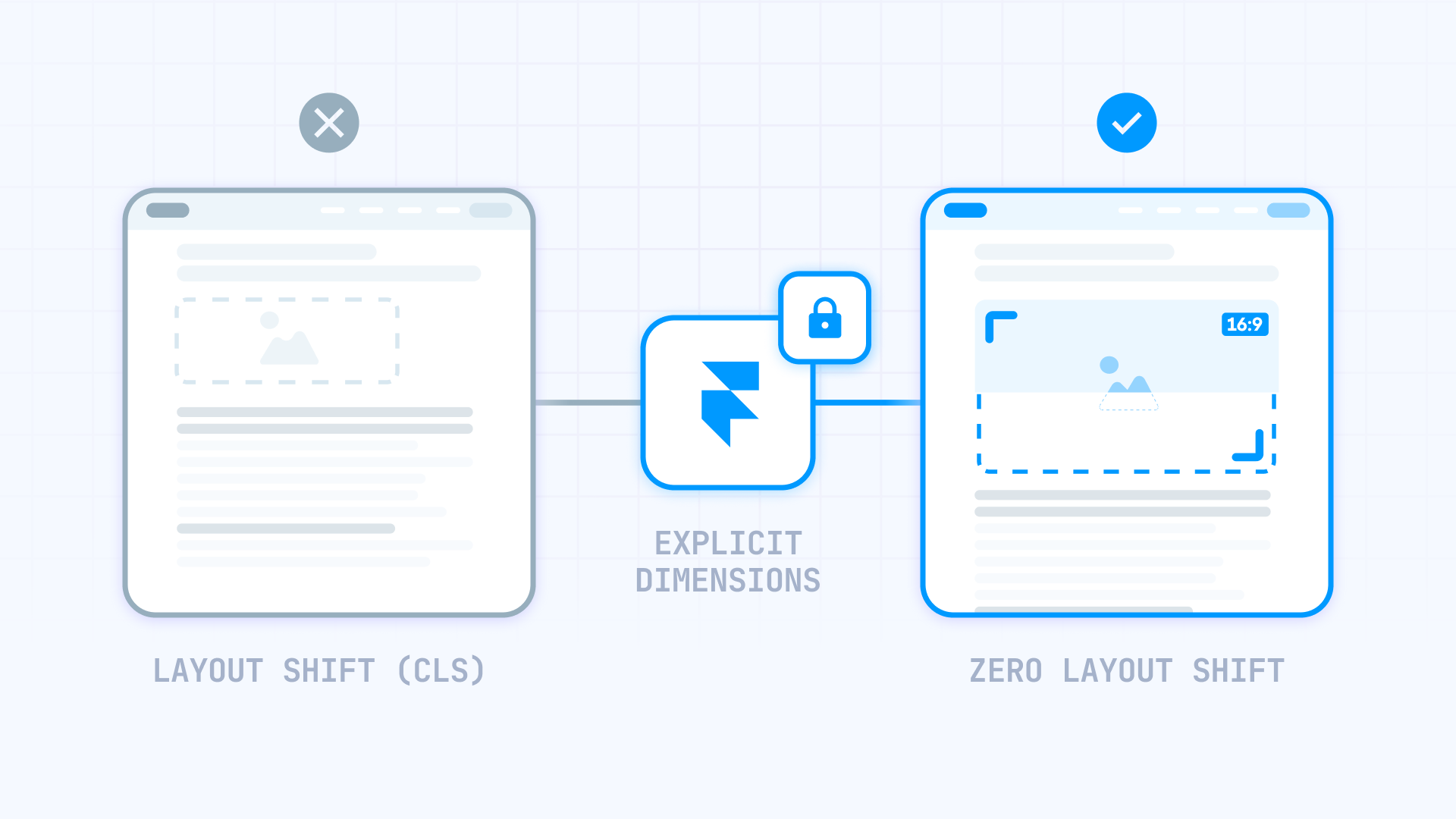
You’re scrolling a landing page and comparing rows in a pricing table when the whole section suddenly shifts down. An image above finishes loading, and now you’re looking at the wrong row.
That jump happens when your layout doesn’t reserve space for an image upfront. The browser renders the page first, then has to reflow once the image appears — nudging everything below it.
In Framer, you can prevent this with locked aspect ratios, wrapper Frames that define image space ahead of time, and a simple CSS rule for tricky spots like CMS Formatted Text. This guide walks through each method (including CMS images and hero cover layouts) so your pages stay steady while images load.
Why fixing image layout shift matters for Framer sites
Unexpected content movement creates real problems for visitors. Here's what actually happens when your layout shifts:
- Missed form submissions: Users filling out a contact form suddenly find their cursor in the wrong field — or worse, they accidentally submit incomplete data
- Banner and CTA blindness: When promotional sections jump around, users learn to ignore them entirely, killing your conversion opportunities
- Scroll position chaos: Readers lose their place mid-paragraph and have to hunt for where they left off
- Touch target confusion: On mobile, users tap one button but hit another because the layout shifted at the exact wrong moment
- Slower perceived performance: Even if your site loads quickly, visible jumping makes it feel sluggish and unreliable
- Eroded brand credibility: Pages that can't hold still signal amateur development, which undermines trust in your product or service
Google tracks this behavior through a metric called Cumulative Layout Shift (CLS) — one of the Core Web Vitals that affects search rankings and user experience scores.
How to identify if images cause layout shift on your Framer site
Not every layout shift comes from images. Fonts, third-party embeds, and async scripts can cause similar problems. Here's how to isolate the culprit.
The real-world test for Framer layout shift
Simulate what visitors on slower networks actually experience:
- Launch Chrome and navigate to your published Framer URL
- Access Developer Tools: Hit F12 (or right-click → Inspect)
- Switch to the Network panel
- Activate throttling: Click the dropdown (default: No throttling) and choose Slow 3G
- Hard refresh the page (Ctrl+Shift+R or Cmd+Shift+R)
- Watch the viewport: Notice any sections that expand, cards that reposition, or text blocks that jump downward as images paint in
Focus on hero sections and anything visible without scrolling. If the jump lines up with images popping in, you've found the first thing to fix.
Using PageSpeed Insights as a secondary check for Framer
Run your published URL through PageSpeed Insights and look for "unsized image" or CLS warnings. Treat it as a pointer, not a verdict: it can miss obvious shifts, and it can also flag issues that aren't actually noticeable.
Why images cause layout shift in Framer (the core concept)
Browsers need to know element dimensions before painting the page. Text, buttons, and containers have predictable sizes. Images don't — unless your layout explicitly declares them.
This is the pattern behind most image-driven shifts:
- Initial render: Browser paints your Framer page using available dimension data
- Image download begins: The browser fetches the image file
- Dimensions revealed: Once loaded, the browser learns the image's actual width and height
- Layout recalculation: The container expands to fit, and content below gets pushed down
In Framer specifically, you control image dimensions through Fill settings on Frames, the lock icon for aspect ratios, wrapper containers with fixed proportions, and Fit Image for CMS-driven content. Your job is to make the image area predictable before the pixels show up, so the layout never has to resize mid-scroll.
Two primary approaches work in Framer:
- Locked aspect ratios: Apply a ratio directly to the image layer or its parent Frame, then set width to Fill — the height calculates automatically
- Wrapper Frames: Create a container with a defined shape (e.g., 4:3), then place your image inside using Cover or Contain fit
Choose based on your layout needs. Both prevent that late resize that pushes everything below.
How to set stable (intrinsic) image dimensions in Framer
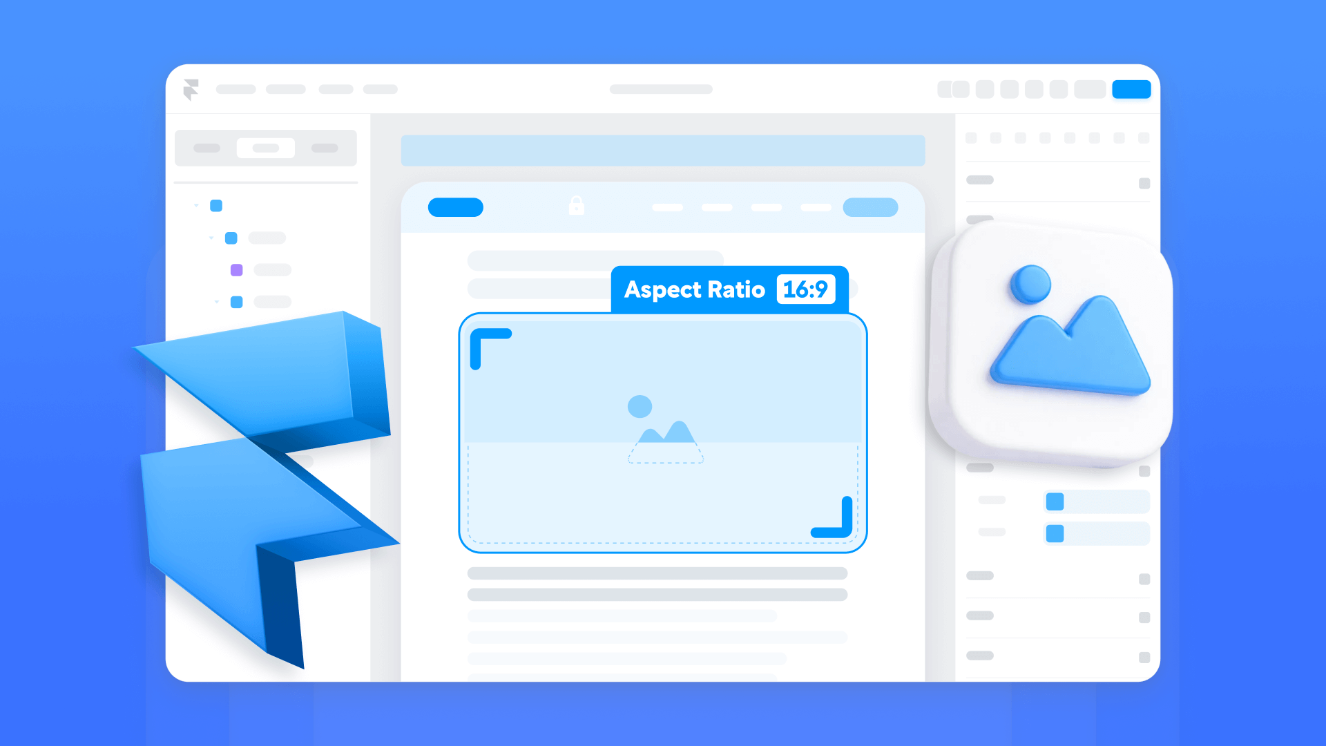
If you're working with regular image layers (not CMS or Formatted Text), locking the aspect ratio is the fastest path to a shift-free layout. Once you define the ratio, the browser knows exactly how much vertical space to hold — no surprises when the image finishes loading.
How to access Framer image settings
Most images in Framer live inside Frames as a Fill layer (Fill → Image in the right panel). You can also drag an image directly onto the canvas, which creates its own layer. Either way, selecting the element reveals sizing controls, fit options (Fill, Fit, Stretch, Tile), and resolution settings. Framer handles optimization behind the scenes — generating responsive srcset/sizes attributes automatically.
Setting width and height in Framer
- Select the image layer (or the Frame that has an Image Fill)
- Set a real size once: For example, 1200 × 800
- Click the lock icon next to width/height to lock the aspect ratio
- Now set Width to Fill (or whatever your responsive layout needs)
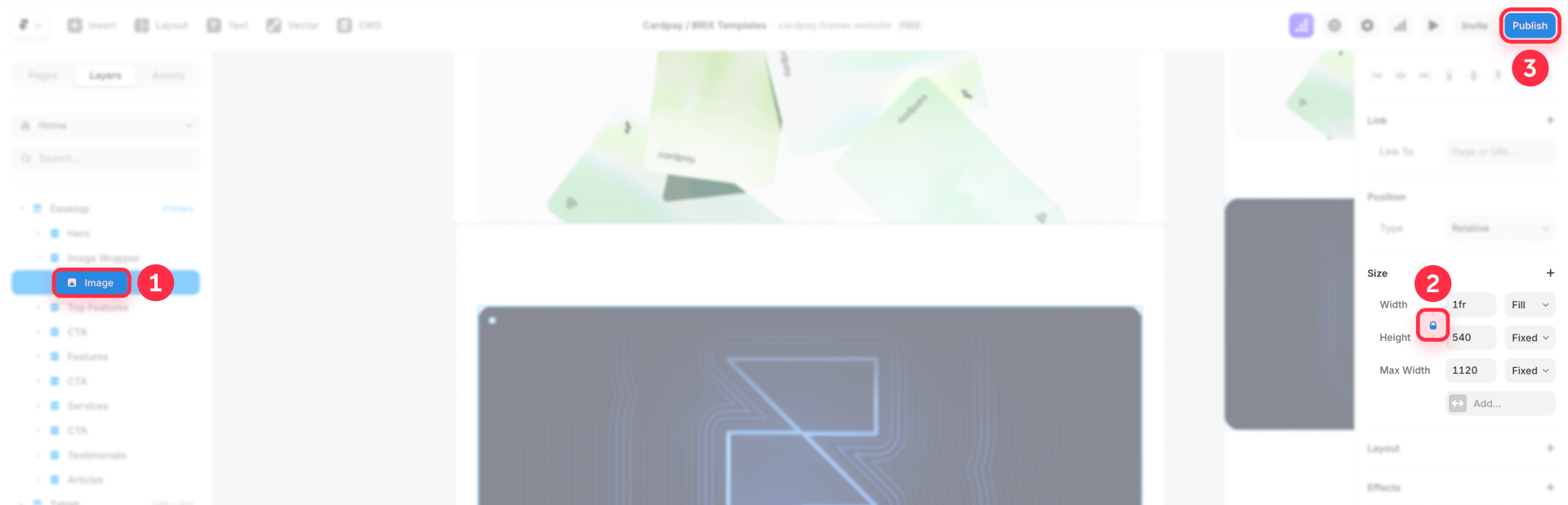
When the ratio is locked and Width is set to Fill, Framer adjusts the height automatically to maintain the locked ratio.
This single step — locking the ratio — tells the browser how much room to reserve from the very first paint.
Keeping Framer images responsive after setting dimensions
Some designers worry that defining dimensions will make images rigid and break fluid layouts. That's not how it works in Framer. Locking the ratio keeps the proportions fixed while still allowing the width to stretch or shrink with its container — height simply follows along.
What you're aiming for is simple:
- Width adapts to the container (Fill, columns, breakpoints)
- Height follows from the locked ratio (so the space is reserved)
How to reserve space with aspect-ratio wrappers in Framer
When building repeatable components — blog cards, team grids, product tiles — it's often smarter to let a parent Frame control the image area. You define the wrapper's shape once, and every image inside automatically inherits those proportions.
Set the box first (locked ratio), then let the image fill that box. The box is what keeps the layout steady.
Setting aspect ratio on the Framer wrapper
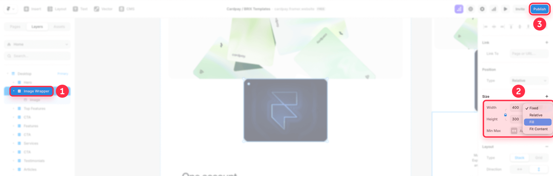
- Create or select a Frame that will wrap the image
- Give it an initial size that matches your desired ratio (e.g., 400 × 300 for 4:3)
- Lock the ratio using the lock icon next to the sizing properties
- Set Width to Fill (if needed)
This keeps the wrapper's proportion stable across breakpoints.
Making the image fill the Framer wrapper
- Apply the image as a Fill on the wrapper Frame (Fill → Image)
- Choose the fit behavior:
- Fill crops the image to fill the wrapper — best for cards and hero visuals
- Fit shows the whole image without cropping — best when you must show the complete image
Because the wrapper's shape is fixed from the first paint, loading the image can't push content around.
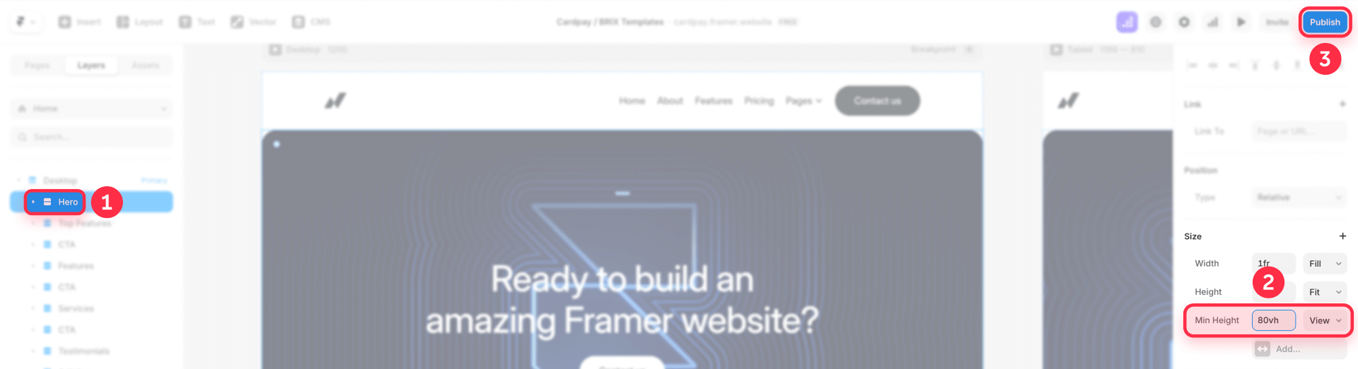
How to fix layout shift for Framer hero cover images
Hero sections are where shifts hurt the most, because people are about to click, scroll, or read the headline.
Building a stable hero with a Framer cover image
- Create a hero Frame (your hero "section")
- Give the hero a stable height using one of these:
- Min height: For example, 80vh to make the hero take up most of the viewport
- A locked aspect ratio: For consistent proportions across devices
- Apply the hero image as an Image Fill on that hero Frame
- Set the image type to Fill
As long as the hero Frame has a real height (min-height or a locked ratio), the image loading won't change the section's footprint.
How to fix layout shift for Framer CMS images
On CMS pages, content can fight your layout: editors will upload whatever looks good to them. One editor uploads a wide landscape shot; another adds a tall portrait. Without intervention, your carefully designed grid turns into a shifting mess where cards expand unpredictably.
Set expectations for Framer CMS image uploads
Framer doesn't rely on strict enforcement for every workflow, so the practical move is to document recommended image sizes/ratios right inside your CMS setup, so editors upload images that match your layout. Framer explicitly suggests adding guidelines like recommended image sizes when structuring CMS collections.
Use wrappers when you need consistent Framer layout
If your list/grid must look uniform:
- Wrap each CMS image in a Frame with a locked aspect ratio
- Use Fill mode to crop consistently
A locked aspect ratio in a collection list makes all CMS images inherit the same ratio, keeping layout consistent.
Use Fit Image when you want the Framer layout to adapt to each image
If you actually want each CMS image to keep its natural proportions (and avoid "manual ratio matching"), use Fit Image.
Fit Image is a sizing option that adapts automatically to the width or height of uploaded images, designed specifically for dynamic content like CMS.
Use it when:
- You don't want a fixed ratio wrapper
- You want the image layer to adapt to varying source ratios without constant tweaking
Handling Framer CMS gallery images
When you have multiple images per item, you typically want one of these strategies:
- Uniform layout: Wrap each gallery image in the same locked-ratio Frame + Fill mode
- Mixed ratios: Use Fit Image (or a layout that's designed to accommodate variable heights)
For clean, aligned galleries, stick with uniform wrappers — every image gets the same dimensions. If you prefer a more organic, Pinterest-style arrangement where images vary in height, go with Fit Image instead. Just know that variable-height layouts won't feel as "locked in" visually, which is fine if that's the aesthetic you're after.
How to prevent layout shift for images in Framer CMS Formatted Text
When your posts use CMS Formatted Text, the most reliable way to keep the layout steady is to treat “layout-critical” images as structured content — not inline editorial content. Instead of inserting key visuals inside Formatted Text, place them in a dedicated CMS Image field (for example, Featured Image) and render them in your template inside a wrapper Frame with a locked aspect ratio. This way, the wrapper reserves space from the first paint, and the content below won’t move when the image finishes loading.
Set up a CMS Featured Image for a stable layout
- Open your CMS Collection (for example, Blog Posts).
- Create (or identify) an Image field like Featured Image.
- In your blog post template, add a wrapper Frame where the image should appear.
- Give the wrapper an initial size that matches your target ratio (for example, 16:9).
- Enable the lock icon to keep the wrapper’s aspect ratio stable.
- Set the wrapper to Width: Fill (if you want it responsive).
Make the image fill the wrapper without distortion
- On the wrapper Frame, apply the CMS image as a Fill: Fill → Image (bound to Featured Image).
- Choose the fit behavior: Fill (crops to cover) — best for hero sections and cards. Fit (shows the full image, no cropping) — best when you must display the entire image.
- Keep the focus on the container: the wrapper defines the reserved space, and the image simply fills it when it loads.
If you need advanced rules for inline images inside Formatted Text (consistent sizing, custom behavior, and per-post control), our team can implement a tailored solution at BRIX Templates.
How to verify your Framer layout shift fix worked
Automated scores only tell part of the story. Run these three quick checks to confirm your fix actually works:
3 quick checks for Framer layout stability
- Fresh browser test: Open your published site in a private/incognito window (no cached assets). Enable Slow 3G throttling in DevTools. Refresh and observe — does anything visibly shift as images load?
- Scroll test: While images are still loading, scroll through the page. Watch for content that repositions or sections that expand unexpectedly.
- Mobile simulation: Toggle device mode in DevTools and repeat. Slower mobile connections and smaller screens often reveal shifts that desktop testing misses.
If your layout holds steady through all three, your implementation is solid.
Confirming with PageSpeed and Lighthouse for Framer
Once manual testing looks good, run PageSpeed Insights to check whether CLS warnings have decreased. Look for reduced "unsized image" flags in the diagnostics. But remember: what matters most is what users actually see, not the score itself.
Troubleshooting Framer image layout shift issues
Here's how to fix the most common problems:
"Avoid large layout shifts" still appears:
- Confirm the flagged images aren't inside CMS Formatted Text, where you have less structural control (CSS can style them, but wrappers aren't available per image). See Framer's guide on styling Formatted Text images.
- Check if the problem is actually the container (hero/section/card) having no stable height — that's the most common real cause
Images stopped behaving responsively:
- If you forced fixed width/height, switch to locked aspect ratio + responsive width (Fill) so the ratio stays stable but the layout remains fluid. See Framer's documentation on unique aspect ratios.
Hero cover image still causes layout shift:
- Verify the hero wrapper has a defined height (min height or locked ratio) before the image loads
- Prefer applying the image as a Fill on the hero Frame so the container, not the image, defines space
CMS images still jump because of varying upload ratios:
- Use locked-ratio wrappers for consistency in lists/grids. See Framer's guide on CMS aspect ratios.
- Or use Fit Image when you want the layout to adapt to each source image. Learn more about Fit Image in Framer.
- Add clear CMS field guidelines for recommended image sizes/ratios. See Framer's tips for making templates easier to edit.
Frequently asked questions about fixing Framer image layout shift
Why do my Framer pages shift when images load?
On first paint, the browser lays out your page without knowing the final size of each image. When the image appears, it recalculates the space — which can push anything below it. In Framer, you solve this by locking aspect ratios on image layers (using the lock icon), creating wrapper Frames with fixed proportions, or applying CSS to CMS Formatted Text images. Each method tells the browser exactly how much room to hold.
What's the difference between layout shift and CLS in Framer?
Layout shift is what you see — content jumping around as elements load or resize. Cumulative Layout Shift (CLS) is Google's way of measuring that movement for Core Web Vitals. They're related but not identical: a page might have a low CLS score but still show annoying micro-shifts, or vice versa. Prioritize fixing what users actually notice, then check your CLS metrics as a secondary indicator.
When should I use locked ratios vs. wrapper Frames in Framer?
Lock the ratio directly on an image layer when that image has a consistent, predictable size in your design — like a product photo that's always 1:1. Use a wrapper Frame when you're building components that need to accommodate different images with the same layout footprint, such as blog cards or portfolio grids where you want uniform appearance regardless of source dimensions. For CMS-heavy projects, wrappers tend to be more reliable.
How do I fix layout shift for Framer CMS images with different aspect ratios?
You have two options: use locked-ratio wrappers with Fill mode to force consistency (some cropping will occur), or use Fit Image to let each image keep its natural proportions. If uniform grids matter more than showing full images, go with wrappers. If showing complete images matters more, use Fit Image and accept variable heights.
Does CMS Formatted Text need a code override for Framer images?
Not by default. The supported path for styling images in CMS Formatted Text is custom CSS in the head. See Framer's guide on centering Formatted Text images. A code component/override is mainly relevant if you need to enable lazy loading for Formatted Text images (since they're an exception to Framer's automatic lazy loading). Learn more about lazy loading in Framer.
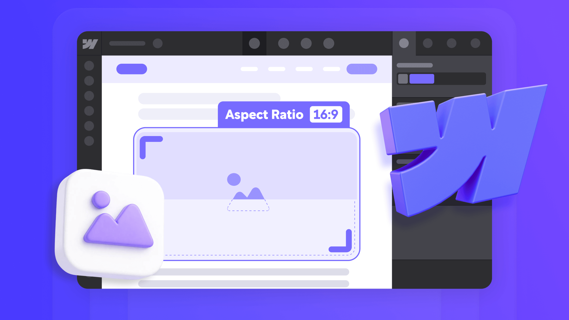
What's the best aspect ratio to use for Framer images to prevent layout shift?
There's no single "best" ratio — it depends on your design. 16:9 works well for hero images and video thumbnails. 4:3 is great for blog featured images. 1:1 (square) is ideal for profile photos and product grids. The key is consistency: pick a ratio that works for your layout and stick with it across your site.
Can I fix Framer layout shift without any code?
Yes, for most cases. Setting locked aspect ratios on image layers or wrapper Frames is entirely visual — no code required. The only scenario that requires CSS is CMS Formatted Text images, where you can't wrap individual images from the canvas. For everything else, Framer's built-in controls handle it.
How do I test if my Framer layout shift fix is working?
The most reliable test is visual: publish your site, open it in an incognito window with network throttling set to Slow 3G, and watch if content jumps as images load. If nothing moves, your fix works. PageSpeed Insights and Lighthouse can provide additional data, but real-world observation is more reliable than automated scores.
Why does my Framer hero image still cause layout shift?
The most common cause is that the hero container doesn't have a defined height before the image loads. Make sure your hero Frame has either a min height or a locked aspect ratio set. Then apply the image as a Fill on that Frame with Fill type selected. This ensures the container reserves space regardless of image load timing.
Does Framer automatically prevent layout shift for images?
Framer optimizes images and generates responsive srcset attributes, but it doesn't automatically prevent layout shift. You need to define stable dimensions through locked aspect ratios or wrapper Frames. The optimization Framer provides helps with loading speed and file size — you're responsible for layout stability.
Conclusion
The fastest way to kill layout shift in Framer is to make image space predictable from the start — before any image finishes loading.
Here's the quick breakdown by image type:
- Standard images: Lock the aspect ratio, set width to Fill, and let height follow automatically
- Cards and grids: Use wrapper Frames with fixed proportions and Fill or Fit mode
- CMS collections: Apply locked-ratio wrappers for uniform layouts, or switch to Fit Image when you want each image to keep its native proportions
- Formatted Text fields: Add CSS targeting .framer-image to enforce a consistent aspect ratio across all inline images
Stable pages aren't about chasing metrics — they're about giving visitors a smooth experience where nothing moves unexpectedly. Nail that, and better performance scores come as a side effect.
For complex implementations requiring custom conditional logic, advanced CMS configurations, or performance optimization across your entire Framer site, our Framer development team can create sophisticated solutions tailored to your specific requirements.


Join readers commenting on this post!