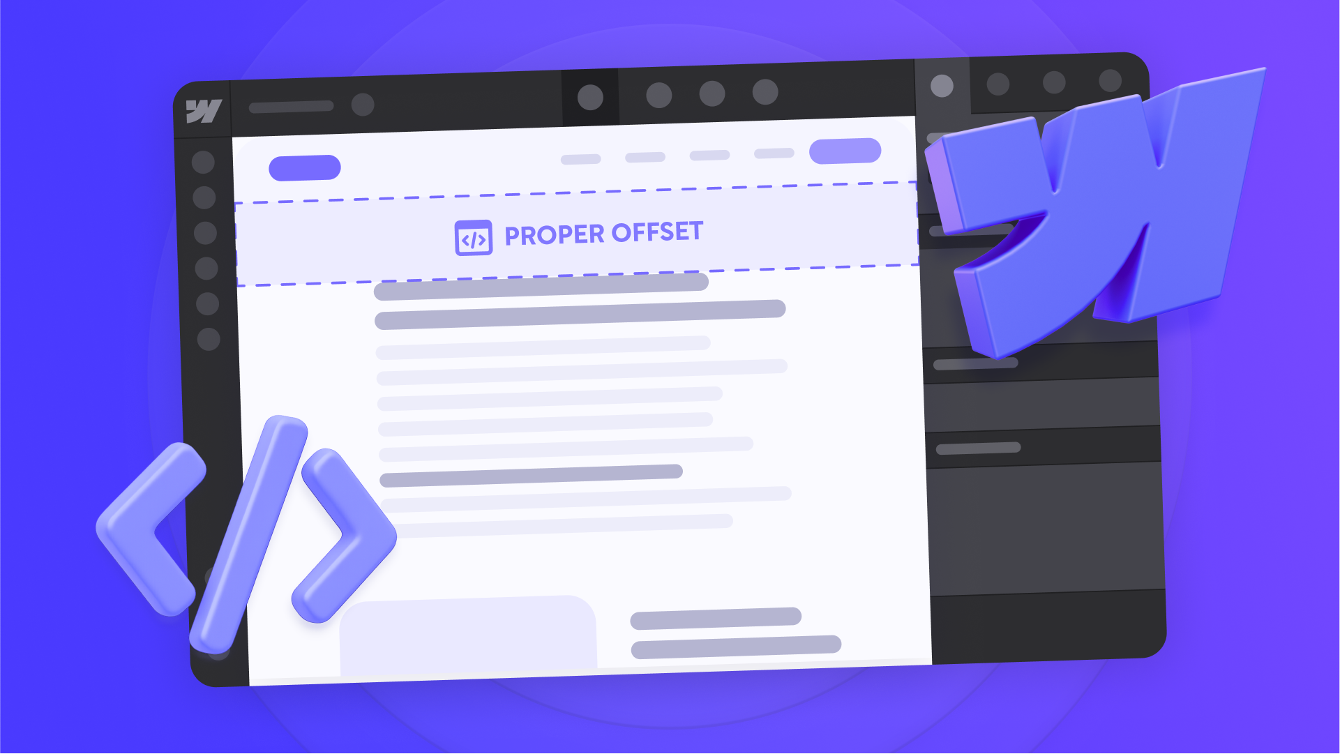
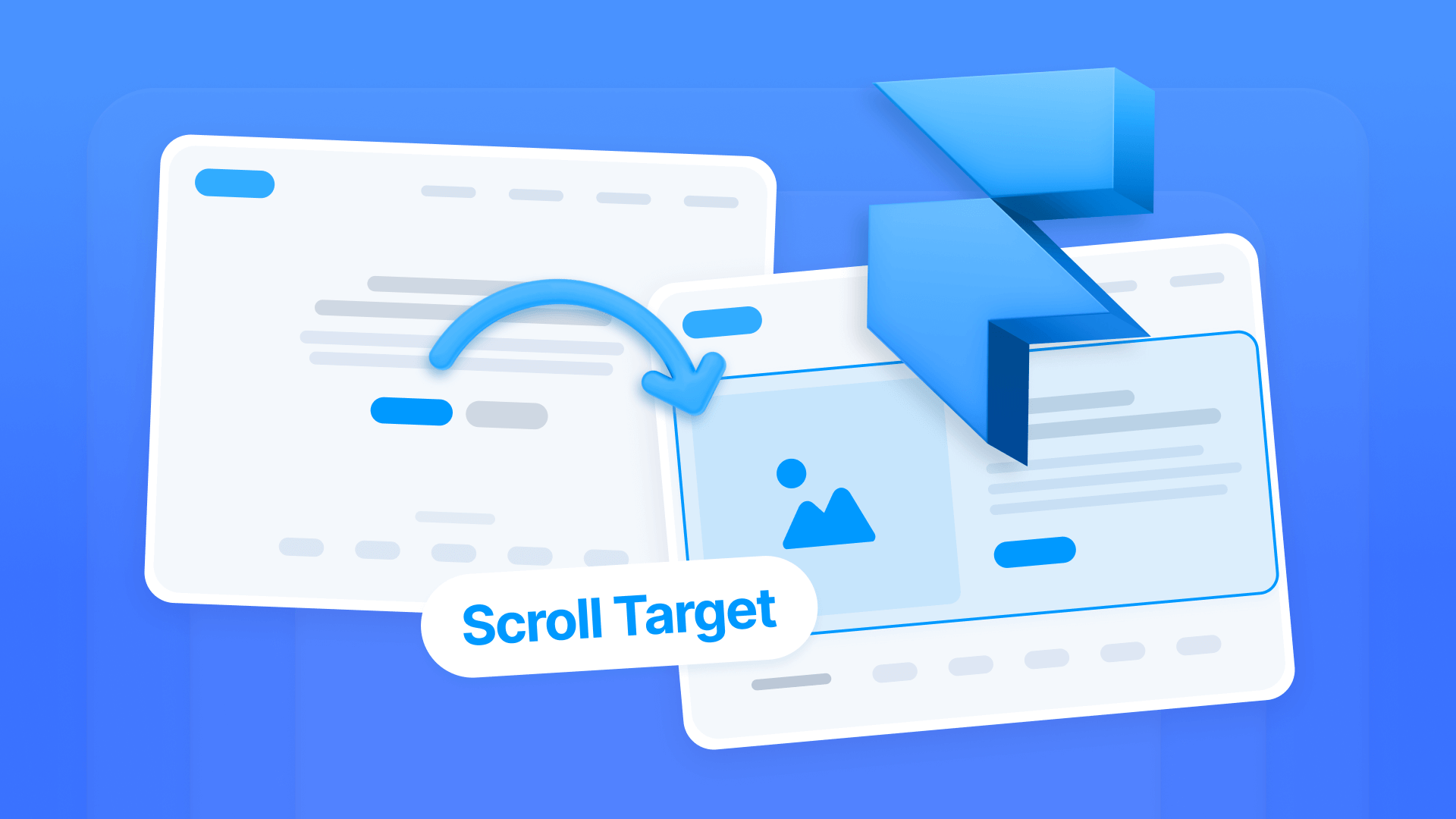
Ever clicked a navigation link on your Webflow site, only to watch the target section's heading disappear behind your sticky navbar? It's a frustrating user experience that makes your site look unpolished and can cause visitors to miss crucial information.
This problem happens because browsers scroll the top of the target section directly to the top of the viewport, without accounting for your sticky navbar's height. In this tutorial, you'll learn to implement a definitive JavaScript solution that gives you total control over scrolling, ensuring every anchor link lands perfectly, every time.
Why fixing anchor links matters for Webflow sites
A smooth navigation experience is fundamental. Solving the sticky navbar issue ensures your site works as well as it looks. Here are the key benefits:
- Flawless landing page navigation: Essential for long sales pages or portfolios where users jump between sections.
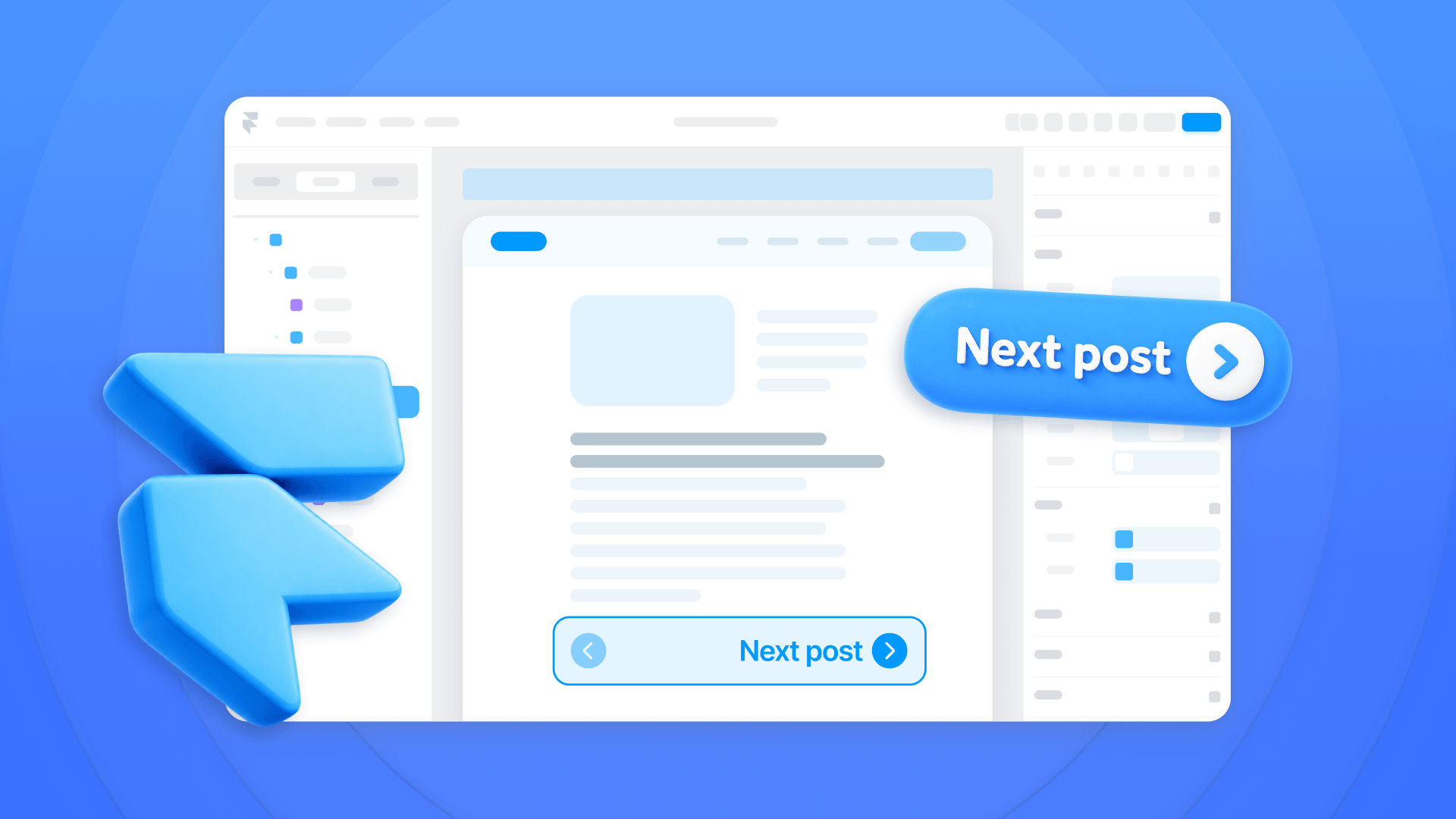
- Better blog readability: Lets readers use a table of contents to navigate long articles without frustration.
- Smooth user experience: Visitors can navigate without important content being hidden, creating a professional impression.
- Reliable external links: When another site links to a specific section, users arrive exactly where they should.
- Better SEO performance: Search engines reward sites that provide a positive user experience.
- Improved accessibility: Users who rely on keyboard navigation will have a more predictable experience.
Understanding the anchor link problem in Webflow
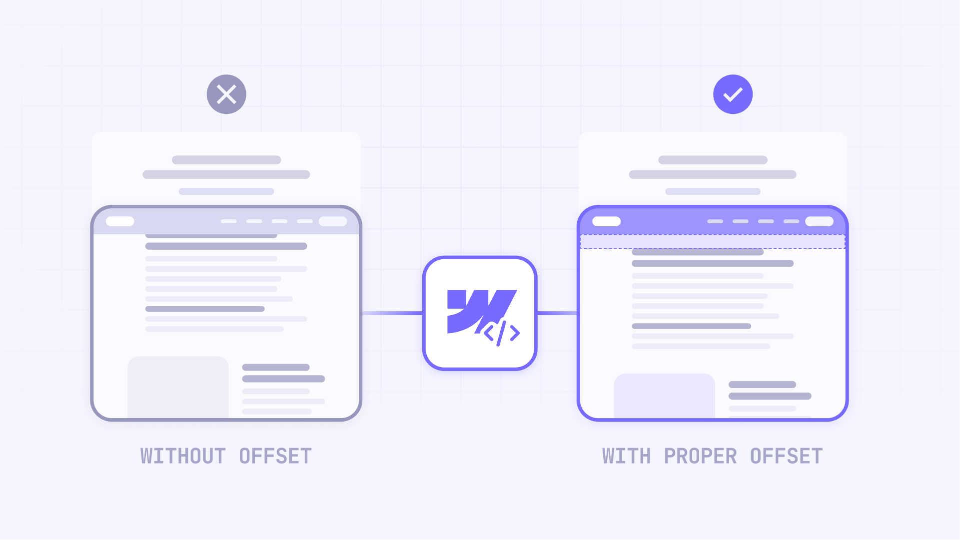
Webflow doesn't automatically adjust scroll position to compensate for sticky navbars. By default, when a user clicks a link like #features, the browser aligns the top of that section with the top of the viewport. However, your sticky navbar remains in place, covering the content.
This behavior is particularly annoying on mobile, where screen space is limited and every pixel counts.
The definitive solution: an easy-to-configure JavaScript script to fix anchor links on Webflow
The most robust way to solve this is with a custom JavaScript snippet. This simplified version lets you manually define the exact offset you need for desktop and mobile, giving you total control.
Implementation across your entire Webflow site
Follow these steps to apply the solution to all pages in your project:
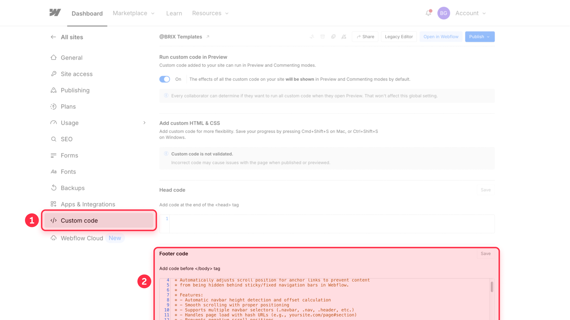
- Go to Project Settings from your Webflow Dashboard.
- Click the Custom Code tab.
- Scroll down to the Footer Code section, labeled Before </body> tag.
- Paste the JavaScript code provided below.
- Click Save Changes and Publish your site.
Implementation on a single Webflow page
If you only need this functionality on a specific page (like a long landing page or the blog post CMS):
- In the Webflow Designer, go to the page you want to modify.
- Click the gear icon (⚙️) to open Page Settings.
- Scroll down to the Custom Code section.
- Paste the code in the Before </body> tag field.
- Save and publish. The script will only run on that page.
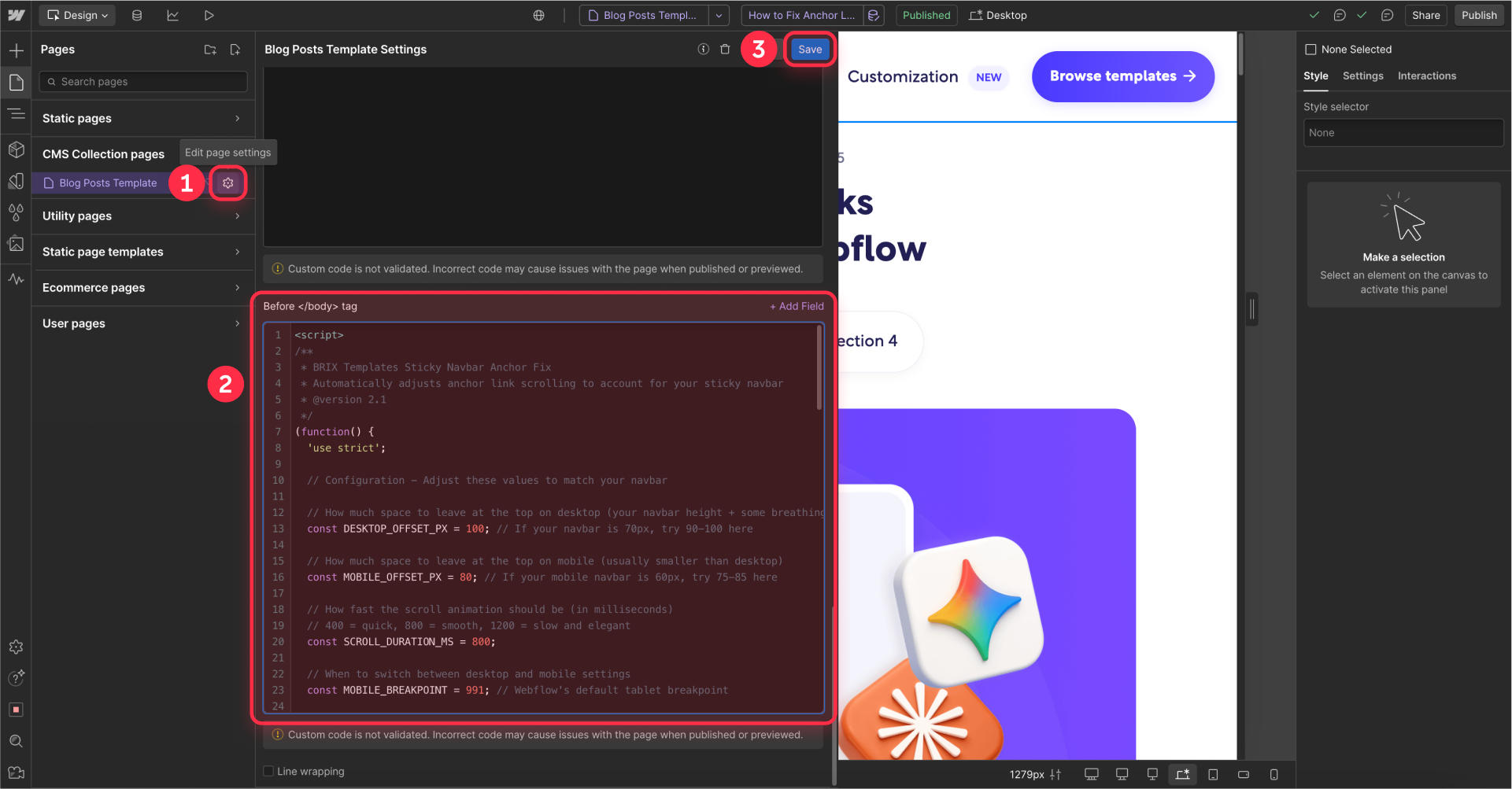
Here's the complete JavaScript code to fix your anchor links:
<script>
/**
 * BRIX Templates Sticky Navbar Anchor Fix
 * Automatically adjusts anchor link scrolling to account for your sticky navbar
 * @version 2.1
 */
(function() {
  'use strict';

  // Configuration - Adjust these values to match your navbar

  // How much space to leave at the top on desktop (your navbar height + some breathing room)
  const DESKTOP_OFFSET_PX = 100; // If your navbar is 70px, try 90-100 here

  // How much space to leave at the top on mobile (usually smaller than desktop)
  const MOBILE_OFFSET_PX = 80; // If your mobile navbar is 60px, try 75-85 here

  // How fast the scroll animation should be (in milliseconds)
  // 400 = quick, 800 = smooth, 1200 = slow and elegant
  const SCROLL_DURATION_MS = 800;

  // When to switch between desktop and mobile settings
  const MOBILE_BREAKPOINT = 991; // Webflow's default tablet breakpoint

  // --- Script Logic (No need to edit below this line) ---
  function scrollToElement(targetElement) {
    const isMobile = window.innerWidth <= MOBILE_BREAKPOINT;
    const offset = isMobile ? MOBILE_OFFSET_PX : DESKTOP_OFFSET_PX;
    const targetPosition = targetElement.offsetTop - offset;
    const finalPosition = Math.max(0, targetPosition);
    const startPosition = window.pageYOffset;
    const distance = finalPosition - startPosition;
    let startTime = null;

    // Easing function for a smooth start and end
    function easeInOutQuad(t, b, c, d) {
      t /= d / 2;
      if (t < 1) return c / 2 * t * t + b;
      t--;
      return -c / 2 * (t * (t - 2) - 1) + b;
    }

    function animation(currentTime) {
      if (startTime === null) startTime = currentTime;
      const timeElapsed = currentTime - startTime;
      const run = easeInOutQuad(timeElapsed, startPosition, distance, SCROLL_DURATION_MS);
      window.scrollTo(0, run);
      if (timeElapsed < SCROLL_DURATION_MS) requestAnimationFrame(animation);
    }

    requestAnimationFrame(animation);
  }

  function setupAnchorLinks() {
    const anchors = document.querySelectorAll('a[href^="#"]');
    for (let i = 0; i < anchors.length; i++) {
      anchors[i].onclick = function(e) {
        const href = this.getAttribute('href');
        if (href && href.length > 1) {
          try {
            const target = document.querySelector(href);
            if (target) {
              e.preventDefault();
              e.stopPropagation();
              scrollToElement(target);
            }
          } catch (error) {
            console.warn('BRIX Anchor Fix: Could not find element for selector:', href);
          }
        }
      };
    }
  }

  function handlePageLoadHash() {
    if (window.location.hash) {
      setTimeout(function() {
        try {
          const targetElement = document.querySelector(window.location.hash);
          if (targetElement) {
            scrollToElement(targetElement);
          }
        } catch (error) {
            // Fails silently for invalid selectors
        }
      }, 100);
    }
  }

  if (window.Webflow) {
    window.Webflow.push(function() {
      if (window.jQuery) {
        window.jQuery(document).off('click.wf-scroll');
      }
    });
  }

  document.addEventListener('DOMContentLoaded', function() {
    setTimeout(function() {
      setupAnchorLinks();
      handlePageLoadHash();
    }, 500);
  });
})();
</script>
How to customize the JavaScript script in Webflow
This script is very easy to customize. You only need to adjust the values in the Simple Configuration section:
DESKTOP_OFFSET_PX: Set the total offset in pixels for desktop screens. How to calculate it: Measure your navbar height in desktop view and add 20-30 pixels of extra space so it doesn't feel cramped. If your navbar is 70px tall, a good value would be 90 or 100.
MOBILE_OFFSET_PX: Do the same for the mobile version. The navbar height is usually different. Measure it and add a small margin. If your mobile navbar is 60px tall, a good value would be 80.
SCROLL_DURATION_MS: Controls the scroll animation duration in milliseconds. A higher value means slower, smoother scrolling, while a lower value makes it snappier.
- 400 is fast scrolling
- 800 is a good starting point, smooth and pleasant
- 1200 is slow, elegant scrolling
Troubleshooting common issues
Anchor links don't work at all: Verify that your target sections have unique IDs in Webflow's Element Settings panel.
The script isn't running: Confirm the code is pasted in the Before </body> tag section and not in Head Code.
Scrolling is incorrect on mobile: Simply adjust the MOBILE_OFFSET_PX value in the script configuration until it's perfect. No need to do anything else.
Links only work sometimes: If your site is very heavy, try increasing the setTimeout value from 500 to 1000 (milliseconds) at the end of the code.
Frequently asked questions about sticky navbar anchor links in Webflow
How do I fix Webflow's sticky navbar covering content?
The most reliable solution is using a JavaScript script in your site's custom code (Before </body> tag). This script intercepts anchor link clicks and calculates an offset (top margin) so content always displays below your navbar, instead of behind it. The script provided in this guide handles all the calculations automatically and works with any sticky navbar height.
Why does my fixed menu in Webflow hide part of the section?
This happens because of how browsers work. When clicking an anchor, the browser aligns the section's start with the window's top. Since your fixed menu is "floating" above, it inevitably covers that top portion. The script solves this by telling the browser to stop scrolling a bit earlier, accounting for your navbar's height.
Can I add an offset in Webflow without using code?
No, Webflow doesn't have a native feature to add scroll offset visually. While there are complex workarounds with interactions, they're not reliable. The standard and most robust way to solve this is with the simple JavaScript script provided in this guide. It's a one-time setup that works permanently across your entire site.
How do I set different offsets for mobile and desktop in Webflow?
The best way is using a script that distinguishes screen size. The code in this article lets you define two values: DESKTOP_OFFSET_PX and MOBILE_OFFSET_PX. The script automatically applies the correct value depending on the user's viewport width. This ensures perfect positioning on all devices without any additional configuration.
Will this affect my site's loading speed in Webflow?
No, the script is lightweight (less than 2KB) and runs after your page loads, so it doesn't impact initial page load speed. It only activates when someone clicks an anchor link, making it completely performance-friendly. The script is also optimized to work efficiently with Webflow's own JavaScript framework.
Conclusion
Implementing anchor links that work flawlessly is a detail that makes a huge difference in your Webflow site's professionalism. With this automated, simplified solution, you can fix this common problem in minutes. Define your offsets, paste the code, and enjoy navigation that's always smooth, precise, and user-friendly.
If you need help implementing this solution or require more advanced custom development, our Webflow team can help with expert support and tailored solutions.


Join readers commenting on this post!