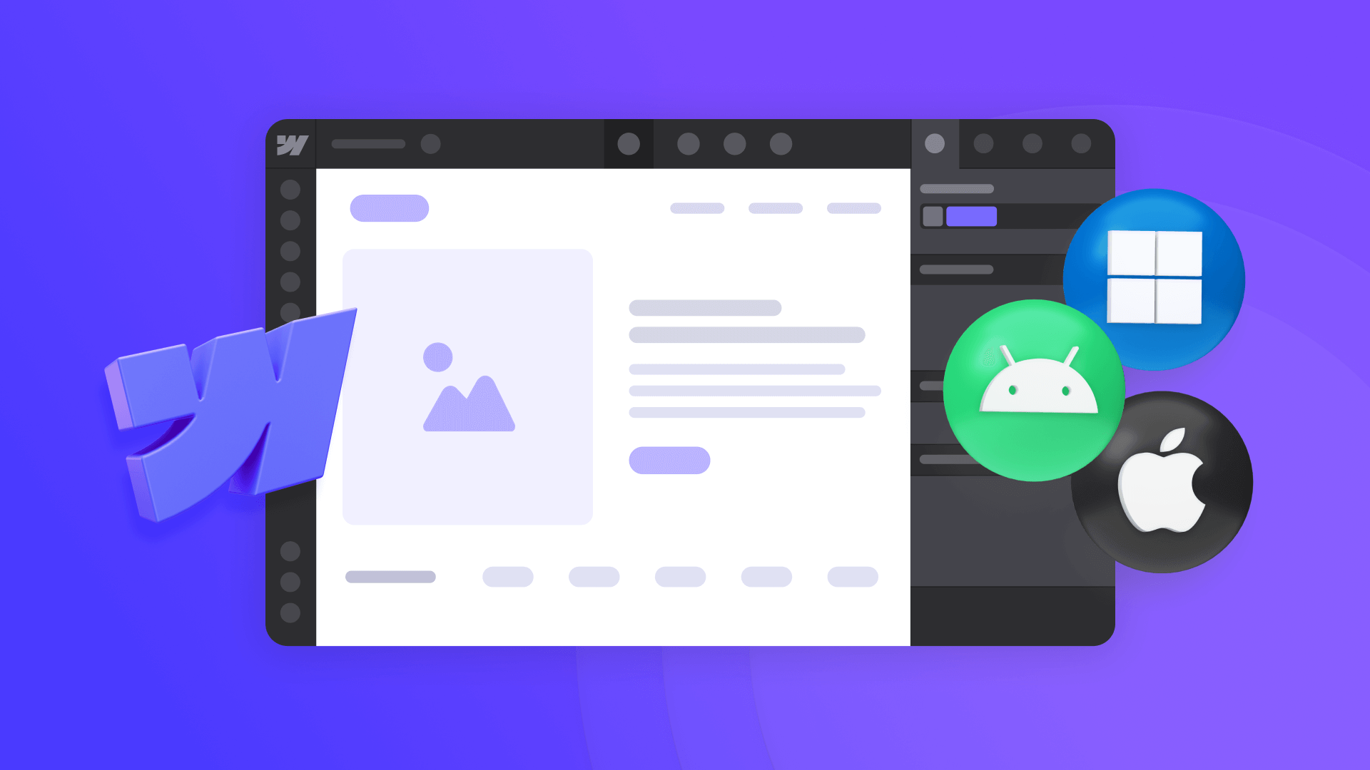
In today's multi-platform world, delivering the right content to users based on their device is crucial for a seamless experience. While there are several solutions available for OS-based content targeting in Webflow, many require complex JavaScript implementation or expensive third-party tools.
This guide introduces a simple, free approach that only requires adding a single attribute to your elements in order to show different content for users depending on their platform (Windows, macOS, Android or iOS).
Why implement OS-based content display in Webflow?
When you're building a website that needs to show different content for different operating systems, having automatic OS detection removes friction and improves user experience. The big benefit of using our script is the following:
- Zero configuration: Just add an attribute to any element you want to control.
- No external dependencies: Everything is handled by a single, lightweight script.
- Automatic detection: Works instantly across all major platforms.
In what scenarios can it be useful to have OS-based content display?
Here are some practical scenarios where OS-based display proves invaluable:
- Software downloads: Present the exact installation file for each user's system (i.e. exe for Windows or DMG for macOS), eliminating confusion and reducing support tickets about downloading the wrong version.
- Mobile app links: Create a seamless app installation experience by automatically directing iOS users to the App Store and Android users to Google Play.
- Installation guides: Provide precise, platform-specific setup instructions that match exactly what users will see on their screens.
- Feature screenshots: Customize your product demonstrations based on the user's platform, ensuring they see features and interfaces that match their actual experience.
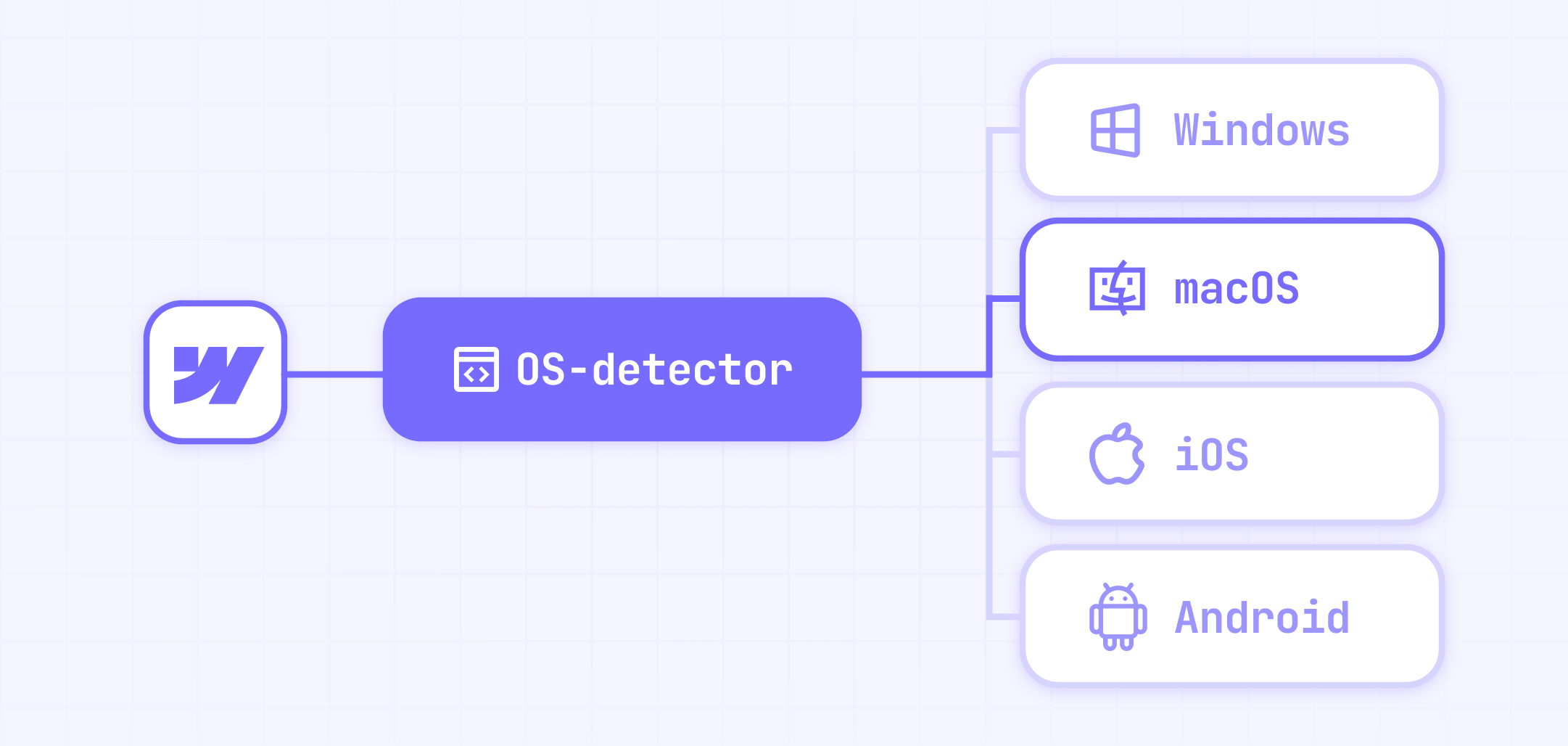
How OS detection works in your Webflow site
The system uses the browser's user agent string to identify the visitor's operating system, categorizing them into one of these groups:
- windows: For Windows desktop users
- macos: For Mac desktop users
- ios: For iPhone and iPad users
- android: For Android device users
- fallback: For other platforms (Linux, ChromeOS, etc.)
When a visitor loads your page, the script automatically checks their OS and reveals any elements tagged for that platform using smooth fade-in animations.
Adding our free script to set up OS detection in Webflow
First, you'll need to add the detection script to your Webflow project. Here's how:
Go to your Project Settings in Webflow > Navigate to the Custom Code tab.
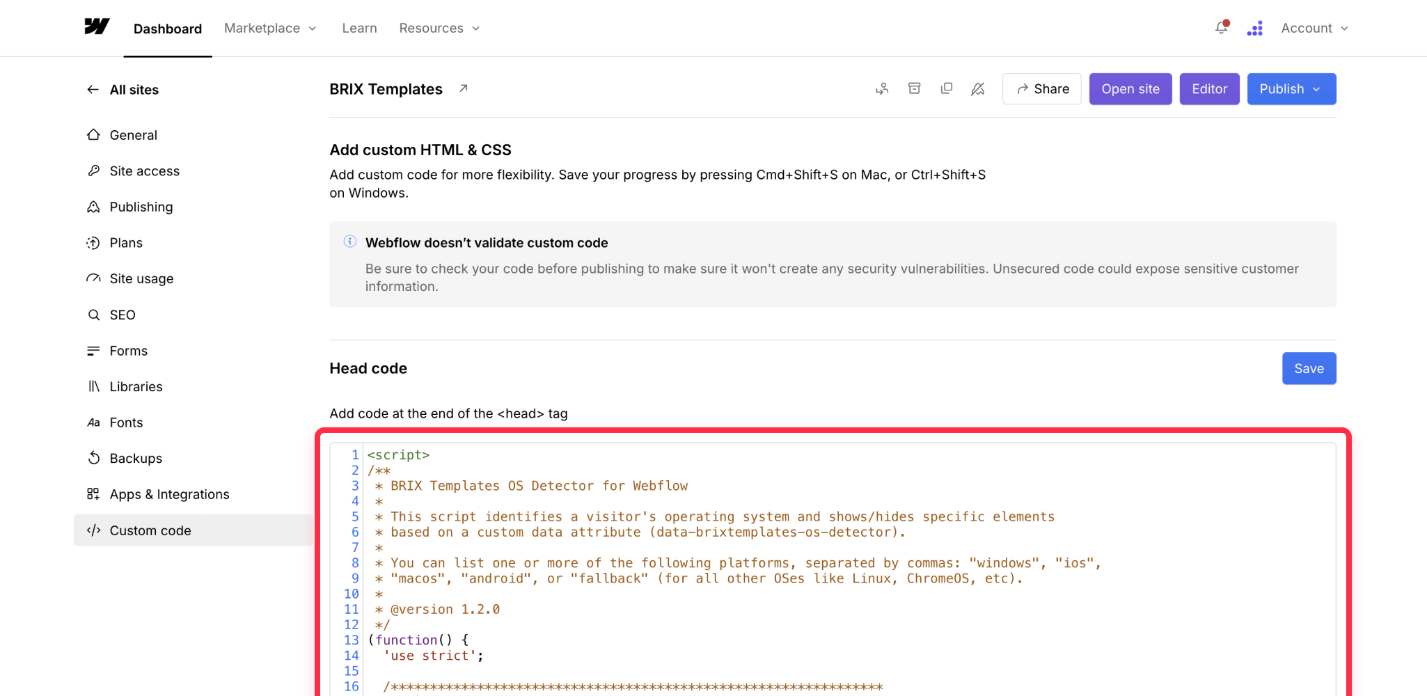
Once you are in there, paste the following script in the Head section:
<script>
/**
 * BRIX Templates OS Detector for Webflow
 *
 * This script identifies a visitor's operating system and shows/hides specific elements
 * based on a custom data attribute (data-brixtemplates-os-detector).
 *
 * You can list one or more of the following platforms, separated by commas: "windows", "ios",
 * "macos", "android", or "fallback" (for all other OSes like Linux, ChromeOS, etc).
 *
 * @version 1.2.0
 */
(function() {
  'use strict';

  /***************************************************************
   * 1) Inject CSS styles into <head>
   ***************************************************************/
  var styleEl = document.createElement('style');
  styleEl.type = 'text/css';
  styleEl.appendChild(document.createTextNode(`
    /* Hide OS-specific items by default (display: none) */
    .brix-templates-os-hidden {
      display: none !important;
    }

    /* Sets up fade-in-up transition (initial state: opacity=0, y=20px) */
    .brix-templates-os-anim {
      opacity: 0;
      transform: translateY(20px);
      transition: opacity 0.4s ease, transform 0.4s ease;
    }

    /* Final "show" state: fade in + move up to original position */
    .brix-templates-os-anim.brix-templates-os-show {
      opacity: 1;
      transform: translateY(0);
    }
  `));
  document.head.appendChild(styleEl);

  /***************************************************************
   * 2) Setup DOM Loader Handler
   ***************************************************************/
  if (document.readyState === 'loading') {
    document.addEventListener('DOMContentLoaded', initBrixOSDetector);
  } else {
    initBrixOSDetector();
  }

  /**
   * Main function: detect OS, show matching elements
   */
  function initBrixOSDetector() {
    var userOS = detectUserOS();
    var osElements = document.querySelectorAll('[data-brixtemplates-os-detector]');

    if (!osElements.length) {
      return; // No elements found, no action needed
    }

    osElements.forEach(function(el) {
      var attrVal = el.getAttribute('data-brixtemplates-os-detector') || '';
      // e.g. "windows,macos" => ["windows", "macos"]
      var possibleOSes = attrVal.toLowerCase().split(',').map(function(v) {
        return v.trim();
      });

      // If the user's OS is in the list, reveal it
      if (possibleOSes.includes(userOS)) {
        fadeInUpElement(el);
      }
      // If userOS == 'fallback', only show if 'fallback' is in that attribute
      else if (userOS === 'fallback' && possibleOSes.includes('fallback')) {
        fadeInUpElement(el);
      }
    });
  }

  /**
   * Detects user's OS. Returns 'windows', 'ios', 'macos', 'android', or 'fallback'.
   */
  function detectUserOS() {
    var ua = navigator.userAgent.toLowerCase();
    var platform = (navigator.platform || '').toLowerCase();

    // First check for iOS devices (including iPads)
    if (
      /ipad|iphone|ipod/.test(ua) ||
      (platform === 'macintel' && navigator.maxTouchPoints > 1) // Modern iPads
    ) {
      return 'ios';
    }

    // Windows
    if (ua.indexOf('win') !== -1 || ua.indexOf('windows nt') !== -1) {
      return 'windows';
    }

    // Android
    if (ua.indexOf('android') !== -1) {
      return 'android';
    }

    // macOS (check after iOS to avoid false positives with iPads)
    if (
      (ua.indexOf('macintosh') !== -1 || ua.indexOf('mac os x') !== -1) &&
      !(/ipad|iphone|ipod/.test(ua)) &&
      !(platform === 'macintel' && navigator.maxTouchPoints > 1)
    ) {
      return 'macos';
    }

    // Otherwise, fallback
    return 'fallback';
  }

  /**
   * Reveals an element with a fade-in-up animation
   * @param {Element} el - The OS-specific element
   */
  function fadeInUpElement(el) {
    // Remove display:none (brix-templates-os-hidden)
    el.classList.remove('brix-templates-os-hidden');

    // Add animation base class (opacity:0, y=20)
    el.classList.add('brix-templates-os-anim');

    // Force a reflow so browser sees the start state
    void el.offsetWidth;

    // Finally trigger the show transition (opacity:1, y=0)
    el.classList.add('brix-templates-os-show');
  }

})();
</script>
Let's break down how this script works, explaining sequentially every step:
- Style Injection: The script automatically adds necessary CSS styles to your page:
- A class to hide elements by default (brix-templates-os-hidden)
- OS Detection: Using the browser's user agent string, it accurately identifies:
- Windows systems (including different versions)
- iOS devices (iPhone and iPad)
- macOS computers
- Android devices
- Other platforms (grouped as "fallback")
- Element Management:
- Finds all elements with the data-brixtemplates-os-detector attribute
- Checks if the user's OS matches the allowed platforms for each element
- Handles multiple OS values (comma-separated) per element
- Manages fallback cases appropriately
Setting up OS-specific elements in the Webflow designer
Once you've added the script, you can start marking elements for OS-specific display. Here's how:
- Select any element you want to control in the Webflow Designer
- Add the class brix-templates-os-hidden to hide it by default
- Open the element's Settings panel
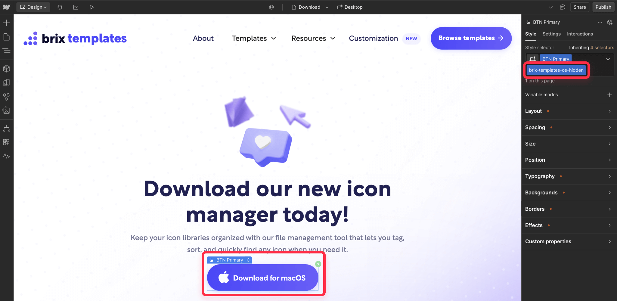
Once you are inside the element's Settings panel, add a custom attribute with the following data:
- Name: data-brixtemplates-os-detector
- Value: One or more OS names that you want to show this element for (i.e. windows)
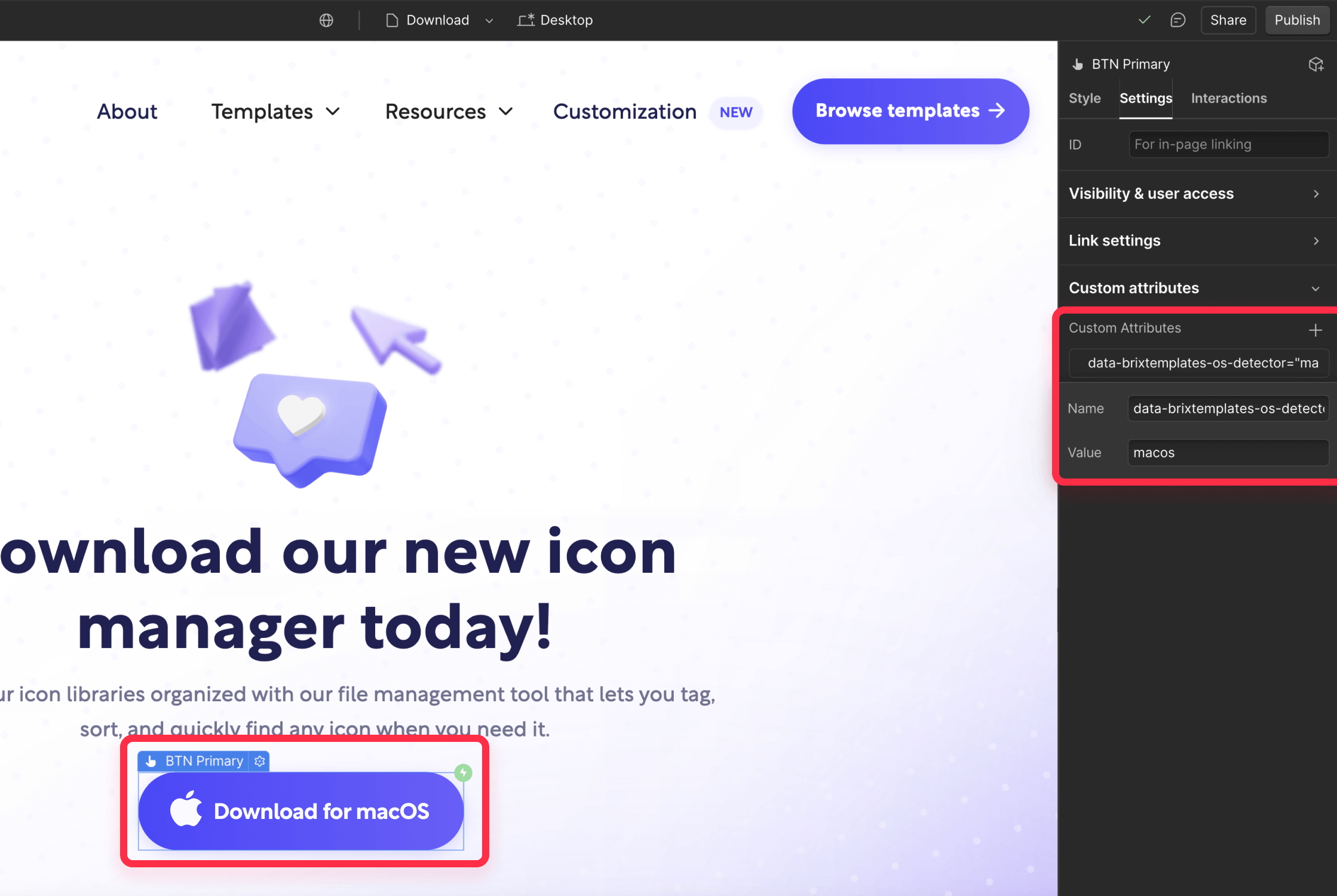
You'll need to repeat this process for each OS-specific element on your page. For example, if you have a "Download for macOS" button like the one shown in the image, you'd add the brix-templates-os-hidden class and set the data-brixtemplates-os-detector attribute value to "macos" — This ensures the macOS download button only appears for Mac users while remaining hidden for everyone else.
Then, you repeat the same process for the button for the other OS, and you're done!
Testing OS detection on your Webflow site
Before launching, verify that your implementation works correctly:
- Publish to staging: Deploy your site with the script and OS-specific elements to your staging environment
- Test OS detection: Use different devices or browser developer tools to test detection
- Verify visibility: Confirm that elements appear correctly for each platform
- Check animations: Ensure that fade-in animations work smoothly
- Test fallback: Verify that fallback content appears when appropriate
- Publish live: Once everything is working correctly, publish your site to production
Common questions and troubleshooting
Why aren't my elements showing up?
- Verify the brix-templates-os-hidden class is applied
- Check that the data-brixtemplates-os-detector attribute is spelled correctly
- Confirm the OS values are lowercase and comma-separated (if using more than one)
- Make sure the script is added to your project's Custom Code section
Can I show elements for multiple operating systems?
Yes, just separate the OS names with commas in the attribute value (i.e. 'windows, macos')
Wrapping up
Implementing OS-based element display in Webflow doesn't have to be complicated. With our approach, you can create tailored experiences for different platforms using just a simple attribute and our lightweight script. This leads to cleaner interfaces, better user experiences, and ultimately, more effective websites.
Need help implementing more advanced OS detection or device-specific customizations? Our Webflow agency can help you create sophisticated targeting solutions, whether you need to distinguish between iPhones and iPads, target specific Linux distributions, or implement any other granular device detection scenarios. Get in touch to discuss how we can help optimize your site for all platforms.


Join readers commenting on this post!