
Modern websites often need mobile-exclusive content. App download banners, touch-optimized buttons, and location-based features make perfect sense on smartphones but feel completely out of place on desktop screens.
Webflow's breakpoint system allows you to create mobile-only elements that enhance smartphone experiences while staying invisible to desktop users.
Why mobile-only elements matter for Webflow sites
- App store promotions: Display download buttons for iOS/Android apps that desktop users can't install
- Touch-specific interfaces: Show swipe indicators and gesture controls irrelevant to mouse users
- Location-based services: Present "Call Now" or "Get Directions" leveraging mobile device capabilities
- Device-native features: Include camera scanners, mobile payments, or SMS opt-ins unavailable on desktop
- Simplified mobile workflows: Create streamlined processes perfect for small screens but unnecessary on large displays
How to create mobile-only elements in Webflow
The technique requires hiding elements from desktop users first, then making them appear exclusively on mobile breakpoints.
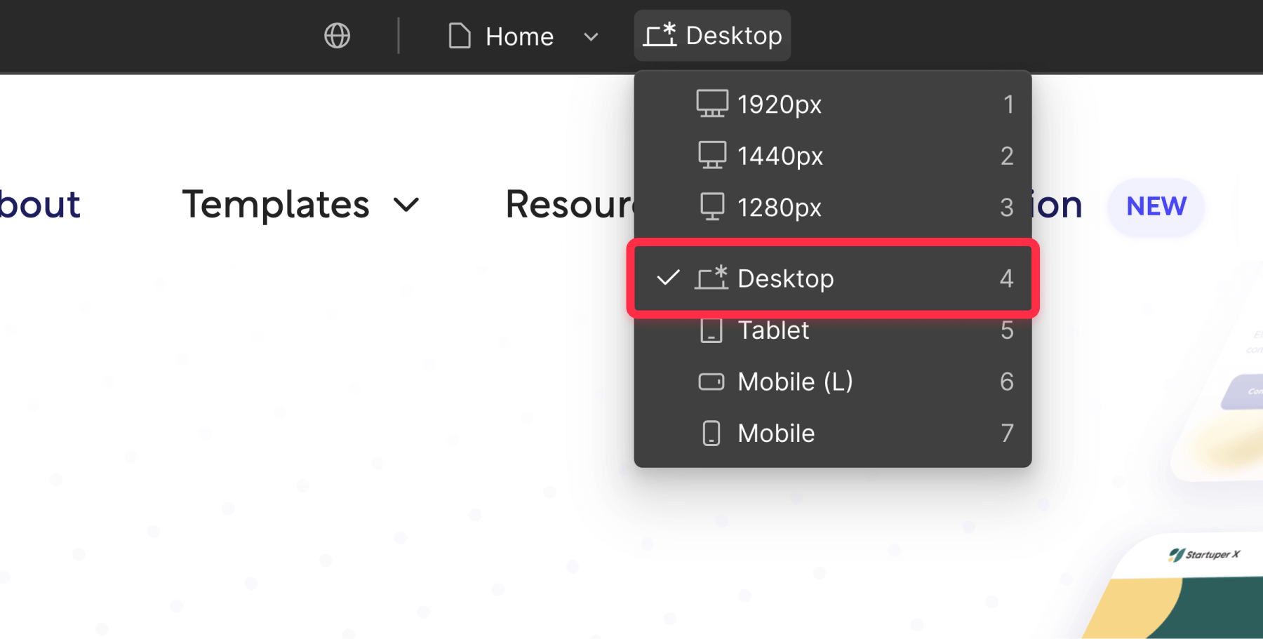
- Launch your Webflow project in the Designer interface
- Ensure you're working in Desktop view (monitor icon at the top center)
Before proceeding, understand this important concept:
Webflow's class inheritance system: Properties applied to larger screens automatically flow down to smaller ones. When you hide something on Desktop, it also disappears on Tablet and Mobile by default. In order to avoid this, you must then manually restore visibility on Mobile to create mobile-exclusive content.
How to hide elements from desktop users in Webflow
- Click on your chosen element within the design canvas
- Access the Styles panel (paintbrush icon) located in the right sidebar
- Locate the Layout section and identify the Display setting
- Switch Display from "Block" / "Flex" to "None"
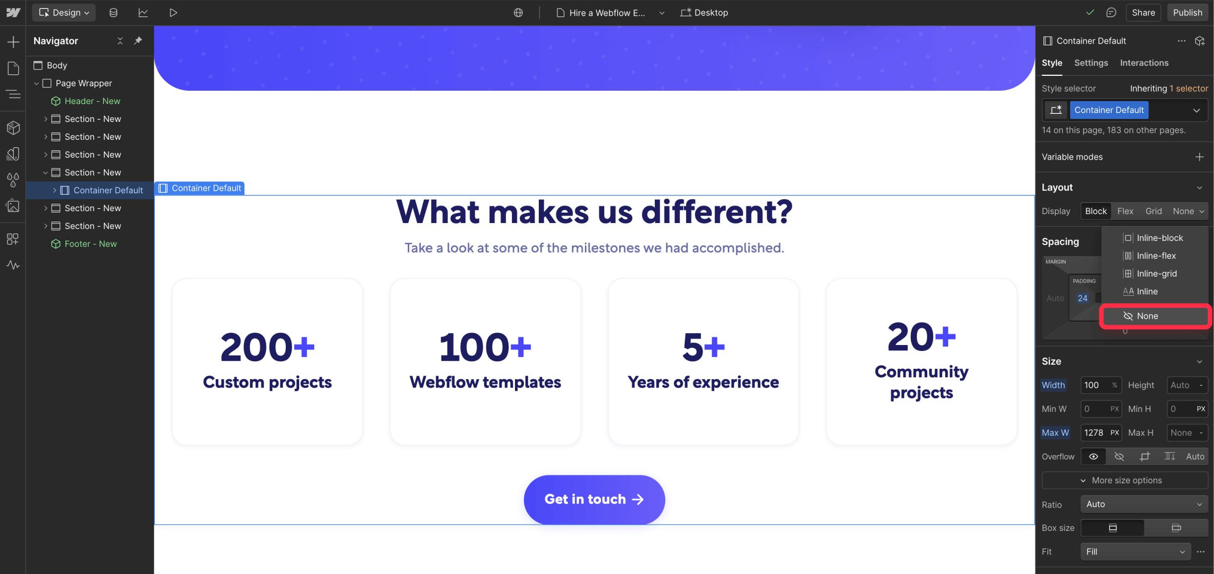
Your element will vanish from the desktop preview, confirming that desktop users won't see it. Now, let’s enable them on mobile devices.
How to make elements appear exclusively on mobile in Webflow
For elements that should only exist on smartphones:
- Stay in Desktop view and complete the hiding step above
- Switch to Mobile portrait or Mobile landscape breakpoint using the device icons
- Select the same element using the Navigator panel (since it's invisible on canvas, as we just added Display: None)
- Change Display from "None" back to "Block" or "Flex" to restore mobile visibility
Verifying your mobile-only content works
Check visibility across different screen sizes
- Desktop/Tablet views: Elements remain hidden and don't disrupt the layout
- Mobile breakpoints: Elements display properly and integrate smoothly
Validate on actual devices
- Publish your website to the staging environment using the Publish button
- Access your site using real smartphones with various browsers (Safari, Chrome, etc) installed
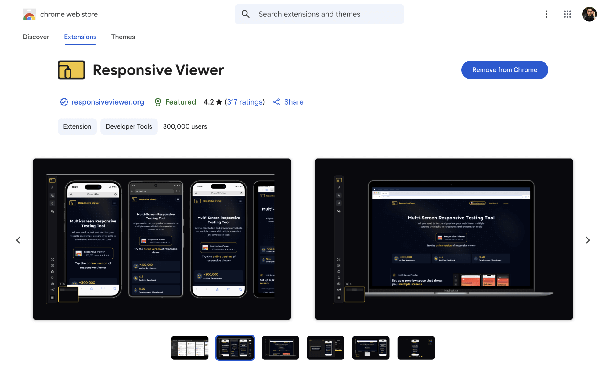
- Install Responsive Viewer Chrome extension to simulate multiple device dimensions simultaneously
Fixing common mobile-only element problems
- Elements appear on desktop: Confirm Display property reads "None" in Desktop breakpoint, not "Hidden"
- Missing on mobile devices: Verify Display shows "Block" or "Flex" in Mobile breakpoint settings
Frequently asked questions
When should I use mobile-only content instead of a responsive design in Webflow? Create mobile-exclusive elements when features specifically require smartphone capabilities (app installations, call buttons, etc) that desktop environments cannot provide.
What happens to mobile-only elements during device rotation? Rotating smartphones typically maintains mobile-only element visibility since both portrait and landscape orientations use mobile breakpoints. Test both orientations to ensure proper display.
Conclusion
Creating smartphone-exclusive content through strategic desktop hiding unlocks powerful targeting opportunities in Webflow. By designing elements that leverage mobile device capabilities while keeping desktop interfaces uncluttered, you deliver experiences tailored to each platform's unique strengths.
Smart mobile-only design recognizes that smartphones and desktops serve different user contexts. Strategic implementation can significantly boost engagement and conversions among mobile audiences.
Looking to implement advanced mobile-first strategies? Our top Webflow agency excels at creating device-optimized experiences that maximize each platform's potential while maintaining brand consistency.


Join readers commenting on this post!