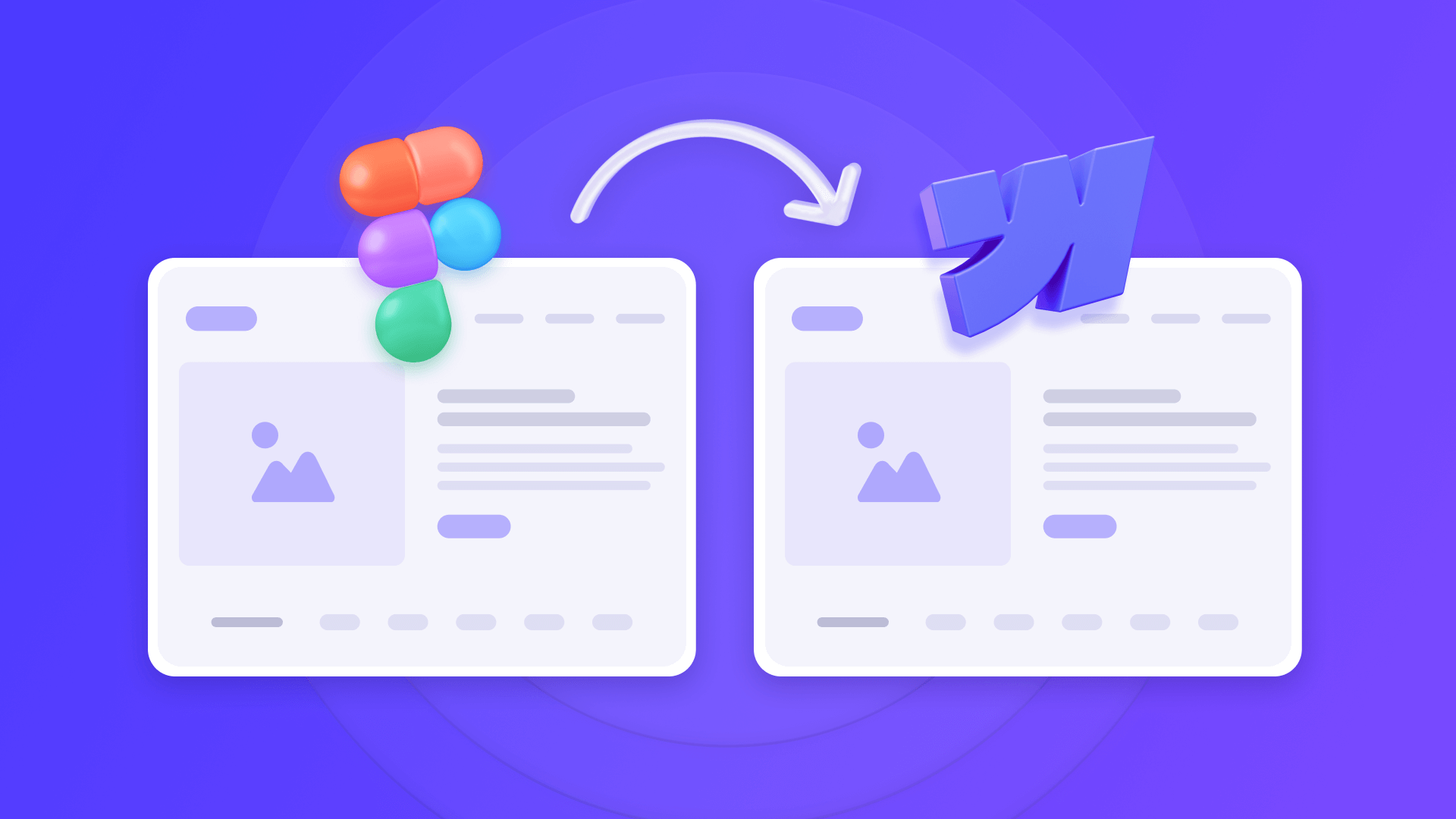
Figma and Webflow are two powerful tools for designers and developers. Figma offers an easy-to-use interface for creating detailed UI/UX designs, while Webflow lets designers turn those designs into websites without needing to code.
However, moving designs from Figma to Webflow can be tough without a clear plan. This guide will present best practices for converting Figma designs into Webflow projects that are scalable and responsive, making sure everything stays consistent, efficient, and easy to maintain.
What you will learn
By following this guide, you will learn:
- How to understand Figma frames and styles in Webflow’s visual design environment.
- Techniques to set up reusable structures, classes, and components.
- How to keep design consistency using Webflow’s Variables and Components
- Best practices for responsive design and accessibility in Webflow.
- Strategies to optimize performance and keep your project scalable.
- Advanced tips for adding animations and improving user experience.
Why it matters
A well-organized approach ensures smooth teamwork between design and development teams, cuts down on repeated work, and improves scalability. This guide helps you effectively recreate Figma designs in Webflow’s no-code platform while keeping the original design’s intent.
Following these practices also makes sure your projects are ready for the future, easier to update, and optimized for user satisfaction.
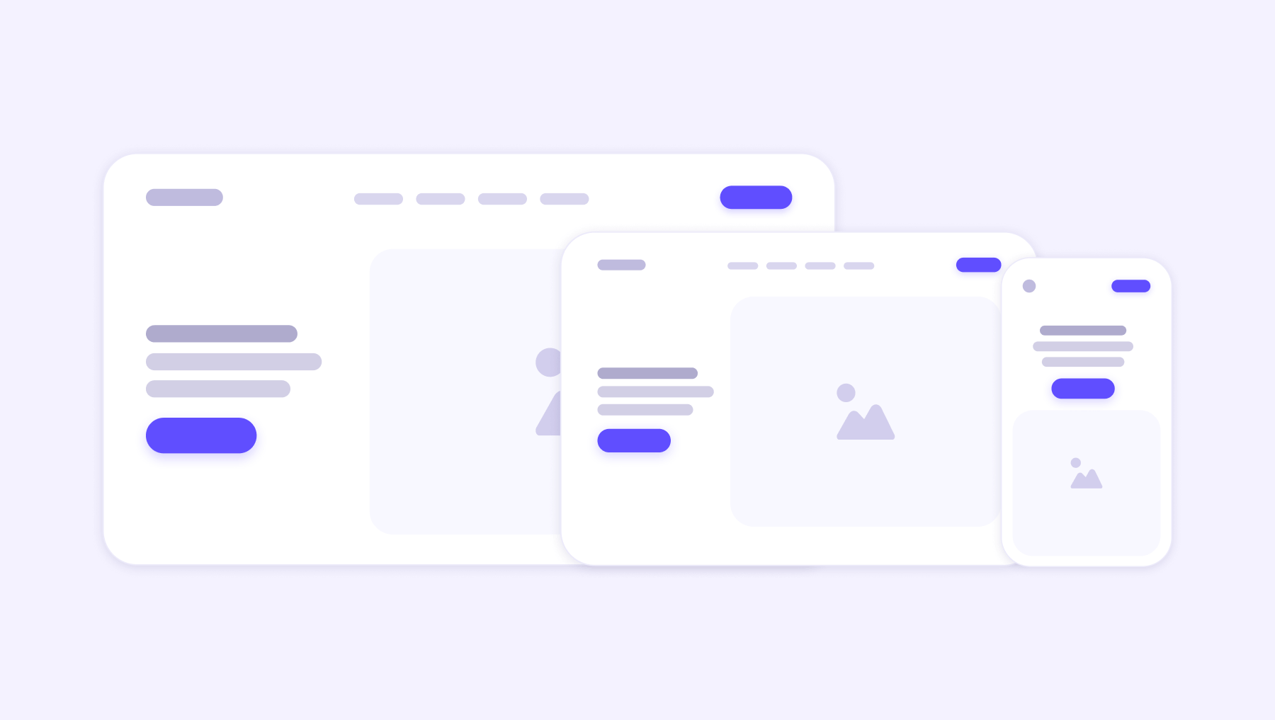
1. Translating structure and layout to Webflow
In Figma, designs are arranged in frames and layers, while Webflow uses sections, containers, and divs. Start by matching Figma’s frames to Webflow’s structural elements:
- Sections: Represent top-level frames in Figma, like hero sections or footers.
- Containers: Center content using Webflow’s built-in container or custom div blocks with maximum width settings.
- Div blocks: Create more detailed layouts, similar to Figma’s nested groups.
Leveraging Webflow’s grid and flexbox
Figma designs often use a grid system to line up elements. Do the same in Webflow:
- Use grid layout for organized designs like cards or galleries.
- Apply flexbox for flexible layouts such as navigation bars or centered sections.
- Keep all widths, heights, margins and paddings on Webflow the same as the Figma design
Semantic structure for accessibility
Use proper semantic HTML tags, like header, section, footer, in Webflow to improve SEO and accessibility. This helps screen readers and search engines understand your content better. Make sure each page has a logical reading order, even for users who navigate without seeing.
2. Defining color palette as Webflow variables
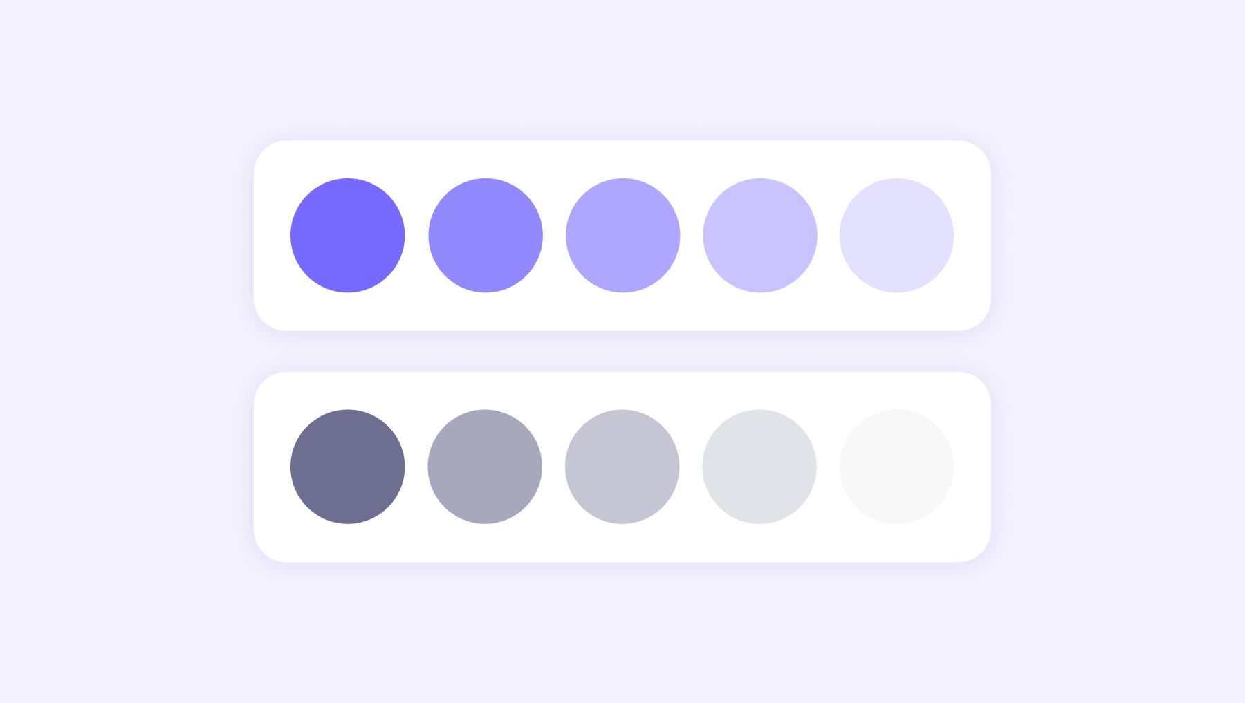
Defining and organizing color variables is crucial for creating a consistent and scalable design system. Start by extracting the global colors from your Figma design system and transferring them to Webflow as Variables. This keeps the visual look consistent and makes further updates and customization to individual elements easier.
Categorizing color variables
Organize your colors into clear categories:
- Primary colors: Show your brand’s main identity, often used for key UI elements like buttons or highlights (e.g., --color-primary, --color-primary-hover).
- Secondary colors: Complementary tones that contrast with primary colors (e.g., --color-secondary, --color-secondary-dark).
- Accent colors: Used sparingly for emphasis or to draw attention (e.g., --color-accent-success, --color-accent-warning).
- Neutral colors: A range of shades from light to dark for headings, borders, and text. Examples include:
- --color-neutral-100: Lightest shade (e.g., #F9F9F9).
- --color-neutral-200: Slightly darker (e.g., #EDEDED).
- --color-neutral-300: Light gray (e.g., #DADADA).
- --color-neutral-400: Mid gray (e.g., #B3B3B3).
- --color-neutral-500: Standard gray (e.g., #8C8C8C).
- --color-neutral-600: Dark gray (e.g., #666666).
- --color-neutral-700: Almost black (e.g., #333333).
- --color-neutral-800: True black (e.g., #000000).
Naming conventions for variables
Use clear and descriptive names for variables to show their purpose. For example:
- --background-light
- --text-primary
- --border-default
Write down these variables in a shared style guide for consistency (on a Webflow page, Notion file, or your preferred tool of choice) and easy access by your team.
Implementing themes (aka dark or light mode)
If your design has light and dark modes, use theme-based variables to make switching styles easier. Group variables into folders like "Light Mode" and "Dark Mode." Use these methods:
- Dynamic classes: Apply classes like light-mode or dark-mode at the root level to switch styles.
- Scoped variables: Define specific colors for each theme (e.g., --background-light: #FFFFFF for light mode and --background-light: #1A1A1A for dark mode).
Testing is important to ensure smooth transitions between themes without color mismatches or readability problems.
Checking color accessibility
Accessibility is crucial in modern web design, and even more if you are a big company and are looking to comply with certain regulations or get certain certifications. Make sure your color choices meet WCAG (Web Content Accessibility Guidelines) for contrast and usability.
Use tools like WebAIM’s Contrast Checker to check the contrast between text and backgrounds, and keep a contrast ratio of at least 4.5:1 for normal text and 3:1 for large text.
By carefully defining, implementing, and testing your color variables, you build a strong and user-friendly visual base for your Webflow project.
3. Loading your Figma fonts into Webflow
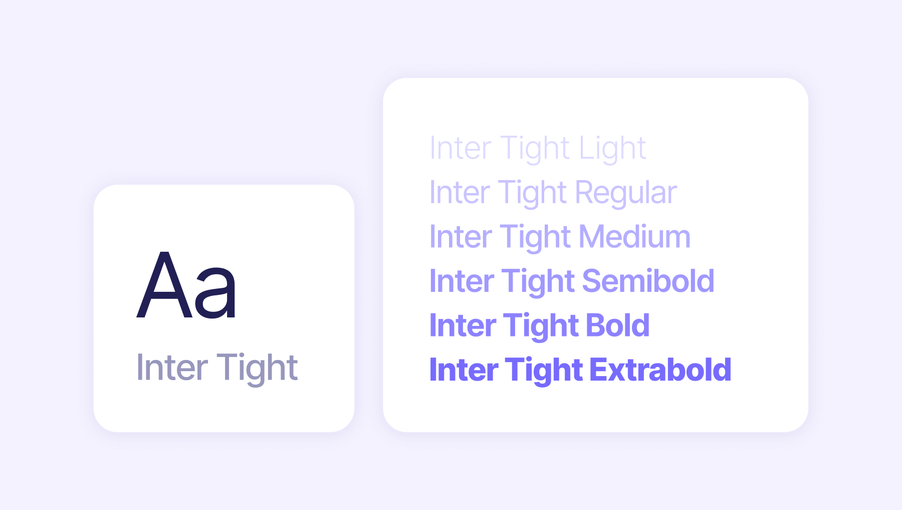
In Webflow, managing fonts, type scales, and responsive typography properly ensures consistency and readability on all devices. In this section, we will cover best practices for syncing fonts, creating a scalable typography system, and optimizing text for the best user experience.
Connecting fonts
Choosing and adding fonts is the first step in creating a solid typography system. To make sure your Webflow project matches the designs in Figma:
- Google Fonts: Google Fonts has a large library of free fonts. Add them easily through Webflow’s Project Settings, choosing specific font weights and subsets to reduce performance issues.
- Adobe Typekit: For a more extensive and professional font library, use Adobe Typekit (Adobe Fonts). Sync the chosen font families with Webflow by linking your Adobe account.
- Third-party fonts: If your Figma design uses custom or third-party fonts, make sure to buy the necessary web licenses to avoid legal problems. Upload these fonts directly into Webflow’s Fonts section on the Project Settings and set them up correctly.
Don’t use too many font weights or families to keep load times short.
Establishing a type scale
A clear and consistent type scale is essential for visual harmony and clear hierarchy on your site. A well-defined type scale improves readability and makes your design look cohesive. In Webflow, use variables to set font sizes, line heights, and spacing that fit your project. Here is an example of a type scale system with 12 levels, but you can easily create your own based on your design system requirements:
- H1 - display large: For main headlines or hero sections. Example: --h1-display-large (3.5rem, 56px line height).
- H2 - display medium: Secondary important headings. Example: --h2-display-medium (2.75rem, 48px line height).
- H3 - display small: Subheadings with emphasis. Example: --h3-display-small (2rem, 40px line height).
- H4 - title large: For section titles or key highlights. Example: --h4-title-large (1.75rem, 32px line height).
- H5 - title medium: Smaller section headers. Example: --h5-title-medium (1.5rem, 28px line height).
- H6 - title small: For tertiary headings or content labels. Example: --h6-title-small (1.25rem, 24px line height).
- Paragraph large: Standard body text for featured sections. Example: --paragraph-large (1.125rem, 20px line height).
- Paragraph medium: Default body text. Example: --paragraph-medium (1rem, 18px line height).
- Paragraph small: For captions or disclaimers. Example: --paragraph-small (0.875rem, 16px line height).
- Caption large: Small print for callouts or emphasis. Example: --caption-large (0.8125rem, 14px line height).
- Caption small: Tiny supplementary text. Example: --caption-small (0.75rem, 12px line height).
- Overline: Uppercase text for categories or labels. Example: --overline (0.75rem, 14px line height, letter-spacing 0.1em).
Match your type scale with the modular scale used in your Figma design for a smooth transition. Write down these variables and their uses in a style guide to standardize typography across your project and keep the team on the same page.
Responsive typography
Typography should adjust smoothly to different screen sizes and resolutions. Webflow’s breakpoint system lets you customize text styles for different devices:
- Heading sizes: Make heading sizes smaller on smaller screens while keeping the hierarchy. For example, style H1s on mobile like H2s or H3s on desktop.
- Line spacing and margins: Change line heights and paragraph margins to avoid overcrowding or too much space on smaller screens.
Test your typography on different devices to make sure the user experience is consistent. Focus on keeping text readable and avoiding text that is too big or too small.
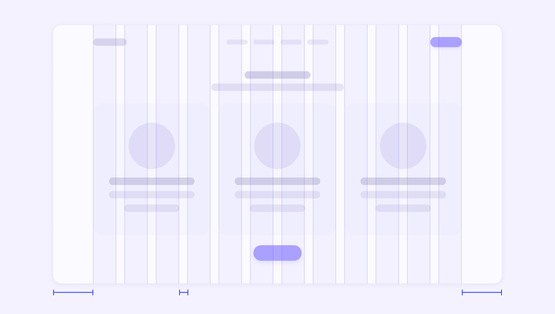
4. Design system for spacing and sizing tokens
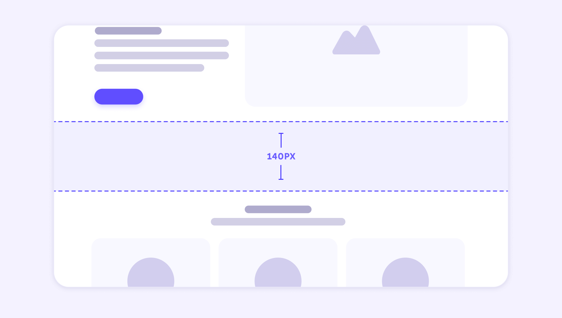
By building a system based on consistency and scalability, you can keep a smooth visual rhythm and balance in your Webflow project. This section explores how to use spacing tokens, keep alignment, and test adaptability for various content types.
Using spacing tokens
Set up a strong spacing system by making global variables for margins, paddings, and gaps. This not only keeps things consistent but also allows for quick changes across your project. Examples of spacing tokens include:
- --space-xs (4px): Great for small gaps or tight layouts.
- --space-sm (8px): For compact spacing between related elements.
- --space-md (16px): Standard spacing for paragraphs and block elements.
- --space-lg (32px): Used for separating sections or major content blocks.
Write these tokens down in your style guide, explaining their intended uses. This helps team members work together more efficiently and stick to the design system.
Maintaining consistency
Use uniform vertical and horizontal spacing to keep a cohesive rhythm across sections. Here’s how:
- Standardize margins and paddings: Use reusable spacing classes like margin-medium or padding-large to keep gaps between elements consistent.
- Leverage grid systems: Use Webflow’s grid and flexbox layouts to spread spacing evenly and create alignment.
- Align with design tokens: Match each spacing token to its use case from Figma, ensuring the design and implementation are the same.
Test your spacing by previewing pages with different content lengths to make sure the design holds up with short text blocks or long paragraphs.
By following these spacing and sizing best practices, you create a flexible base that supports design consistency while allowing for scalability and adaptability in future updates.
5. Imagery and media best practices
Optimizing images and managing media properly ensures high performance, accessibility, and visual consistency. By using modern formats and following SEO and accessibility best practices, you can significantly enhance Webflow site's build quality.
Optimizing images
When preparing images for Webflow, it's important to balance quality and performance. Start by exporting images from Figma at @2x resolution for your needs—ensuring to use the proper formats:
File formats:
- WEBP: A newer format that combines the best of JPG and PNG, offering better compression and quality.
- JPG: Good for photos because they have smaller file sizes and decent quality for most uses. Only use it over WEBP if you have a high share of old-browser users.
- PNG: Best for transparent backgrounds or images that need high clarity. Only use it over WEBP if you have a high share of old-browser users.
- SVG: Ideal for icons, logos, and vector graphics because they stay sharp at any size and are lightweight.
In modern Webflow development, prefer using WEBP and SVG when possible. WEBP loads faster, and SVG scales without losing quality, which is great for performance optimization.
Fortunately, if your current images are not WEBP, you can use the Webflow image conversion tool to bulk convert all of them.
SEO and file naming
File naming is important for managing images and impacts both organization and SEO. Properly named files not only help search engines rank your site better but also help you quickly find the images when searching on the Webflow Asset Gallery.
Avoid generic names like “Screenshot123.png” or “IMG001.jpg.” Instead, use descriptive, hyphenated names that show what the image is about. For example:
- Use names like team-meeting-2024.png instead of screenshot.png.
- Include relevant keywords related to the image or content to improve SEO visibility.
- Make sure filenames are in lowercase and avoid spaces, which can cause problems with URLs.
Also, organize your images in folders based on their use, like blog-images or product-gallery, to make workflows smoother and keep things consistent.
Accessibility considerations
Accessibility is key to making your site inclusive and easy to use (plus it has a lot of SEO benefits too!). Always add descriptive alt text for images to give meaningful information to users who use screen readers. Good alt text should:
- Clearly describe the image’s content and its role on the page. For example, use “Portrait of a smiling businesswoman in an office setting” instead of “picture” or “image.”
- Include key details if the image shows important information, like charts or infographics.
Use aria-hidden="true" for purely decorative images to stop screen readers from reading them unnecessarily, keeping the focus on important content.
By following these SEO and accessibility practices, you can optimize your images for performance, searchability, and user experience, making your Webflow website have better SEO performance and be more inclusive.
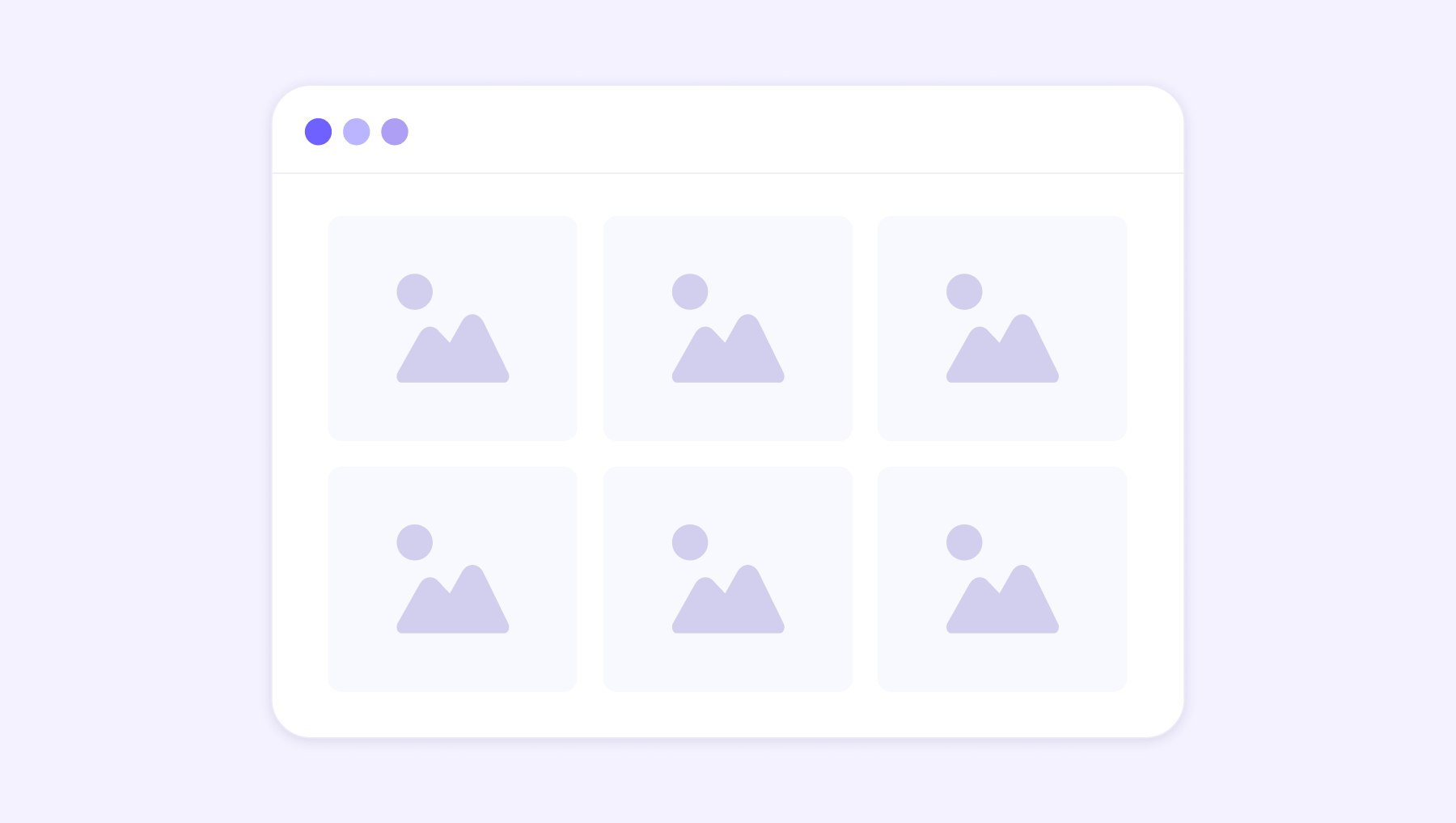
6. Building reusable Webflow components
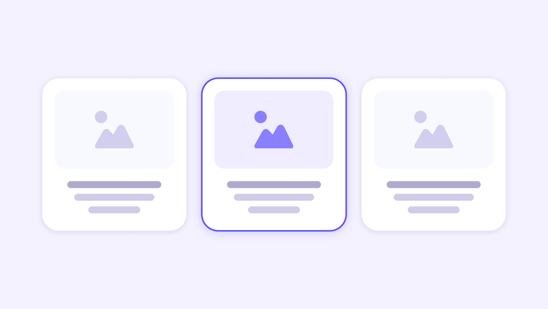
Reusable components are the foundation of scalable and efficient Webflow projects. They help keep your website consistent and greatly reduce design and development time.
By carefully structuring and documenting components, you can simplify collaboration and updates, making sure your project grows smoothly as needs change.
Identifying patterns
Start by finding UI elements in your Figma designs that are used often across pages, like buttons, cards, navigation menus, and headers. Turn these into Webflow Components to make modular elements that can be updated everywhere at once. For example:
- Buttons: Define a main button style for CTAs and secondary styles for less important actions.
- Cards: Create reusable card designs with placeholders for images, titles, and descriptions. Use classes for different layouts to keep them flexible.
- Headers and footers: Use Webflow’s components feature to centralize the structure and styling of global elements.
Regularly check your components to make sure they match design updates and follow best practices. This step stops outdated styles from spreading across your project.
Managing overrides with Webflow Component Fields
Dynamic content is important for reusable components. Webflow’s Component Fields let you add editable fields within Components, allowing unique content variations without copying the design.
For example, a testimonial card component can have editable text, author name, and profile image fields.
Clearly document override options for team members. Provide instructions on which fields can be customized and how to keep consistency when adding variations.
Enhancing component flexibility with Webflow's conditional visibility
For advanced projects, use conditional visibility settings to show or hide elements within a component based on the use case. For example, a product card might have a “Sale” badge that only shows when needed. Combine this with nested components to create very flexible UI elements without losing design quality.
Documenting components
To make your components last and be useful, create a dedicated style guide page in Webflow. This page should:
- Show each component visually, with descriptions of its purpose and how to use it.
- Include naming conventions for classes, variables, and nested elements.
- Highlight editable fields and give examples of acceptable variations.
This helps team members see changes and understand why adjustments were made. A well-documented component library makes it easier to onboard new team members and keeps everyone aligned throughout the project.
By adding these practices to your workflow, you’ll build a foundation of reusable components that enhance consistency, speed up development, and support long-term scalability of your Webflow site.
7. Animations and interactions from Figma to Webflow
Webflow’s Interactions Panel lets designers create dynamic animations and interactions without coding, matching the micro-interactions designed in Figma. These include:
- Hover effects: Small changes like color shifts or enlarging that give immediate feedback to user actions.
- Scroll-based reveals: Content that animates into view as users scroll, adding a dynamic flow to the narrative.
- Triggered animations: Elements like modals, dropdowns, or carousels that activate when users click or hover.
- Multi-step animations: Combine multiple triggers and sequences for advanced storytelling, such as fade-ins followed by slides.
Use Webflow’s triggers like page load, scroll progress, or click events to create layered and complex interactions. Combine these animations with Webflow’s easing options (ease-in, ease-out, linear, etc.) to fine-tune motion transitions.
Ensuring performance
Performance is important when adding animations. While animations can make your site engaging, too many can slow down page load speeds and hurt user experience. To keep high performance:
- Minimize complex animations: Focus on short, meaningful transitions instead of resource-heavy effects.
- Test across devices: Check your animations on both desktop and mobile devices to ensure they work smoothly. Use Webflow’s device preview and external tools to verify.
- Optimize assets: Compress images, videos, and Lottie files used in animations to lower load times.
- Limit concurrent animations: Reduce multiple animations happening at the same time to avoid overwhelming users or causing browser lag.
Write down animation settings, like easing functions, durations, and delays, to keep a consistent visual style across the project. Use shared styles or utility classes for animations you use often to make updates easier.
Advanced techniques
For those wanting more complex animations, consider using:
- Lottie animations: Lightweight, vector-based animations imported as JSON files for smooth scaling and performance.
- Custom JavaScript: Extend Webflow’s native features for unique interaction scenarios that need custom scripting.
8. Responsive design on Webflow
Creating responsive designs makes sure your website offers a smooth user experience on all devices. This section covers key strategies for mobile-first design, testing responsiveness, and optimizing components for flexibility.
Testing responsiveness is a repeated process that goes beyond Webflow’s preview modes. While these modes are a good start, thorough testing needs real-world checks on different devices.
Steps for testing responsiveness:
- Use physical devices: Test designs on actual smartphones, tablets, and desktops to find layout or usability problems.
- Use browser-based tools: Platforms like BrowserStack or Chrome DevTools let you mimic many screen sizes and orientations.
- Evaluate performance: Check load times, especially on mobile networks, to make sure assets like images and animations are loading as expected.
- Focus on breakpoints: Make sure designs transition smoothly between Webflow’s default breakpoints and any custom ones you set.
Testing at every step helps find inconsistencies early, allowing for quicker fixes.
Adapting component
Responsive components are crucial for keeping design integrity across devices. By building with flexibility, you can adjust elements like cards, modals, and grids for different screen sizes without repeating styles.
Tips for responsive components:
- Use conditional visibility: Webflow’s conditional visibility settings let you show or hide elements based on screen size. For example, show a compact navigation bar on mobile and a full-width menu on desktops.
- Implement modular classes: Create scalable classes that change padding, margins, and font sizes for each breakpoint, ensuring consistent styling without repeating code.
- Stack or reflow layouts: Design flexible layouts that stack vertically on small screens and spread out horizontally on larger screens. For example, a card component can switch from a single-column layout to a multi-column grid.
- Test components individually: Check each component against edge cases, like different content lengths or unexpected user inputs, to ensure they work well.
Final thoughts on Figma to Webflow dev hand-off
Moving Figma designs to Webflow is a straightforward but detailed process that needs careful attention and strategic planning.
By following these best practices, you can make sure your designs are accurately converted, visually consistent, and optimized for performance. As you improve your Webflow workflow, revisit these principles to make future projects easier.
If you encounter any challenges during the transition from Figma to Webflow, the BRIX Templates team is always here to help.
With years of experience in design and Webflow development, and hundreds of pretty unique Webflow builds, our team can assist to ensure your project achieves the desired outcome. Feel free to reach out for personalized guidance and support tailored to your specific needs.


Join readers commenting on this post!