
In modern web design, tabs have become an essential tool for organizing content efficiently on websites. While tabs effectively manage space and improve user interface organization, there are times when you need to direct users to specific tab content that isn't visible by default. This guide will show you how to implement direct tab linking in Webflow, making your content more accessible and your user experience more streamlined.
Common use cases
Here are three practical scenarios where direct tab linking proves useful:
- Product catalogs: An e-commerce site organizes different product categories in tabs. Marketing campaigns can link directly to specific product category tabs, eliminating the need for customers to navigate through multiple sections.
- Service offerings: A business website displays various services in separate tabs. Team members can share direct links to specific service tabs when communicating with potential clients via email or social media.
- Documentation sections: A help center uses tabs to organize different aspects of product documentation. Support teams can provide customers with direct links to relevant troubleshooting tabs, improving response efficiency.
Step-by-step implementation for Webflow tab links
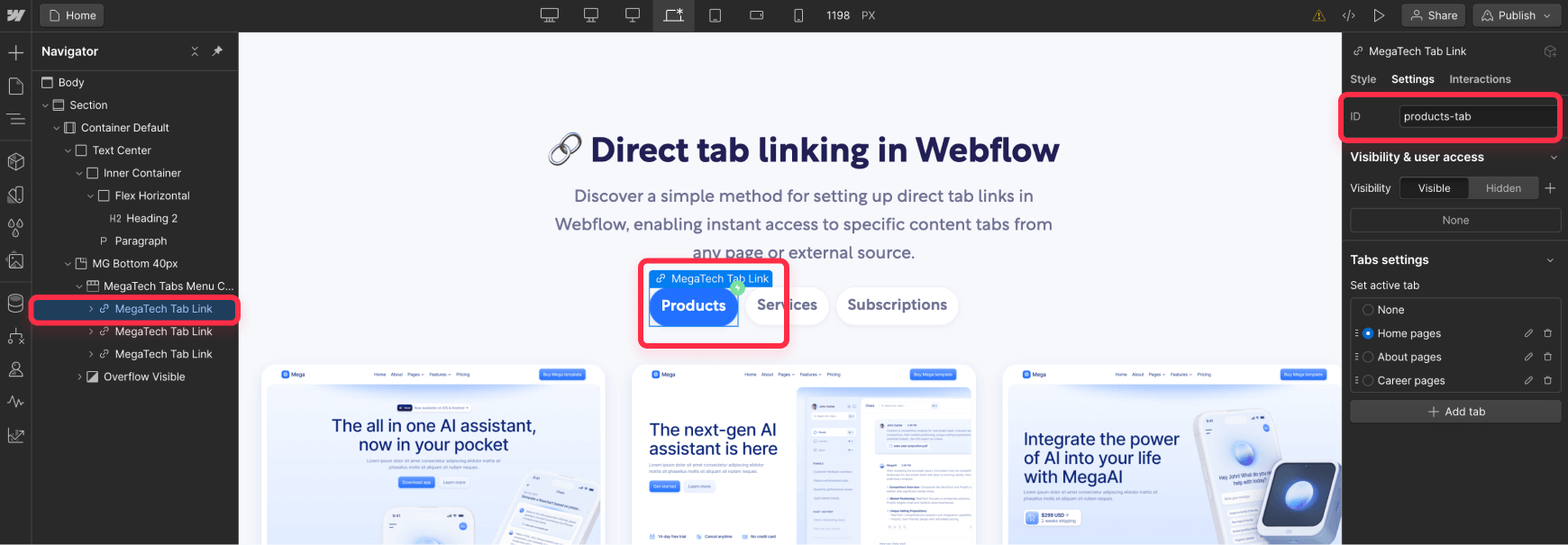
1. Setting up tab IDs
First, you need to assign unique identifiers to your tabs:
- Select your tab element in Webflow (the tab link/trigger element, not the tab pane)
- Open the Element Settings Panel
- Locate the "ID" field in the General settings
- Assign a descriptive ID (e.g., "services-tab" or "pricing-tab")
- Repeat for each tab you want to link to
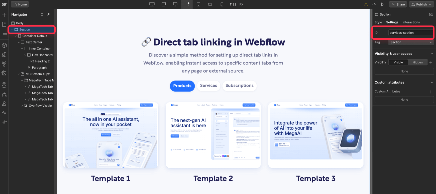
2. Setting up section anchoring
To enable smooth scrolling to your tab section:
- Select the container div that holds your entire tabs component
- Add a unique ID to this container (e.g., "services-section")
- This ID will be used for anchoring in your URLs
3. Adding tab navigation code
You can implement this functionality either site-wide or on specific pages:
For site-wide implementation:
- Go to Project Settings > Custom Code
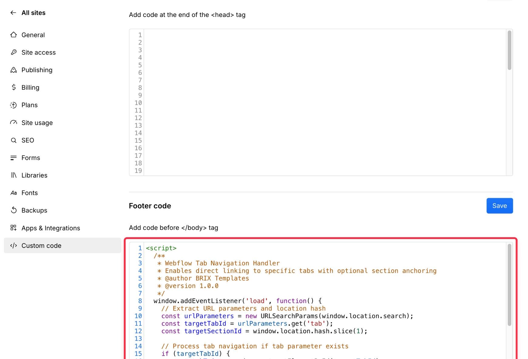
In the "Footer Code" section, add the following code:
<script>
/**
* Webflow Tab Navigation Handler
* Enables direct linking to specific tabs with optional section anchoring
* @author BRIX Templates
* @version 1.0.0
*/
window.addEventListener('load', function() {
// Extract URL parameters and location hash
const urlParameters = new URLSearchParams(window.location.search);
const targetTabId = urlParameters.get('tab');
const targetSectionId = window.location.hash.slice(1);
// Process tab navigation if tab parameter exists
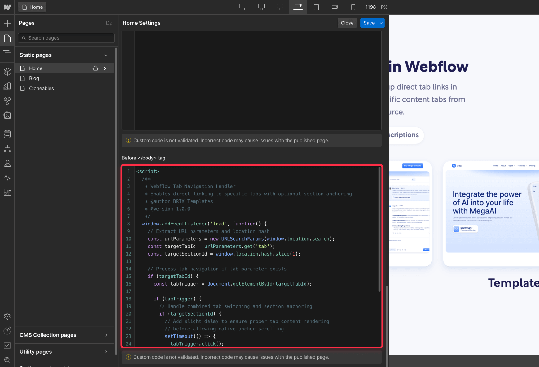
if (targetTabId) {
const tabTrigger = document.getElementById(targetTabId);
if (tabTrigger) {
// Handle combined tab switching and section anchoring
if (targetSectionId) {
// Add slight delay to ensure proper tab content rendering
// before allowing native anchor scrolling
setTimeout(() => {
tabTrigger.click();
}, 50);
} else {
// Simple tab switching without section anchoring
tabTrigger.click();
}
}
}
});
</script>
For page-specific implementation:
- Open Page Settings
- In the "Before </body> tag" section, add the same code as above
4. Creating tab links
You have two implementation options:
Option 1: Tab switching only
- URL Structure: yourwebsite.com/page-path?tab=tab-id
- Example: yourwebsite.com/services?tab=consulting-tab
Option 2: Tab switching with section anchoring
- URL Structure: yourwebsite.com/page-path?tab=tab-id#section-id
- Example: yourwebsite.com/services?tab=consulting-tab#services-section
Testing your Webflow tab link implementation
After setting up tab linking, verify your implementation:
- Check each tab link works correctly
- Verify tab content displays properly
- Test section anchoring
- Confirm functionality across different devices and browsers
Troubleshooting common issues
- Tabs not switching: Ensure your tab IDs exactly match the IDs used in your URLs. Check for typos or case sensitivity issues. The most common issue occurs when the ID in your Webflow settings doesn't match the one in your URL parameter.
- Anchor scrolling issues: When using both tab switching and section anchoring, verify that your section ID is correct. The code includes a small delay to ensure proper tab content rendering before scrolling. If scrolling behavior seems inconsistent, check that your section ID is applied to the correct container element.
- Navigation timing issues: The script includes built-in timing handling for combined tab and anchor navigation. If you experience any issues, verify that your script is placed before the closing body tag. Timing problems often occur when the script loads before the page content is ready.
- Cross-browser compatibility: The implemented solution uses standard browser APIs and should work consistently across modern browsers, however, it's always recommended to test your implementation across different browsers to ensure consistent behavior — Pay special attention to mobile browsers, which may handle tab switching and scrolling differently.
Best practices for tab links
- Descriptive ID naming: Use clear, kebab-case IDs (e.g., "product-overview" instead of "tab1"). This practice improves code readability, makes URLs more user-friendly, and can positively impact SEO when used with anchor links. Well-structured IDs also make it easier to maintain and debug your implementation.
- URL structure consistency: Maintain a consistent URL structure throughout your site for tab links. This helps with analytics tracking and makes your links more predictable for both users and developers. If your Webflow site is very big, consider creating a simple documentation guide for your team to ensure everyone follows the same URL patterns.
Final thoughts
Direct tab linking in Webflow enhances site navigation and improves user experience by allowing precise content targeting. By combining tab switching with section anchoring, you create a robust and user-friendly navigation system that works across all devices and browsers.
Remember that this implementation is entirely client-side and requires no external dependencies or privacy considerations. You can implement it confidently knowing it won't affect your site's security or performance.
If you need assistance with more advanced linking implementations or custom solutions, the BRIX Templates team is here to help. Feel free to reach out to us - we're always happy to support you in creating the best possible experience for your users.


Join readers commenting on this post!